Do you dream to add a kitchen to the living room? Do not rush: weigh the pros and cons. It is tempting to get one spacious instead of two small rooms. It has a lot of light, because when combined, the number of windows increases. It has pleasant proportions: often the kitchen and the room separately have an unsuccessful shape, say, strongly extended, and together form a harmonious square. In addition to architectural, there are arguments of another kind: the hostess is no longer isolated from the family and guests, communicates with the company, and collectively prepare something together. Here, and children play - under the supervision of adults.
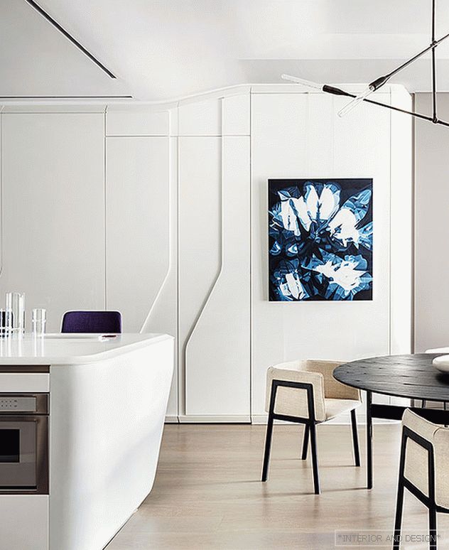 Cove Kitchen, diz. Z. Hadid, Boffi. White Corian makes the island look like an ice block. Relief on the wall cabinets - branded graphics Zaha Hadid. On the wall is the work of A. D‘Arcangelo.
 What is the answer to this? First, a lot depends on the size of the apartment. In the one-room kitchen is, in fact, the second room. Cleaning the partition in this case and depriving oneself of an isolated room is not very reasonable. At least, if more than one person lives in the apartment. However, even if one is still unreasonable: after all, his marital status may change.
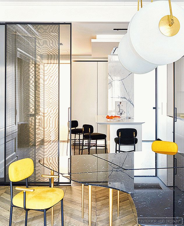 Claude Missyre. Paris. The kitchen is separated from the dining room symbolically - with a Rimadesio sliding glass partition made of transparent glass.
 Secondly, a big role is played by the lifestyle of the owners. The union is suitable for a modern mobile family - for those who eat at home infrequently, and if this happens, it makes dishes simple: salad, omelette, heated pizza. If the house is cooked seriously and for a long time, from morning till evening something is baked and fried - in this case, a working insulated kitchen is needed.
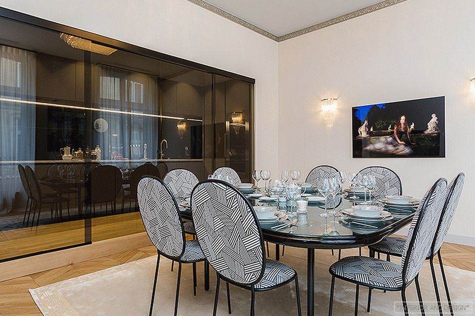 The dining room designed by Gerard Fevre is separated from the kitchen with tinted sliding partitions.
 Supporters of combination say that now such hoods - miracles work. But it's not just the smell. And also in the sounds, types, spots. Do you like pork chop and the sight of fish being cut? If this is what you associate with home comfort, then go ahead. If not, leave the kitchen.
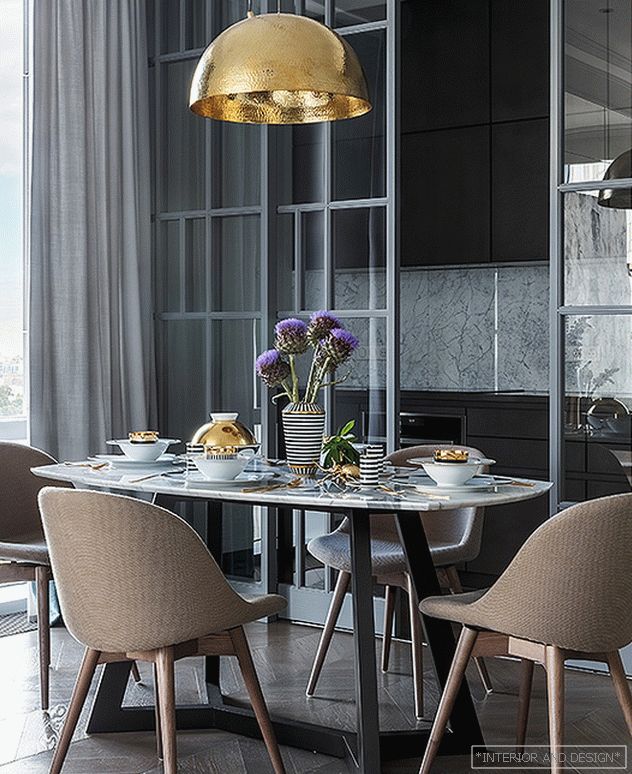 Project by Irina Marchenkova and Maria Zemlyanekh. Kitchen Concrete from Leicht: the facades are finished with hand-applied concrete.
 There are other circumstances: it turns out that not everyone likes to engage in cooking in public. But one lady told us: “It was not worth combining the living room and the kitchen. We often have guests: socialites smoking cigarettes, it is strange to watch as a housekeeper cuts a salad. It spoils the impression of the holiday. ”
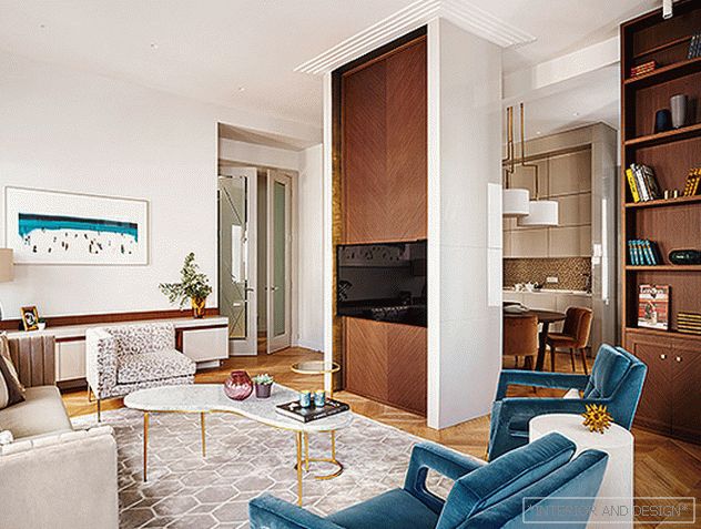 Project TS-Design Studio. The double-sided construction conceals the carrier metal column inside itself, is the dominant of the living room and the zoning element.
 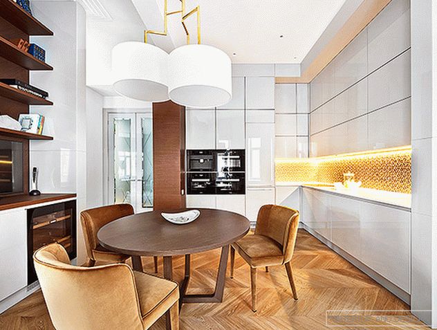 Project TS-Design Studio. From the kitchen side, the zoning design is covered with shelves and modules with a wine cooler. Household appliances Miele. Kitchen apron: L’Antic Colonial glass mosaic (Porcelanosa Grupo).
 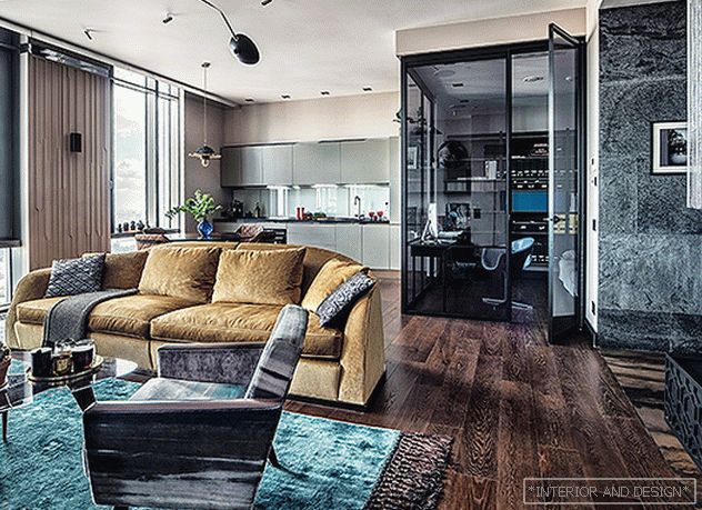 Project Pavel Volovova. Kitchen Dada. In the open space, Albed partitions highlight a glass cube in which the study is arranged, also known as the guest room. Alfred sofa, diz. R. Lazzeroni, Flexform Mood.
 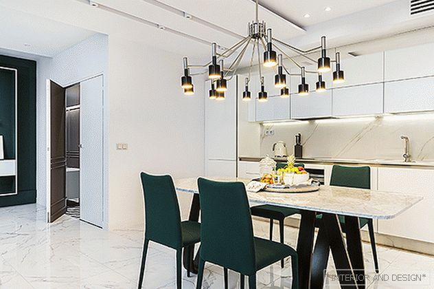 Project Nika Vorotyntseva. Kitchen Arredo3 combined with the living room and dining room. The floor has Atlas Concorde porcelain stoneware. The shade of the upholstery of the chairs is similar to the color of the wall panels, which emphasizes the integrity of the space.
 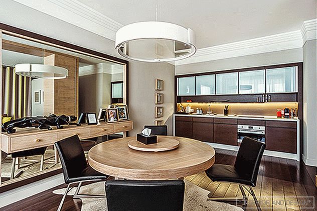 Galina Mikulik. Apartment in Moscow, 110 square meters. meters The kitchen, table, hinged chest of drawers are made to order in Russia. Household appliances Miele.
