two-level apartment of 300 m2 in Kiev
 Passing the gallery
 Stylist: Angelica Garusova
Text: Alexandra Terentyeva
A photo: Eduard Stelmakh
Project author: Valeria Zavgorodneva
Magazine: de Luxe Classic N1 2012
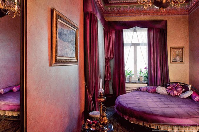
The history of the creation of this interior began almost 10 years ago, when a young family acquired their first joint apartment in the center of Kiev. The house, built in the beginning of the 20th century, attracted customers with its beautiful architecture and good location. However, during its long life the apartment experienced a lot of shocks, and about the former magnificence of the interior was only a ceiling stucco, miraculously preserved in several rooms. “The main demand of the customers was the re-creation of the historical atmosphere of the era in which the house was built. Therefore, we turned to such a direction as eclecticism, ”says
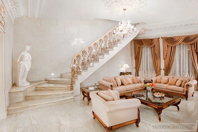
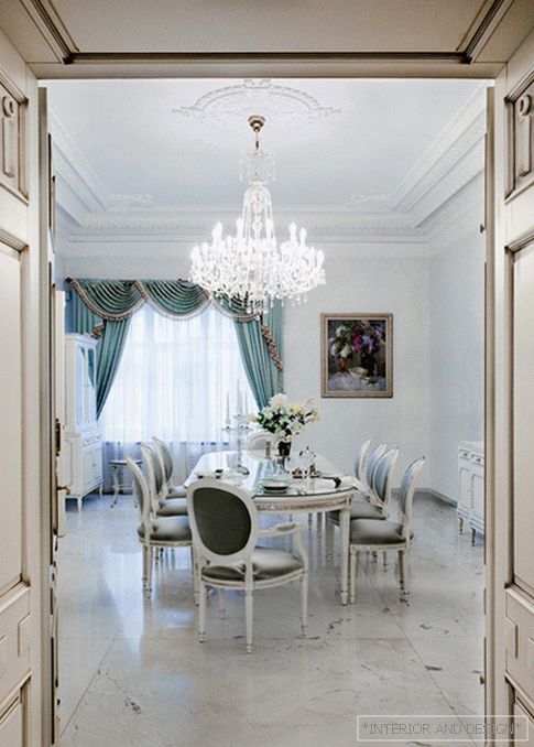
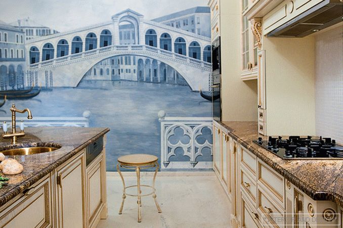
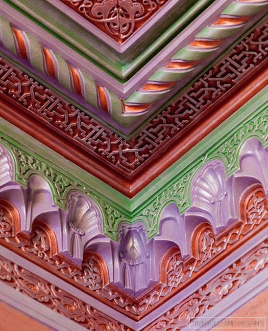
The two-level apartment space is divided into a public presentation zone and a complex of private premises. On the ground floor there is a living room, dining room, kitchen and guest bedroom. The main staircase leads from the main living room to the second floor where there is a small living room, an office and an additional guest room. A small hall separates the master bedroom from the rest of the second floor. Stylistically, the apartment is also divided into two levels. The interior of the attic floor is designed in a modern minimalist manner. Respectable classics dominates the ground floor. The stuccoed decoration of ceilings, made in different styles, reminds of the eclectic character of the original interior. “For us it was extremely important to keep the ceiling moldings. Before replacing the dilapidated wooden floors, casts were taken and sketches of all the surviving samples were made. Subsequently, the ornaments were recreated with historical accuracy, "- says
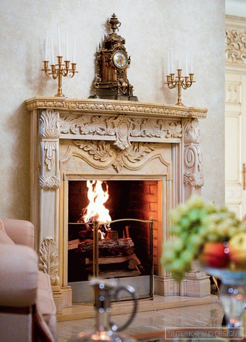
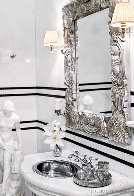
The contrast of the glossy surface of marble with the soft velvety structure of the wall covering SIA creates an interesting textured effect. Despite the rich decoration and use of baroque-style furniture, the interior does not look overloaded. Quotes from different styles and epochs are balanced by concise white color and wonderfully intertwined in an open and completely modern in their spirit space.
Architect

