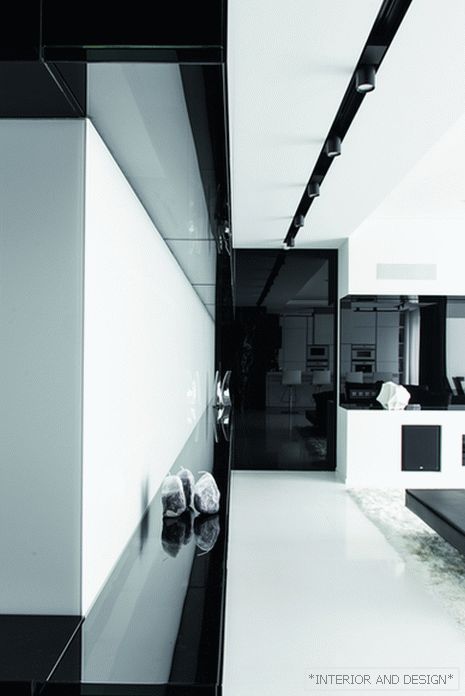
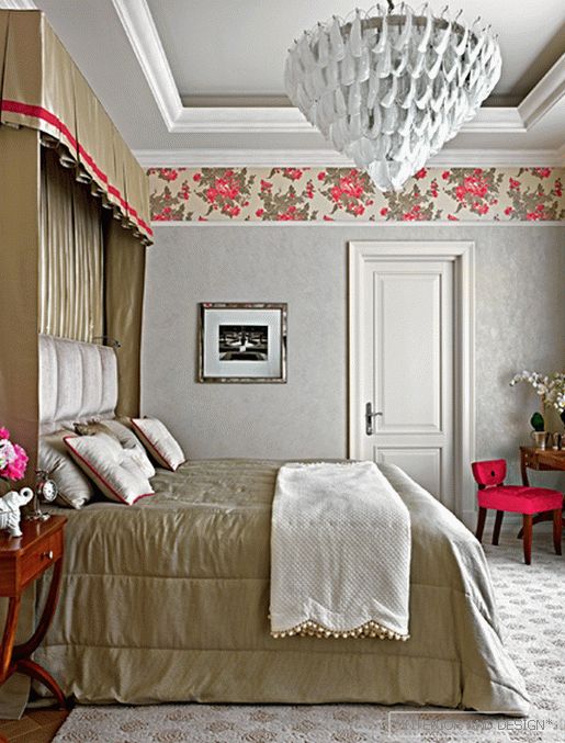
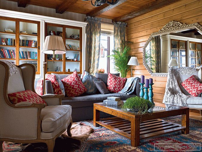
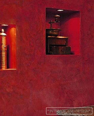
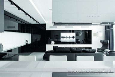
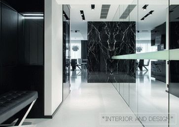
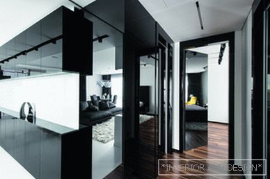
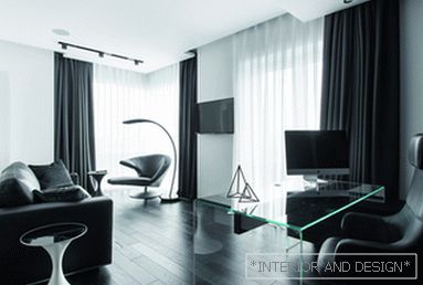
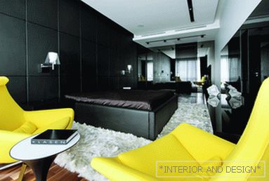
This graphic contrast interior is built according to the laws of refractions and reflections - it is worth changing the point of view, and the picture will change beyond recognition





 Passing the gallery
 Text: Olga Vologdina
A photo: Alexander Kamachkin
Project author: Michael Miroshkin, Helen Miroshkina
Magazine: №1 (222) 2017
A young couple turned to Michael and Helen Miroshkin, who had an unsuccessful experience of cooperation with designers: a year after the start of the renovation of their apartment, the business practically did not move from scratch: only walls were erected and individual materials were ordered. Despite the work done by the predecessors, the architects advised the owners to start everything from scratch, since the “baggage” inherited did not correspond to the expectations of the owners. The architects abandoned the rounded walls, rethought the zoning: reworked the space-planning solution and thought out the functionality of the premises. Full understanding was reached in the development of the design project. The owners wanted to get at the exit a super-modern, contrasting interior.
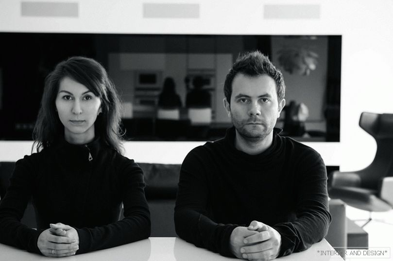
The authors of the project are architects Helen Miroshkina, Michael Miroshkin
The authors of the project are architects Helen Miroshkina, Michael Miroshkin
