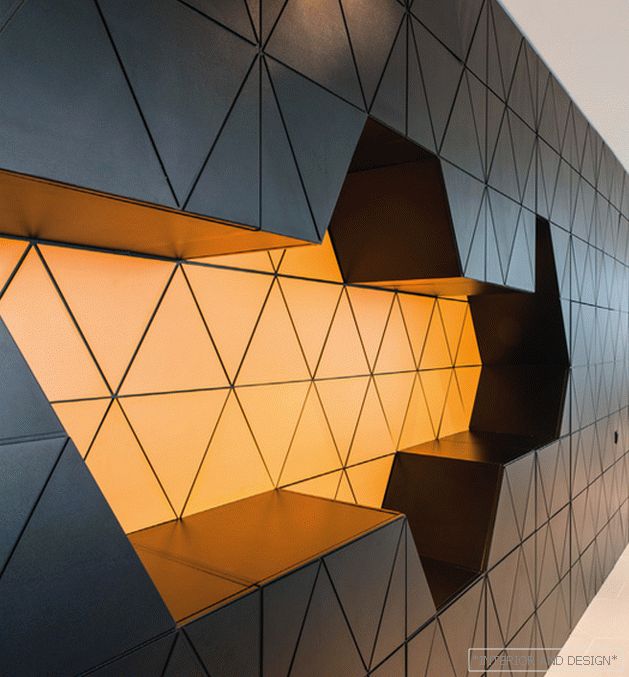
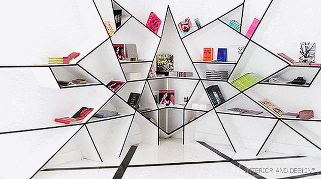
The geometric structure of the interior is the main feature of this new office of a pharmaceutical company.
 Passing the gallery
 Project author: Michael Miroshkin, Helen Miroshkina
Magazine: N5 (193) 2014
Wall panels, glass partitions, reception desk consist of hexagons, and even porcelain stoneware on the floor is cut into the same segments. “Behind all this, there is a functional side,” says Helen Miroshkina. “So, behind the panels in the waiting area and the hall is a spacious storage system. Since this is an office of a pharmaceutical company, we hung up lights in the shape of molecules, and the bright orange chairs in this black and white interior are wonderful color accents (orange is the corporate color of the company). In many rooms there are columns, they became the defining elements of zoning. For example, in the head's office, four columns are made in the same style and highlight a zone where visitors can be received. The desktop in his office was made according to our sketches and is also an art object. ”
Read the full text in paper or


