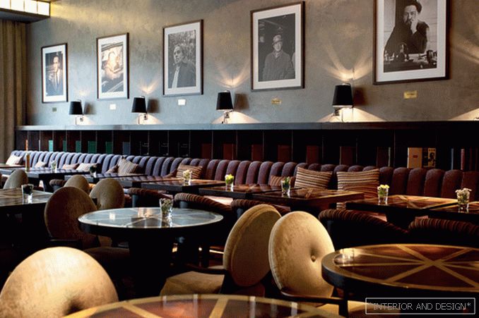
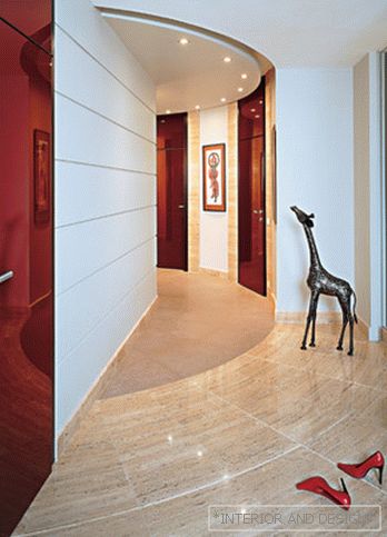
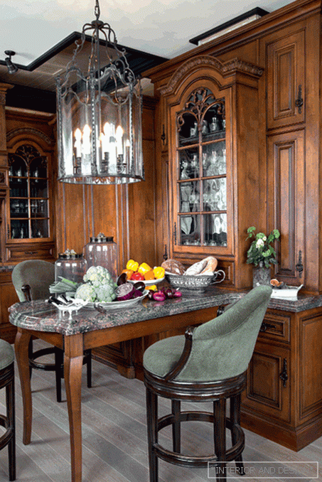
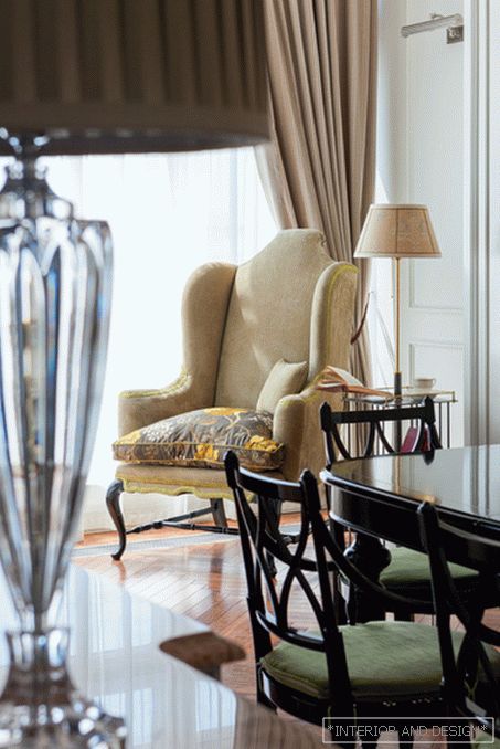
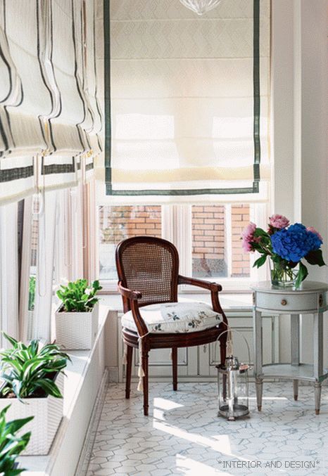
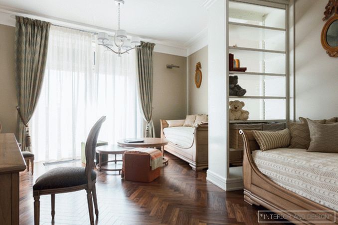
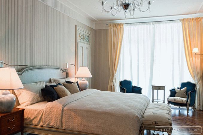
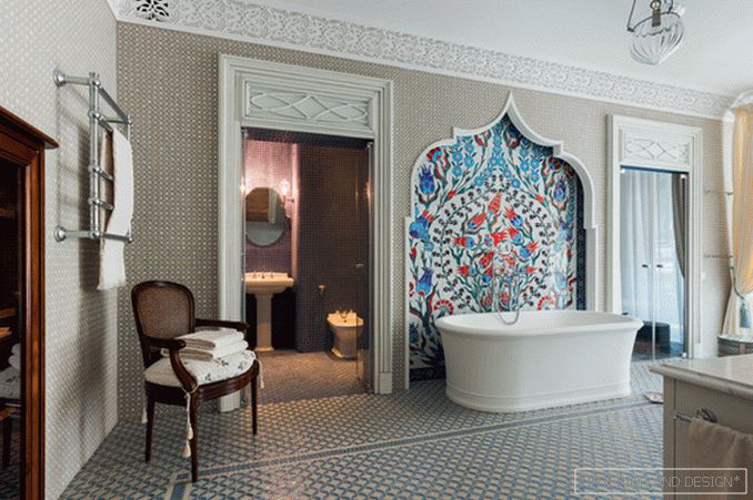
When decorating this two-level apartment, designers from the S-Style studio preferred light European classics with oriental accents.
 Passing the gallery
 A photo: Evgeny Luchin
Interview prepared: Olga Vologdina
Project author: Anna Denisova, Anastasia Rykova, Anastasia Bozhinskaya
Magazine: N10 (187) 2013
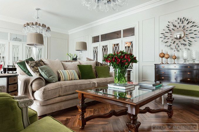
Anastasia Rykova: “This interior was created for a couple. We are well acquainted with customers, and therefore there were no long negotiations with a demonstration of the portfolio. We were sincerely pleased to hear an offer to do an apartment design. The owners have set the task to make a bright, classic apartment without excess luxury. The presence of oriental decor was also the wish of the owners. The spouse said that he would like to have eastern accents, but something more Europeanized. In general, the interior was supposed to give the impression of a calm, spacious and bright city apartment, comfortable, conveniently planned and, of course, cozy. In order not to bore the interior, we added upholstery with rich colors to the neutral color of the walls and combined fabrics of different textures.
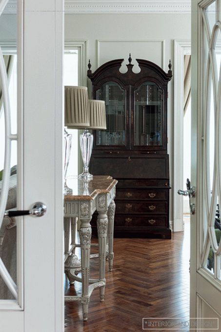
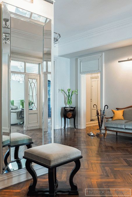
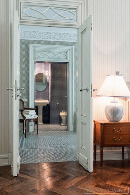
Did customers have any wishes regarding style? Anastasia Rykova: There were no clear requirements. It was rather a general impression. City apartment, light, classic, bright, no redundant palace elements. Almost immediately the image of a European apartment came to mind — with beautiful parquet, high swing doors, and traditional furniture. The image is very generalized, but it turned out to be capacious and sustained. There is something of the English classics in it, Eastern motifs slip somewhere, and in general the atmosphere is more like a house with a measured lifestyle, where family traditions are strong. In general, it was easy to work: the main decisions were made quickly, and, best of all, the customers did not change them, because they made it clear what exactly they wanted to see in the interior, and at the design stage explained what they didn’t like and why .
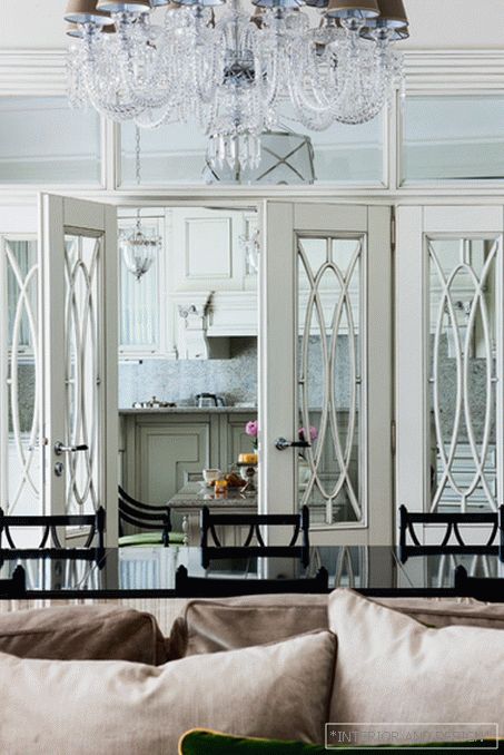
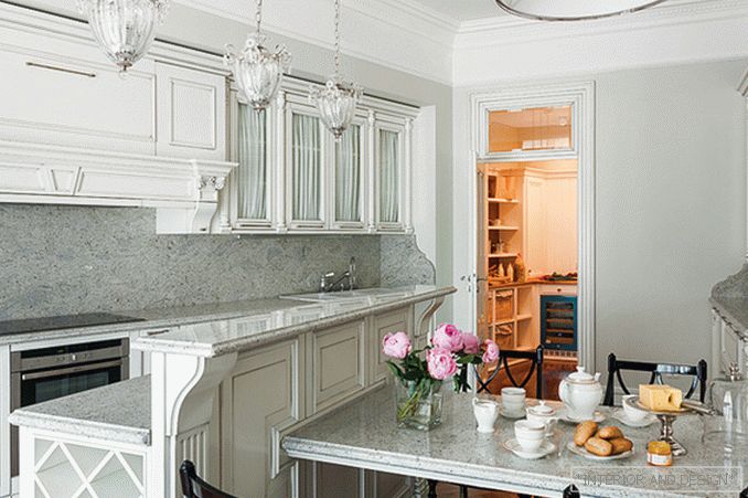
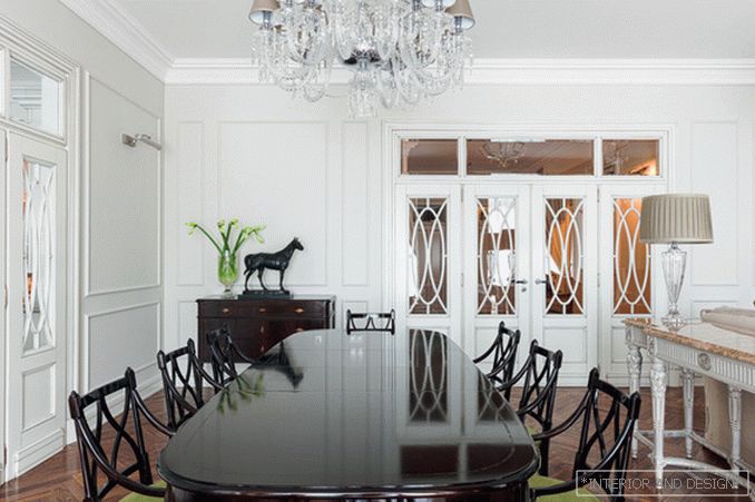
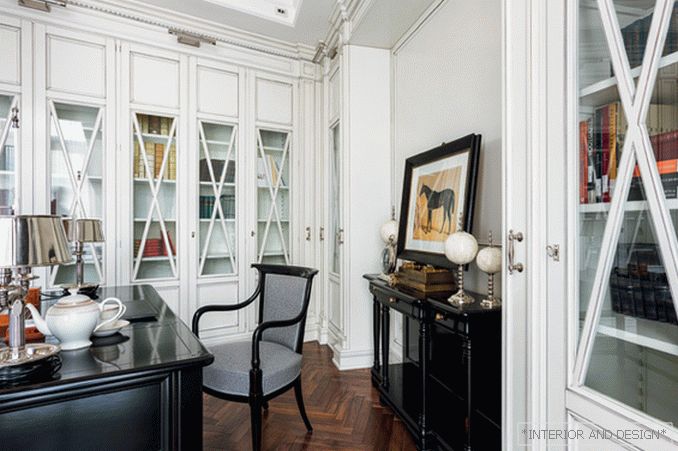
SALON: The first thing you notice in this interior is the doors. Large, multi-fold, with beautiful bindings ... - Indeed, they are one of the main decorations of the interior. From the very beginning we conceived them as hinged, as high as possible, to the ceiling. It is obligatory with transoms to create a feeling of lightness and airiness, when natural light falls into almost all rooms. On the first floor, in particular in the living room, there are two four-leaf doors with vertical layouts in the form of intersecting ovals. On the second floor, private, the door, of course, deaf. To emphasize the unity of the interior, we made the glass only the upper part — the transoms here are also transparent, but with horizontal ovals. Working on this project, we sincerely tried to fulfill the main wish of our customers — to make a comfortable and functional apartment. Therefore, a lot of time was given to trifles. For example, for the master bedroom we designed windows with “pocket doors”. It was assumed that in the cabinets will be exhibited souvenirs, photographs. But the owners also wanted to, if necessary, could be to cover the exposure. Invented doors when opening zayzayut in the side walls of the cabinet, and with them the upper part of the window looks just like a rack with open shelves. In the kitchen, in order to hinged cabinets do not look bulky, the doors are made of glass. However, it was obvious that, if the doors were left open, in everyday life, various jars and dishes visible through glass would destroy the clean, uncluttered atmosphere of the white kitchen. Therefore, a compromise was made — glass doors with curtains on the inside.
S: And really, it seems to be little things, but nice ... - The whole interior consists of parts that are particularly invisible at first glance. In the children's bedroom, the walls are painted with special paint, on which you can write with markers. The central part of the wall was sheathed with cork in order to hang children's drawings and applications. In the wardrobe there are small retractable pins. When the owners change clothes or pick up clothes, they can pull out and hang hangers with clothes not sideways, but face to themselves. There are other similar little things, but you can not tell about all. And you know, it is very nice when the apartment is not only stylishly made, but it is also convenient to live in it. The so-called little things ultimately provide quality of life, convenience, comfort.

