Moscow apartment with an area of 122 m2

 Passing the gallery
 A photo: Dmitry Livshits
Text: Oksana Kashenko
Project author: Alexey Smirnov
Decorator: Ekaterina Smirnova
Magazine: (140)
When customers chose housing for themselves, they liked this apartment right away. She had two significant advantages. First: from all the windows opened a breathtaking view of the Stroginsky floodplain. Second: the apartment was open plan; except for the bearing walls there was not a single partition or column.
Designer
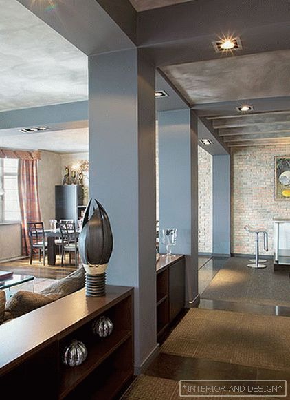
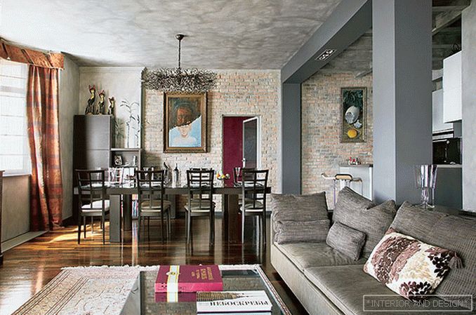
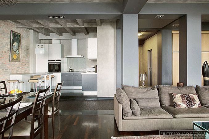
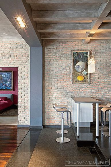
The idea to decorate the guest part of the interior exterior means was born from the designer almost immediately. He was inspired, oddly enough, by the well-made glazing of this zone. Played its role and a large living room area. Thus, columns appeared in the interior, emitting a kitchen in a common space, brickwork of genuine antique brick, and a floor of polished stone with imitation of paving stones. The main color, gray, was chosen by the designer because he wanted to make the guest area cooler and the private one warm. True, he diluted the gray color with a warm brown-ocher palette of brick walls. The ceiling was also made gray, but thanks to the game of textures and shades, the guest room not only does not seem cold, but feels like a comfortable, inviting room to rest.
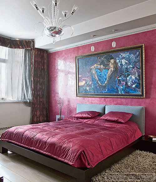
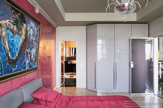
Спальню дизайнер оформил на контрасте с гостевой зоной, выбрав для основной стены цвет фуксии. Это тоже не случайно. С самого начала хозяевам хотелось, чтобы над изголовьем кровати висела копия картины Врубеля "Демон". Designer не противоречил столь необычному желанию, а, наоборот, поддержал его, организовав написание полотна и создав для него необходимый фон: цвет стен и текстильное оформление спальни вторят основному тону картины, как бы усиливая ее эффект.
Of course, the apartment would have looked unfinished, if not for paintings and textiles. These details have made their own, special role in the overall perception of the interior, making it truly cheerful.

