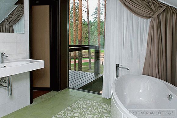
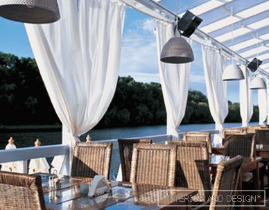
Laconic classical decor, light colors and an emphasis on the Oriental collection of the hostess — this way Julia Kryuchkova created the interior of this mansion near Moscow for a large family
 Passing the gallery
 A photo: Dmitry Livshits
Text: Alexandra Terentyeva
Project author: Julia Kryuchkova, Nina Zhorova
Magazine: N4 (203) 2015
The author of the project is Yulia Kryuchkova: “In all my works, regardless of their style, I try to adhere to minimalist positions. I also did not want to overload this classic interior in its mood with decor or an abundance of textures. There are no extra things, no excess of items. The space, despite the difficulties of the original layout, turned out bright, open, airy. The collection of the hostess and the old parquet we assembled gave it warmth and comfort, filled the house with history. ”
The interior of the house is a reflection of the character, lifestyle of its owner, a logical continuation of the architecture of the building and at the same time the author's statement. In recognition of designer Julia Kryuchkova, this project became for her a kind of interesting experiment, set it before searching and solving new problems.
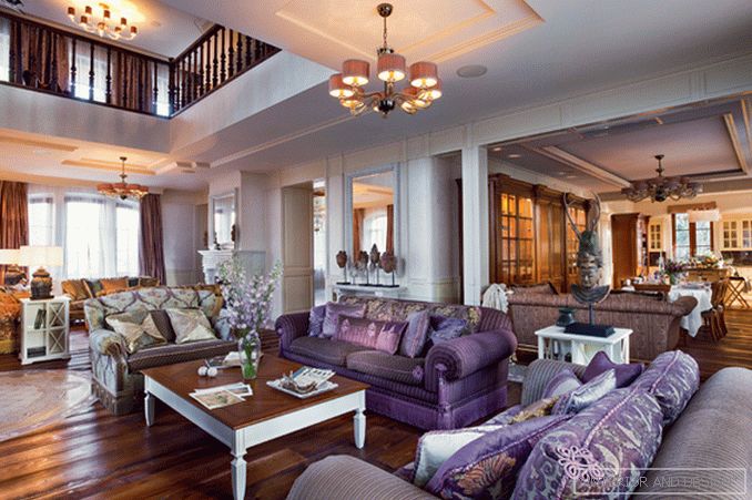
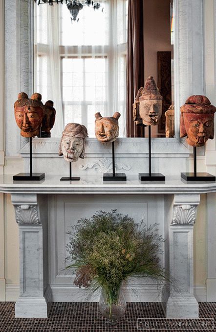
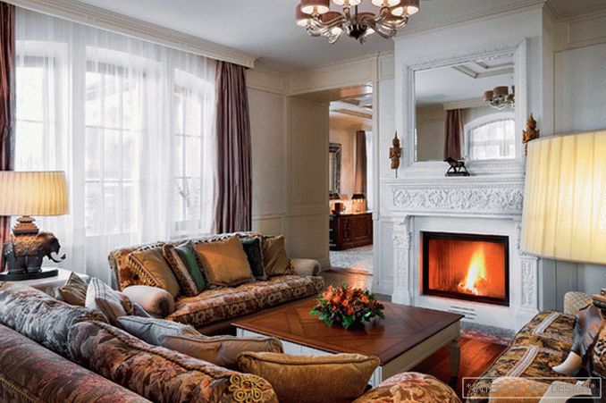
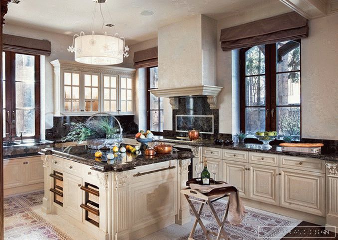
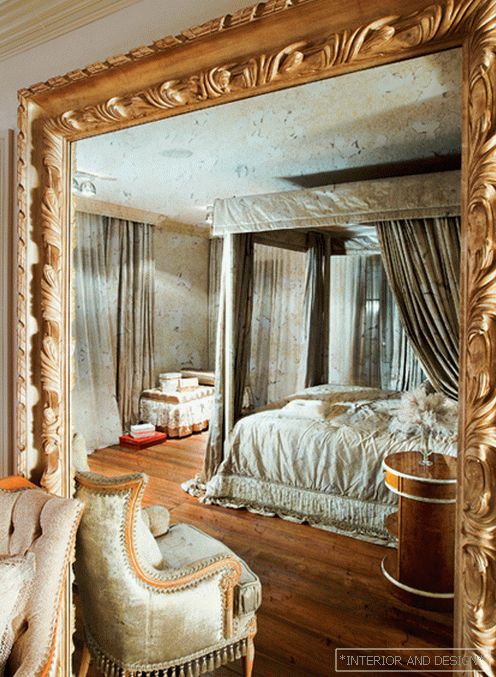
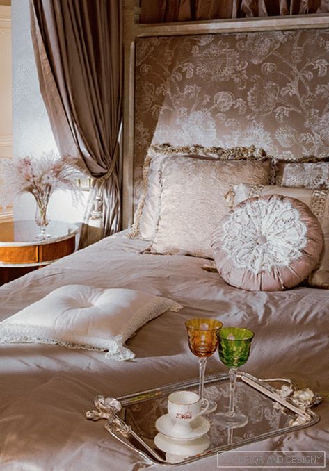
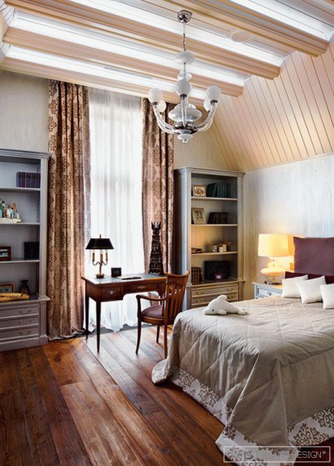
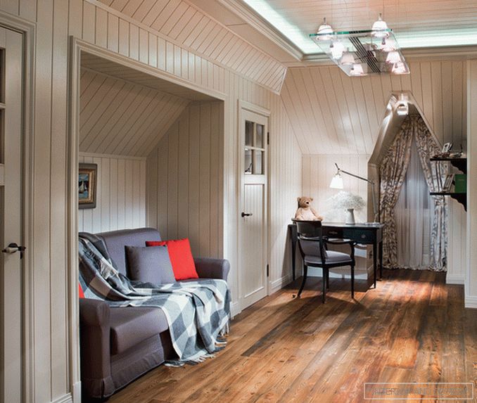
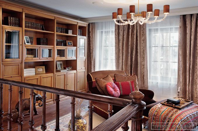
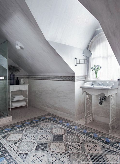
The mansion is located in the suburban village, the ensemble of which is sustained in the traditions of Norman architecture. She identified and vector development of the interior. “The atmosphere of the village, the design of the facade of the house, the shape of the windows and the very configuration of the rooms — all said that only classics would be appropriate here,” says Julia. However, neither the customer nor the architect set a rigid style framework. The main goal was a comfortable, practical space in which the ethnic collection of the hostess would organically fit. The collection of masks, sculptures, carpets is replenished after each trip to Africa or Asia. So that the space of the first floor does not seem to be a set of small isolated volumes, the public zone was decided as a whole. A living room consisting of a fireplace and a sofa group adjoins the main dining room, and that, in turn, flows into the kitchen. A staircase leads to the second floor from the living room, the hall next to it is equipped with a library-office. The main difficulty in working on the interiors of the third floor was non-standard and not the most successful structure of the premises. It was necessary to divert attention from the sloping windows and walls, bulky ceiling beams. This was possible thanks to the wood panels of light colors, which sheathed the surface of the walls and ceiling. In the bedrooms, however, preference is given to decorative plaster, and in the living room, wooden buazeri is based on author’s sketches. The classic image of the interior emphasizes the marble fireplace and console with a carved pattern, made by hand.
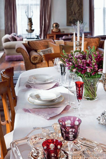
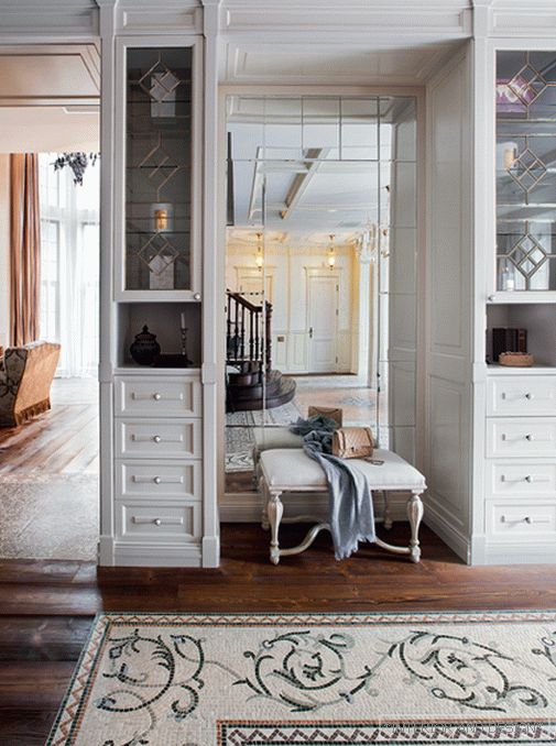
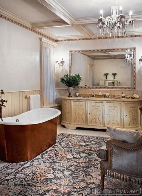
The hostess of the house wanted to develop the given “antique” theme in the floor's decor, for which an antique parquet was selected. “I met this demand for the first time. What was needed was not just an artificially aged board, but real antique wood. Enormous work ahead. We looked for suitable options of the necessary quality, sorted, selected the necessary tone. After all, it was required to cover all three floors of the building with parquet. We decided to supplement the natural wood with marble mosaic-carpeted panels. This is one of our favorite techniques. And here it is very harmoniously combined with the texture of old wood, ”says Julia. The rich and deep color of natural wood is set off by light walls with a light pink-purple hue. It serves as support for the customer’s favorite colors — wine and mauve. In the interior of the public area on the first floor, they were given the role of the main color accents: in the living room, the PROVASI sofas are upholstered with a tapestry in lilac tones, and for the dining room, crystal glassware was selected according to the scale. “This work was the result of our active cooperation with the customer. Her absolute fearlessness in making decisions and great taste opened up a field for us to experiment. It all started with a white-green scale and Provence style. But in the end we came to a more rigorous, laconic version, in which attention is focused on bright accessories from the hostess collection, ”the author says.

