квартира общей площадью 180 м2 Boris Uborevich-Borovsky, Daria Osipova
Passing the gallery
A photo: Kirill Ovchinnikov
Stylist: Alexey Onishchenko
Interview prepared: Karina Chumakova
Project author: Boris Uborevich-Borovsky, Daria Osipova
Magazine: N10 (99) 2005
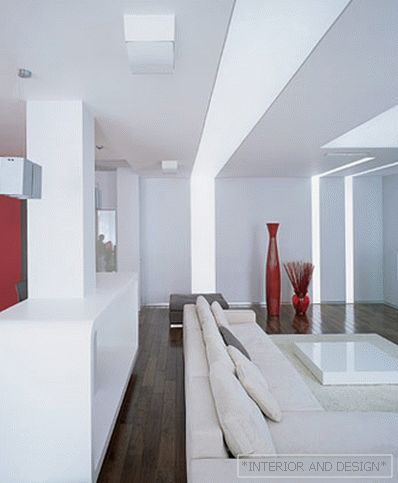
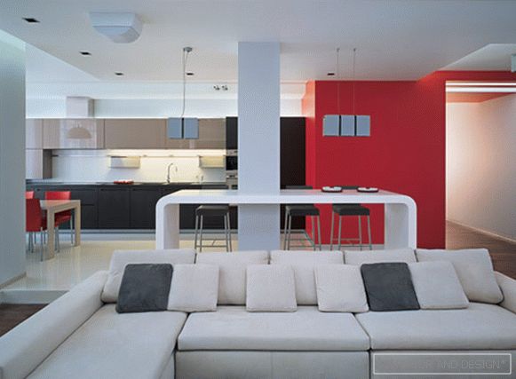
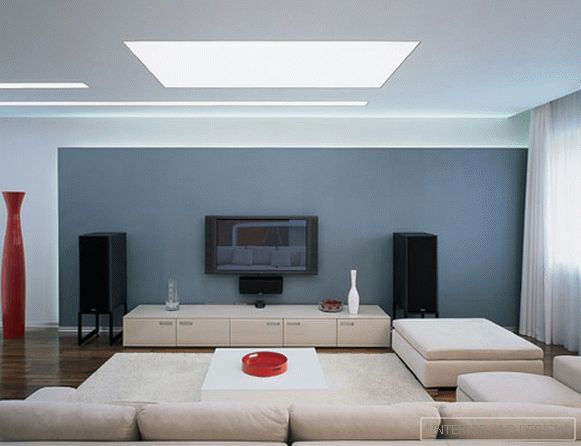
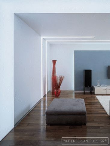
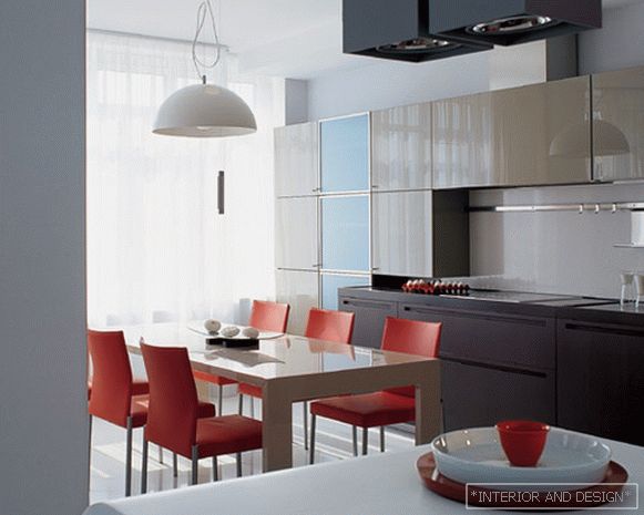
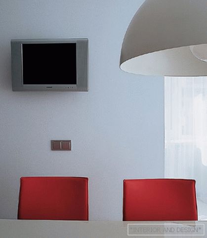
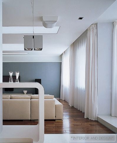
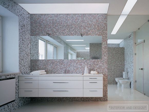
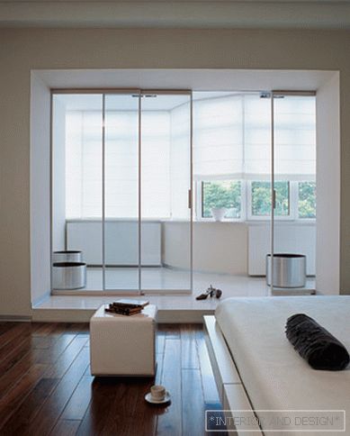
It seems that in the workshop of the Moscow architect Boris Uborevich-Borovsky, disputes have long subsided about what should first of all set the coordinate system for the master's creative work: pure art or the desires of the customer. Boris himself answers this question like this: “There are architects who say: I will do what I will do, and if you don’t like it, leave. And the customer either leaves or bends under the ideology of the architect. And this, in my opinion, is wrong. ” This apartment is an example of responsiveness to the client and the ability to achieve harmony of their own creative intent with the requirements of the project by the customer. “In fact, we didn’t have any difficult task in this apartment,” says one of the authors of the project, Boris Uborevich-Borovsky. - Zoning was clearly traced in it immediately, and the layout itself helped to find functional solutions. In this apartment there lives a family consisting of still young parents and already an adult son. Son, it was decided to settle in a room closer to the exit, so that he could live his life. Therefore, the bathroom, originally planned as a guest, received a different development and became part of the son’s territory. Then everything was simple: we combined the living room, dining room and kitchen into a common space, and made the area for parents completely isolated, having equipped a bedroom, bathroom, dressing room and utility room in it. A certain departure from the traditional for us arsenal of minimalistic techniques was largely due to the influence of the customer. As a regular customer (and we are already making the second apartment with him), the owner influenced our stylistic decisions. He said: "Guys, well, I want something more difficult than your pure minimalism, I want colors." And we went to meet him, decided to experiment with color and made the red wall, and she, in turn, pulled the rest - bright furniture, accessories. The red wall also appeared because, while developing the volume of the living room, we wanted to install a certain turning element, a hinge around which the whole life of the owners would revolve. So we concentrated on this zone attention and “twisted” the space around it. And white and gray in the interior are our traditional colors, because we are primarily architects and work with volumes, and these colors best of all help to designate the shape of the room, to simulate the volume. This apartment was conceived as a kind of SPA for the brain - a refuge from the stylistic chaos of everyday life. A modern and well thought out shelter. Having a fairly high status, the owner of the apartment did not seek to emphasize it in the interior. When he came home, he wanted to be in a space that would relax him. Clear geometry, clear sound, no monograms, instead - hidden accents, soft light, lots of air ... Color spots enliven the calm architectural environment, but remain at the same time in the background without irritating. ” Boris Uborevich-Borovsky:“In this interior we didn’t set the most important task, we just had to make a quiet minimalist apartment. But the customer was afraid of excessive dryness, did not want to get an interior-postulate, a flat-slogan, and inspired us to a rather interesting decision. ”
 Passing the gallery

