Natalya Babievskaya о том, как победить слишком большое пространство и создать безупречный интерьер

 Passing the gallery
 A photo: Zinon Razutdinov, Mikhail Stepanov
Portrait photo: Sergey Morgunov
Interview prepared: Julia Sakharova
Magazine: Decor N9 (153) 2010
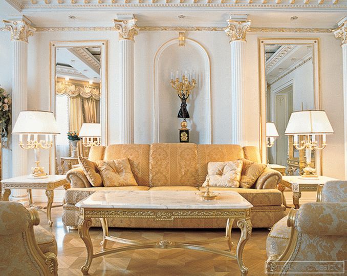
FOR CLASSICS, THE SYMMETRY PRINCIPLE IS IMPORTANT. When I created an empire living room on one of my objects, I built a vertical axis of symmetry: a niche with a sculpture — in the center, to the right and to the left of it — a mirror. A niche with mirrors is a spectacular reception for palace architecture, but I would advise it to be strengthened with the help of a symmetrical arrangement of furniture.
In the middle, put a sofa, to the right and left of it - one hundred faces with table lamps, on the contrary - two chairs. The coffee table is exactly halfway between them. Its center should be located just on the axis of symmetry. In this living room, nothing can be moved one centimeter - the harmony is broken, the very perfection of the picture disappears.
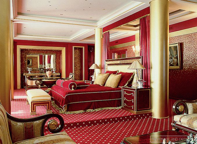
From the deep red color, so characteristic of the Empire, you should not refuse. For example, if the room is too large and it needs to be visually assembled, this can be done with the help of a noble dark red (this is how I designed the bedroom with an area of about 130 square meters). Burgundy walls, the same carpet - and the room felt more comfortable. Other techniques - symmetrical gilded columns, a podium for the bed, caissons on the ceiling and local light - also helped to visually reduce the bedroom.
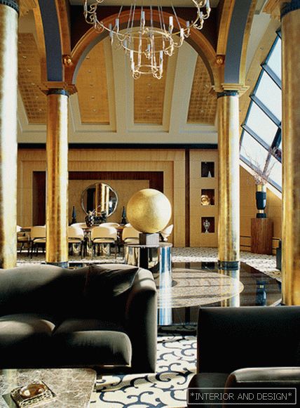
Today in private architecture there really is such a problem - too large spaces. For example, a concrete arch with a height of six meters was laid in one of my objects in the house. Remove it was not possible. And I decided to beat the room, using some of the techniques of ancient Russian temple architecture. The central composition is like in a church: two naves, an apse. “What could have been under the dome?” I wondered. And I decided that the modern sculpture (and at the same time a fountain) in the shape of a ball would be the best place for it. This is the unifying center of the composition. I also used polished surfaces (stone and wood), which reflect the stained glass windows, dark colors and gilding. Reflections work in a paradoxical way: they seem to be designed to expand the space, but in this case they put it together. Dark colors make objects smaller, and gilding helps to highlight accents. ”


