American designer John Hutton gives a decorating lesson
Passing the gallery
A photo: Kirill Ovchinnikov
Interview prepared: Julia Sakharova
Magazine: Decor N11 (89) 2004
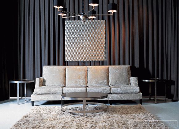
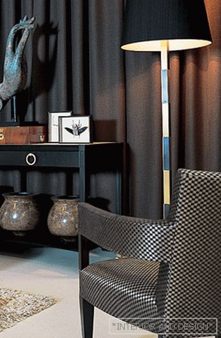
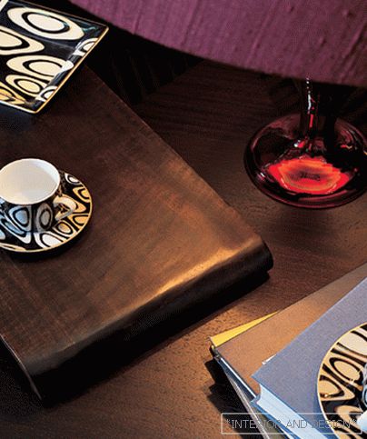
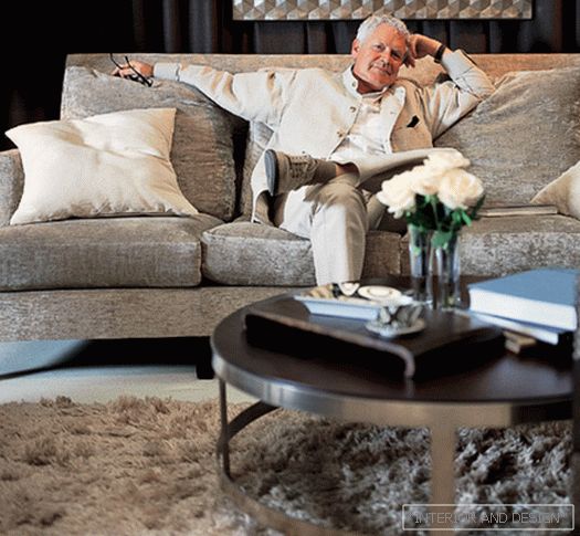
John Hatton is a designer with architectural thinking. He admits that his favorite book is Quatro libri Palladio. The interior of Hatton literally builds: first, it comes up with some kind of interior frame (an analogue of the architectural structure) and then gradually, weightedly builds up the decor elements. The rational method does not contradict the bright emotional result. Especially for the application "Decor" John spent a master class: he invented a beautiful story and immediately, in a matter of hours, brought it to life "Our imaginary client, for whom we are creating the interior of this living room, is a Russian businessman who travels a lot. When he is at home, he wants to feel as comfortable as possible. The color scheme should also contribute to this."1. "I profess a philosophy of psychologically comfortable, and therefore a neutral primary color. I am sure that the color should not dominate, should not be too dense. For at least two reasons. First, the clothes and accessories themselves are some kind of color patches and secondly, people's color preferences can change, sometimes for a very short time. Then they, if the basic tone is completely neutral, can, whenever they want to, have a different emphasis on accents. Therefore, I will now drape the walls of dark cotton mothers th, and this will be the basis of a color. "2. "And again: for my philosophy, it is important to have an antithesis, contrast. Dark walls - let the floor be bright. In America, it is customary to cover tables with white tablecloths and put silver on them. Besides the fact that it creates a festive mood, white fabric and silver work as reflectors so that people's faces look fresher and, ultimately, more beautiful. I have the floor working as such a “reflector.” It will highlight furniture and other interior items with reflected light, and they will look more embossed, more elegant. ”3. "Our businessman needs a comfortable sofa with soft pillows so that you can relax ... For example, such a soft upholstery in fawn color. He has not only a pleasant appearance, but also excellent orthopedic characteristics. (A sofa from the latest collection of the Dutch BENCH factory, designed by John Hutton. - SALON) 4. "Another favorite of my antithesis is a combination of matte and brilliant. I hang over the sofa an abstract picture bought in China. It is covered with leaves of silver leaf. The picture is attached to the ceiling on the lines that are almost invisible. Our hero likes to be in China, he likes things with an unobtrusive oriental flavor. Black chandelier with matte white shades and gold highlights, which I chose for this interior (also by Hatton design. - SALON)is also consistent with the principle of contrast. " 5. "We put round coffee tables: one is bigger - in the center, two smaller - on the sides of the sofa. They are made of mahogany with an interesting, offset from the center, rhythmic pattern on the surface of the table tops and edged with steel. Here, as you see, the principle of contrast is also observed: dark - light and frosted - brilliant. Now we have a sofa, tables, a chandelier and a picture - the structure of space is set (I call it a skeleton). Next we will fill the spatial structure with things. Some of these objects are made according to my design, some of ksessuarov I found in Moscow shops. "6. "The black console that I put on the right against the wall is very convenient, you can store photos, playing cards, wine and other such things in its drawers. The bronze" Buddha Hand "has good proportions suitable for this room. This sculpture is responsible for creating a calm , pacified mood in the room. Put it on the console on top of a stack of books on art. Pair of vases with a finish coating of the type "egg shell" combine the old technology used by masters in ancient China, and the modern form. These vases we put on the bottom shelf to nsoli ". 7. "Next to the console, let there be a floor lamp - a very practical thing: it is convenient to move around the room. One of the chairs is also conceived as a mobile object (which is also indicated by its name - Hatton Occasional Chair). The lamps on the attached tables are on black and gold bases. I it does not seem to say that this is a bachelor's room. Therefore, everything here is rather restrained, almost ascetic. Decor details indicate the owner’s hobbies - traveling and collecting: an antique box made from Karelian birch, a coconut vase edged with silver, a tray in -screw style, art galleries, a collection of exotic whiskered beetles. "8. "Attention, there have been changes in the life of the hero of our story: he has a girl-friend, she works ... in the cosmetic business. The interior simply could not fail to respond! in my opinion, to the situation as a whole.) Cushions, armchair ... We change lamps: instead of black, we put red ones with iridescent Murano glass bases. (In fact, the coat was taken from the store of Mosfilm, once it was used on the set of "War and Peace." - SALON)9. "Our interior story is approaching the finale. Honestly, like any author, starting my 'story', I did not know myself how it would end. But now I understand, this ... In short, this is Sunday morning. Flowers appeared in the room - roses and lilies, books are open, from coffee cups from ROBERTO CAVALLI, it seems, they just drank coffee. Everywhere there is a mess naturally animating everything around. Just now ... our heroes decided to get married. It is very consistent with the happy development of the plot. I personally like this result! "The shooting was carried out at the exhibition "Decor Week of the Mezzanine Magazine" in 2004, with the participation of the company "Expo Park Exhibition Projects" and the group of companies Domus Aurea
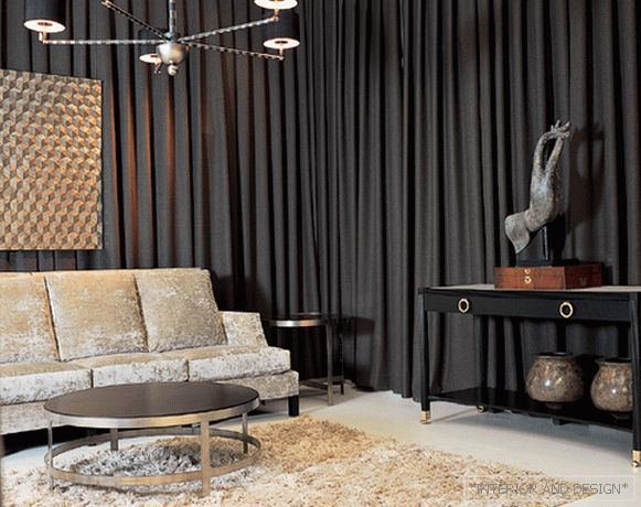
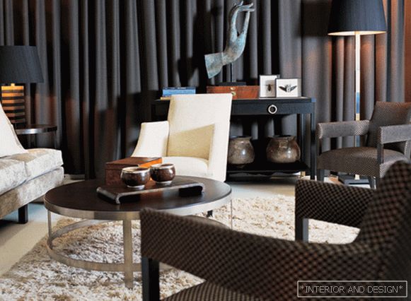
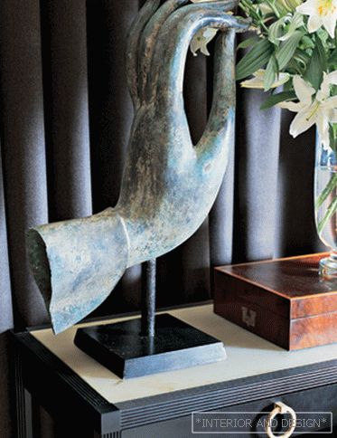
 Passing the gallery
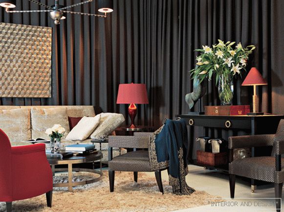
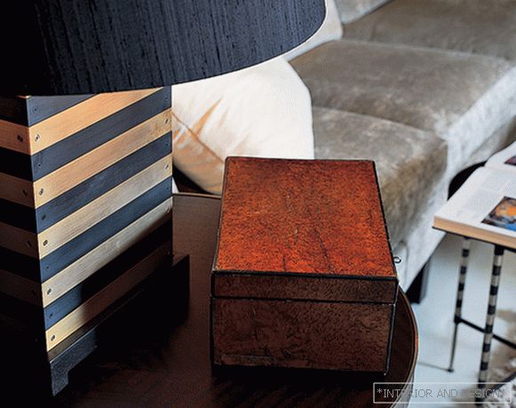

