Designer and gallery owner Oksana Butman advises to borrow colors from nature and from your favorite artists.
Related: The Milan House of Ruben Modigliani and Luca Visconti
“When I started working on the interior of my house, I already had a Cow - an art object by Vladislav Malyshev-Monroe.”
“We purchased the Cow at a charity auction. I knew for sure that she would be in the country house, not in the apartment, and that she would stand on the black and white floor. It can be said that this work became the starting point of the entire project. Then a red sofa appeared - my ex-husband, who dreamed of a bright interior, wanted it. And I thought: what next? I accidentally saw in the magazine a photograph of a cut ripe watermelon on a geometric background, she suggested a solution: I will have a watermelon room! Red sofa - juicy pulp, armchairs in striped green upholstery - watermelon peels, couch in small black squares - bones. I carefully selected the fabric and once again made sure: there is no better artist than nature. She offers win-win combinations.
 Designer and gallery owner Oksana Butman on the background of their work.
 I made the dining room green, in discreet natural shades, close to the nature outside Moscow. In this room, huge windows look at the forest - I wanted to combine the interior with the exterior. The room of the eldest son is sustained in blue tones, blue appears in the guest bathroom: everyone asks what a spectacular tile on the walls, and this is actually wallpaper. In each of the rooms, I added a black color. It is important. Thin black lines of lamps, furniture, frames of mirrors and paintings create the necessary contrast, draw verticals on the walls, structure the surfaces. And also show other colors. From my own experience I know that people are afraid to use rich color in the interior. Think the house will be screaming or too dark. This is not true. We have few sunny days, dominated by depressive, gloomy weather. Color creates vibration, generates energy, gives joy and good mood. He means a lot in our life. ”
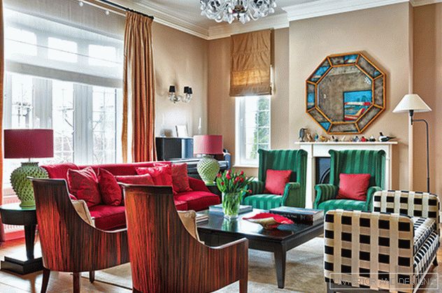 The living room is a “watermelon room”. The Marie’s Corner armchairs in Dedar fabric resemble watermelon rinds, the couch of the same brand in Nobilis fabric has black bones, the Nobilis velvet sofa has juicy flesh. Piano Kawai. Fireplace designer brought from England.
 “Black drawings in the interior are necessary: they create a contrast, structure the architecture”.
The house, built on the Canadian project, Oksana Butman adapted to the Russian reality - corrected the layout. “Before, there was an exit from the garage directly to the living room. It is not comfortable. Having partitioned off part of the guest room, I created a vestibule and a corridor, so now neither exhaust gases nor cold air penetrate the house. I didn’t like the fact that I had to get into the dressing room from the bedroom through the bathroom. If the bathroom is occupied, make it problematic. I swapped the rooms in places.
“The favorite picture will help you to understand what colors you like. I especially advise you to refer to the work of artists for those who have difficulty in selecting colors. Good authors have harmonious colors. Now there is a service: you take a picture, and you arrange it by color. The app is called Plascon Swatch It. ”
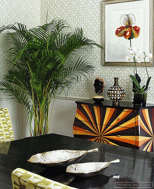 Canteen. Chest Ecco Trading. Reproduction of "Orchid", Trowbridge (ART4INTERIOR gallery).
  Bedroom. Marie's Corner couch in Sanderson fabric, Sanderson curtains and wallpaper, Mis en Demeure floor lamp, Julian Chichester mirror mirror, Bird of Paradise reproduction, Graham and Green table, Trowbridge (ART4INTERIOR gallery).
 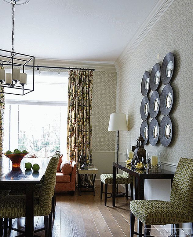 Canteen. Zoffany curtains and wallpaper, Objet Insolite floor lamp, Pottery Barn chandelier.
 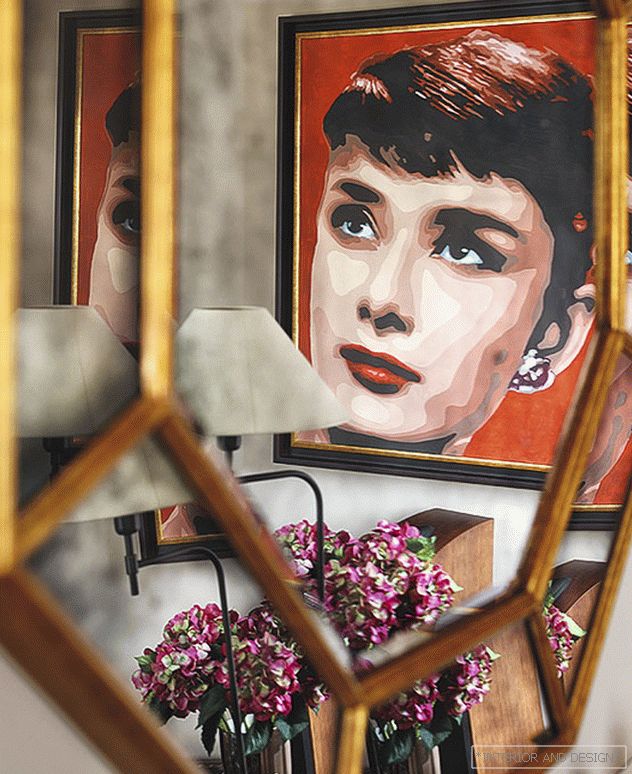 The mirror reflects the work of “Superstar” (Audrey) D. Fedorov.
 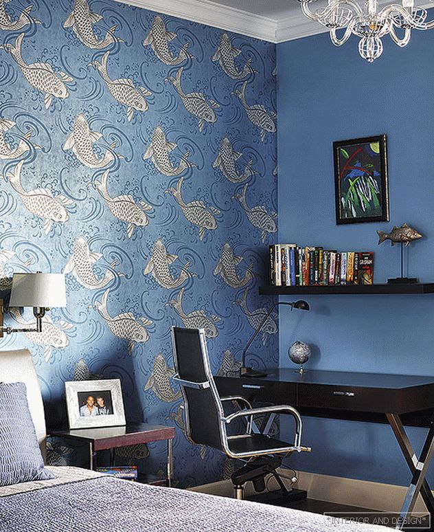 The room of the eldest son is solved in blue tones - he himself chose such a palette. Paint matched with Nina Campbell wallpaper. Ecco Trading table and cabinets. On the wall is a pastel drawing, which the owner of the room made while studying in England.
  Ванная. Обои и ткани Nina Campbell, мебель Villeroy&Boch.
  Guest bathroom. Sandberg wallpaper on the walls. Plumbing Duravit. “I often use wallpapers in bathrooms. If the tile gets bored, it's hard to change, and the wallpaper is easy. ”
 At the stage of a design project, Oksana Butman began to choose works of art for the house. Acquired paintings and expressive reproductions. “I opened the ART4INTERIOR gallery. I present some of our artists and the English company Trowbridge - it offers posters decorated in a magnificent baguette. The advantage of posters is that you can make sets of them, start a horizontal or vertical composition, vary the rhythm. And besides, it is fearlessly used in the bathroom and in the kitchen. ”
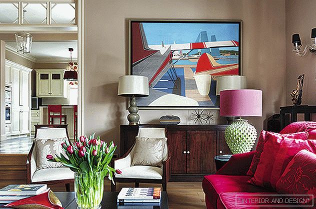 The designer has been looking for a color for the walls for a long time, until she settled on a gray-beige tone. “I bought so many samplers that when their contents were mixed, there was enough paint for a whole garage.” Above the chest of drawers Nina Campbell, a picture by Y. Voronov “Planes on water”.
 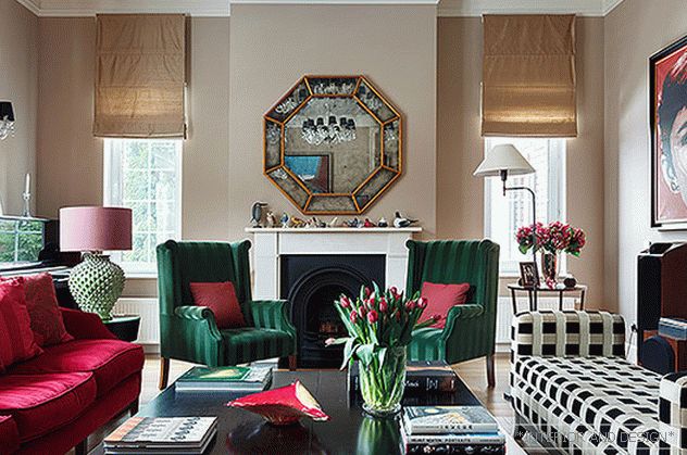 Гостиная — «комната-арбуз». Кресла Marie’s Corner в ткани Dedar, кушетка того же бренда в ткани Nobilis, диван в бархате Nobilis. Пианино Kawai. Люстра Brabin & Fitz. Зеркало Julian Chichester.
 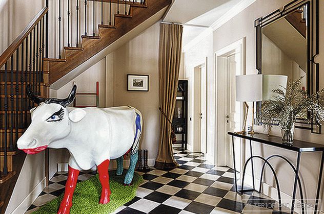 Cow "Pretty Woman" - the work of V. Mamysheva-Monroe is installed in the hallway and sets the ironic mood. Mirror and console Ecco Trading. Porta Romana lamp.
 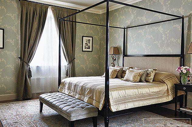 Master bedroom. Bed and bedside tables Leporello, curtains and wallpaper Sanderson. Lamps Mis en Demeure. Reproductions of Japanese watercolors, Trowbridge (ART4INTERIOR gallery).
  Canteen. Lando table and chairs in Zoffany fabric, Marie’s Corner couch in Dedar fabric.
 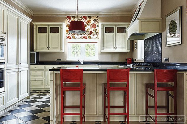 Kitchen. Archeos furniture, Zoffany fabric curtains, Aloe reproduction, Trowbridge (ART4INTERIOR gallery).
  Kitchen. Archeos furniture, Zoffany fabric curtains, Aloe reproduction, Trowbridge (ART4INTERIOR gallery). Table and chair Julian Chichester.

