Nendo Design Bureau has completed the renovation of the Siam Discovery shopping mall in Bangkok. The concept of the shopping center designers formulated as "Research". Instead of mono-brand stores, they offered 13 originally designed shopping areas. Each space in its own way implements a new concept: the buyer is primarily a researcher who is in search of something new - in this way, elements of the laboratory appear in the interiors - instead of the usual podiums and shop windows - giant flasks and test tubes. The décor partially imitates colored smoke and bubbles — the result of chemical experiments. And the fitting rooms with their transparent architecture resemble a cell under a strong microscope magnification.
By topic: MILAN DESIGN WEEK: 50 ctulьiev Oki Sato (Nendo)
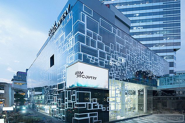 The facade of the updated shopping center Siam Discovery.
 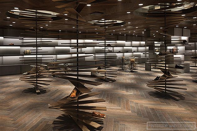 Shopping area with men's shoes.
 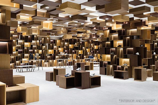 Shopping area with everyday shoes. Both the walls and the ceiling are decorated with drawers, they also serve as podiums.
 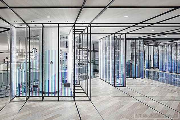 Space with pop-up shops.
 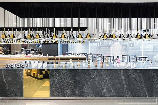 Marble showcase with household goods. Numerous lamps are made in the form of funnels.
 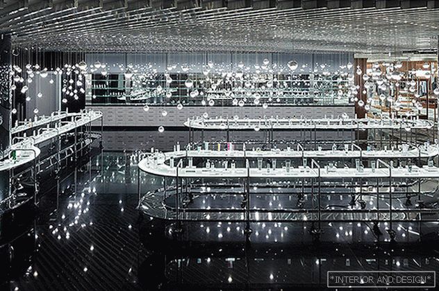 "Bubble" design of the shopping area with cosmetics.
 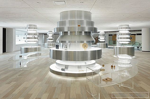 Futuristic design of the shopping area with gadgets.
 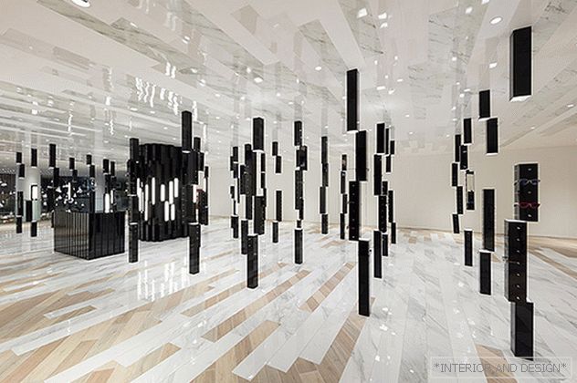 Minimally decorated space in which sunglasses are presented.
 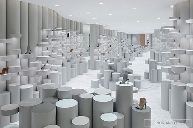 Hall with models of women's shoes. The usual podiums are solved in the form of laboratory flasks and test tubes.
 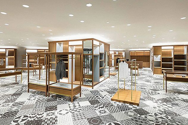 Hall with men's clothing.
 In addition to the internal structure, the changes also affected the facade - it was decided to close it with additional glass, thereby reducing the intensity of sunlight - very important for tourists who are not used to the hot and humid climate of Thailand.
Topic: Nendo and the Shiite in Tokyo
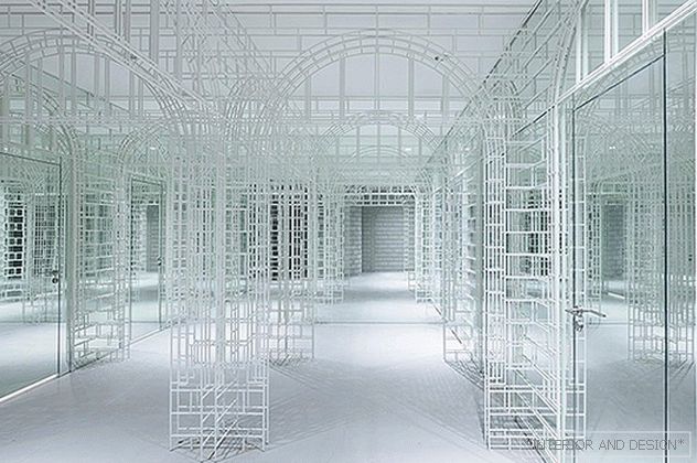 Fitting rooms.
 Initially, the five-story mega-mall had one rather narrow entrance, a lengthy structure and not very convenient location of stores, which significantly affected the number of buyers. Nendo (under the direction of Oki Sato) constructively expanded already existing atriums with retail outlets, transforming the interior into a sort of “canyon” - the scheme is often used in large shopping centers. In addition, in the central part of the complex, a huge video wall consisting of 200 small screens — a visual catalog of all goods presented in Siam Discovery — was installed in all 5 floors of the building. The new symbol of the complex was the white man Discovery Man.
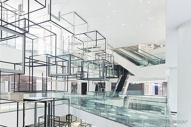 The design of one of the atriums is weightless and translucent constructions.

