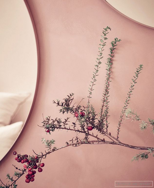
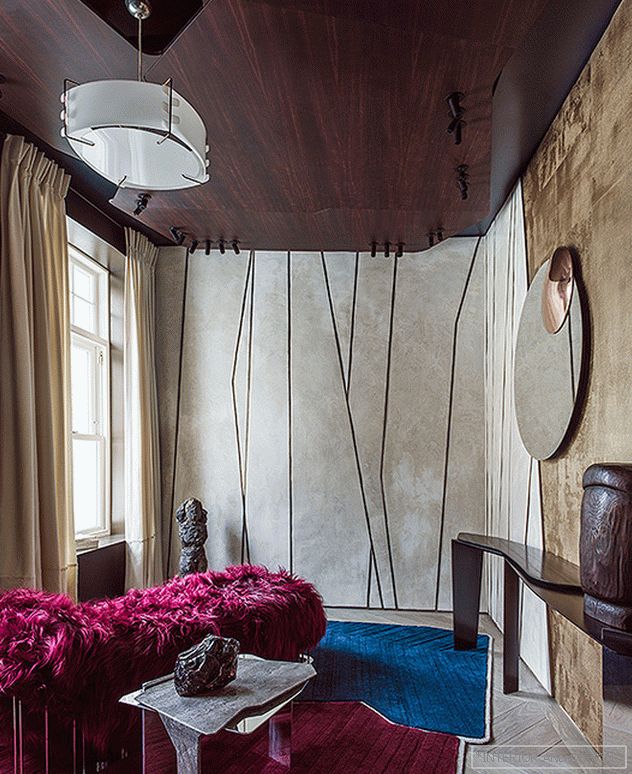
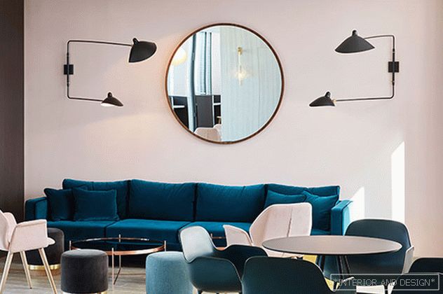
Color - the first thing that forms the image of the interior. The time of pastel sun-bleached tones is replaced by the time of rich palettes and rich colors. Lilac and terracotta is replacing the pink. However, not everyone wants to experience fashion trends in their homes. Fans of timeless interiors choose not a ultraviolet, but a comfortable natural palette. Do recognized pros agree with this?
By topic: Pantone Institute: 10 shades of the future
“How to develop a sense of color? We can rely on our feelings: coffee in a blue cup will seem cold, green will calm us, pink will soften ... and in a scarlet pool it will be extremely difficult for us to swim, reflects Parisian artist, style master, author of educational programs Pascal Gravo, on the power of color.
 Ressource for Maison des Vacances. 2018. 77 shades.
 Some combinations are present in the memory and have a symbolic meaning: red is associated with strength and courage (wealth is expressed through its strong dark shades - burgundy, for example), red-orange is vitality and enthusiasm, orange is friendship. Its low-contrast soft tones create a calm atmosphere.
 Sara Lavian. Коллекция обоев, совместно с Nobilis.
 Shades of yellow and amber seem to us welcoming, in addition to purple - they become full of life and movement. Blue inspires confidence and authority, blue - calm, green - freshness and health. Black claims luxury and power. These are just common foundations - for an architect, they are necessary for the pianist to use familiar scales. They play up to stretch their hands for the sake of free improvisation.
 Jean-Louis deno. Parisian living room.
 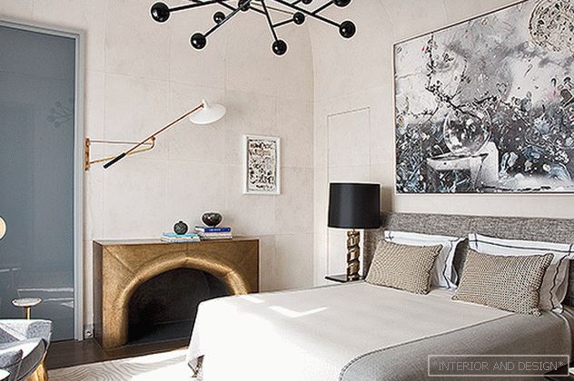 Bedroom In a mirror of rosewood with gold leaf (1970s), lamps of gilded steel of the same decade are reflected. The bronze door linings are made by the workshop of Charles Schmidt - just like the fireplace portal of brass (on the right)
 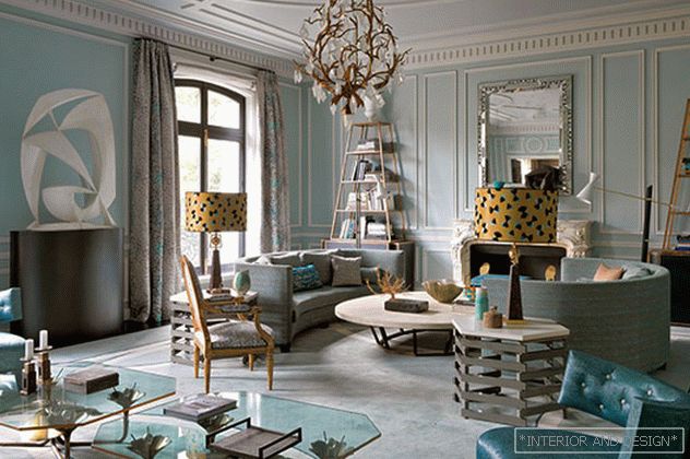 Jean-Louis deno. Parisian living room.
  Living room. Fireplace portal lined with mica - according to the sketches of J.-L. Deno A table with marquetry of straw is made to order Lison de Caunes. The armchairs of the 1950s are rebuilt with Jim Thompson fabric. To the right of the fireplace is the secretary G. Lefebvre for Maison Jansen.
 Jean-Louis Denjo, designer, favorite hero of glossy editions and show decorators: “I experiment with monochrome style, that is, one room - one color. For example, in one of my living rooms you can distinguish 50 shades of green. ”
 Francis Sultana. Fragments of the interior in London.
 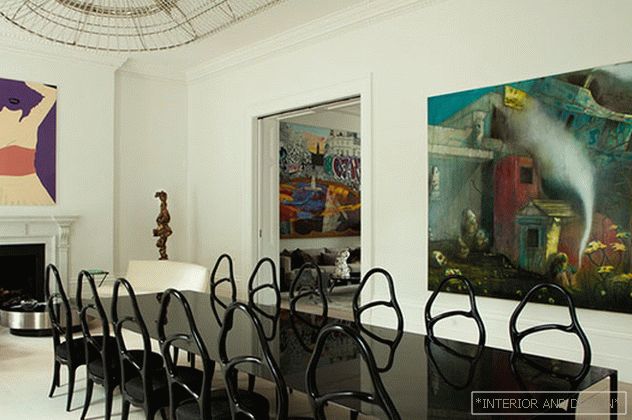 Francis Sultana. Fragments of the interior in London.
 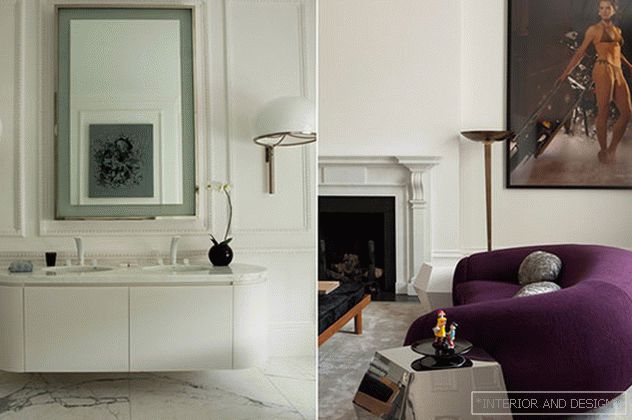 Francis Sultana. Fragments of the interior in London.
 Francis Sultana, millionaires' decorator, director of the famous gallery David Gill: “In 2018, we see an increase in palettes — ocher, yellow sunflower, emerald green, aquamarine and royal blue will come. Textures diversify our sensual experience: first of all, we are in for velvet fever, velvet will be everywhere, I would not be surprised if it appears in the decoration of building facades. ”
 Amy Lo. Фрагмент гостиной.
  Amy Lo. Одну из зон отдыха в обширной гостиной формируют диван В. Кагана, созданный специально для проекта, и его же кресла на поворотном основании, а также кресло с банкеткой, диз. М. Боман. Автор столика из бронзы и агата: С. Синдел.
 Amy Lo, New York master suite: “I prefer to build interiors on the basis of close colors - that is, those that are in the color wheel next to each other. In this way, I create a calm fluid space, reach a peaceful atmosphere. ”
 Bismut & Bismut Architectes: проект An Inner Jorney: интимный, роскошный, но современный будуар.
 Daniel Bismut, Bismut & Bismut Architectes: «В наших проектах много черного, но это не значит, что черный — наш любимый цвет. Читателям ИНТЕРЬЕР+ДИЗАЙН мы советуем обратить внимание на синий: он очень теплый и простой в обращении, различные его оттенки легко соединяются друг с другом. Ну и, конечно, белый — цвет всех цветов. А вот зеленый, на наш взгляд, один из самых сложных цветов для интерьера».
 House Lorenzo Castillo. Next to the couch in Rubelli silk velvet is the design table of L. Castillo. Aluminum lamp - "icon design" Tolomeo, diz. M. de Lucca and J. Fassina, Artemide. On the walls - the work of J.-E. Pizhuana and S. Castillo.
  The bedroom in the house of L. Castillo is decorated with Sanderson wallpaper. Headboard in Rubelli fabric. On the wall - a Spanish portrait of the XVII century. and the work of H.-M. Iturralde, 1970s.
 Lorenzo Castillo, Spanish antiquary and decorator: “Three whales of decor - light, color and proportions. And the color for me, perhaps, is more important than the light. A sustainable palette for a residential interior is one that is built on shades of nature. The colors of stone, clay, sand, various beige and gray tones are pleasant and not tiring. Living in them is comfortable. One of my favorite colors is blue. I use it in different gradations, from very light, whitened, to dark. Since it is rather cold, I add golden yellow to it. ”
Related: In the ocean palette: 45 rooms from designers
 Francois Champsor. Hôtel du Ministère. Paris.
 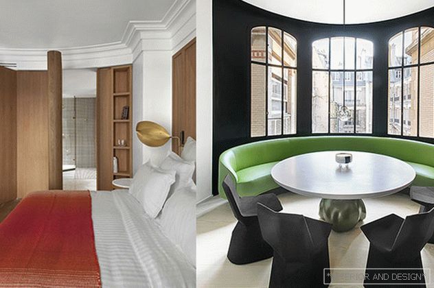 Francois Champsor. Hôtel Vernet and apartment in Paris. Thanks to the minimalist modern decoration, furniture items designed by the designer himself come to the fore.
 Francois Champsor, French designer, timeless style master: “Color is life, exploring its possibilities is a fascinating process and a lot of work. A well-chosen palette can bring harmony to the interior by collecting different-style objects in an ensemble, an unsuccessful one - create a complete imbalance. My advice to you: do not go the beaten path. Try, make mistakes, enjoy! ”
 Sara Lavian. Офис компании l'Oreal в Париже.
  Sara Lavian спроектировала интерьеры Le Roch Hôtel & Spa Paris. Все комнаты построены на сочных цветовых сочетаниях.
  Le Bleu Sarah - fashionable greenish-blue hue, invented by Sarah Lavoine.
 Sara LavianParisian designer with a bright personality. “I love color, I always have a lot of it. My favorites are blue, yellow, pink and, of course, black, because black emphasizes what needs to be revealed and hides what should not be. For me it's a pleasure to work on intense notes, exalt space and play with light and brightness of shades. ”
Related: Beautiful Walls: 5 Professional Tips
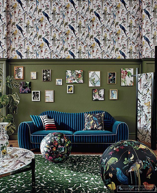 Колл. Natural Stories, Christian Lacroix House.
 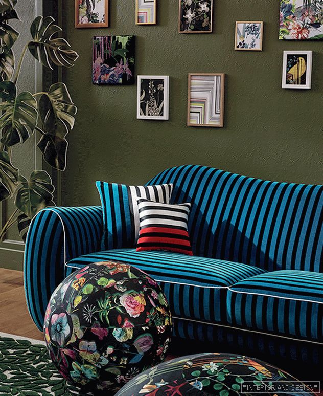 Sasha Valkhof. Колл. Natural Stories, Christian Lacroix House. 2018.
 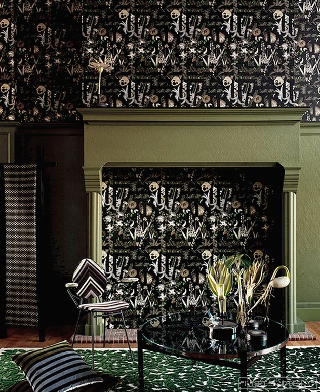 Sasha Valkhof. Колл. Natural Stories, Christian Lacroix House. 2018.
 Sasha Valkhof, designer Christian Lacroix Maison / Designers Guild: “Among the general trends, I will name Bicolor Grafikart. I have always believed that instead of neutral shades it is sometimes better to use a black and white stripe or a graphic black and white design that catches the eye. Our Sol y Sombra pattern in wallpaper, fabrics and even porcelain is a great example. In 2018, especially closely, I will follow the direction of "Arts and Crafts," it seems to me that in the near future it is in this area that interesting discoveries and discoveries await us. "
 Палитра Garden Secretto. 2018. Designers Guild
 Trisha Guild, British decorator, head of the Designers Guild, author of 15 books on decor: “To the one who works on the color palette, I can give simple advice: trust your instincts! And if you like this or that shade and pattern - why not include them in your interior! Is it hard for you to decide on this? Accessories will be a great way to get acquainted with an unusual color and ornament: a pair of pillows, a blanket, a carpet will transform a room. And if they disappoint you, they will be easily replaced. ”
 Brera collection palette. 2018. Designers Guild
  Brera collection palette. 2018. Designers Guild

