Walls - the element to which it is easy to attach their talents. Choose a color, ornament, deepen niches, and maybe trim with wood panels. The options are infinitely many. Here are some of them.
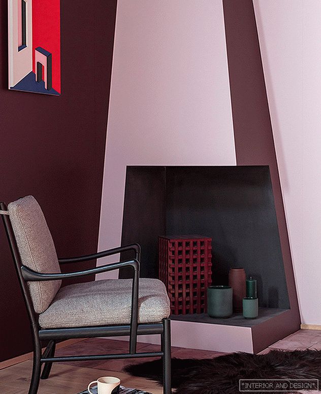 Дизайнер Деспина Кертис для Carl Hansen&Son.
 1. Deep and wide If the apartment initially has a niche (niche) - this is happiness. It must be beaten, stressed and used. Another question: is it worth creating specifically? Go to the costs, hammer walls, build false walls of plasterboard? It is, if it is part of the overall concept, and not a random detail. Niches are well suited for exhibiting: from collection art to fine plastics, glass, and ceramics.
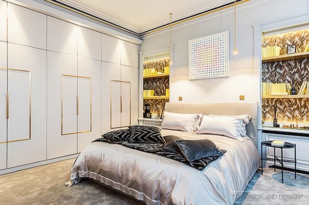 One of the bedrooms designed by Gerard Fevre. The rack is decorated with wallpaper Arte. Works of art: E. Fovo and N. Dass. Bed, diz. T. Agnoli, and the chair Aida, diz. R. Lazzeroni, Poltrona Frau. Velvet bedspread Maison de Vacances.
 2. One color When the furniture is close in color to the walls, the room seems more spacious. And the shape of objects is not so striking. But the contrasting background emphasizes the shape. “Create an interior based on similar shades. You can't go wrong! ”- decorator Tricia Guild teaches us.
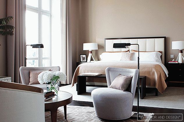 Пентхаус Элизабетес. Рига. Дизайнер Сергей Огурцов. Спальня. На стенах краска Farrow & Ball (оттенок № 6 Londone Stone).
 “Bright colors and sharp contrasts look impressive in pictures in magazines, but they are not suitable for everyday life. I want to live in harmony. What could be more harmonious than white walls! Is it only light gray or light sand - for my taste. If at the same time the doors and the ceiling (and ideally also the floor) are made white, then you will have an incredibly light, calm space. And what's important is not monotonous. ”Carola Baumgarten, decorator.
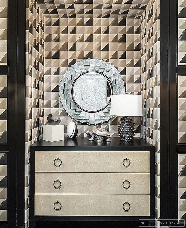 Hall in front of children in a graphic print wallpaper Kelly Wearstler. For wooden parts - doors, platbands, baseboards, floor - black color is used. Project by Olga Malyova.
 Saturated colors are good in rooms, dark "from nature" - where there is no sunlight or it is not enough. Deep shades make them cozier. In black and white ornamental wallpaper is good to put a piece of furniture rich color. Special luck - things with a dark "silhouette" frame. They are colorful and graphic.
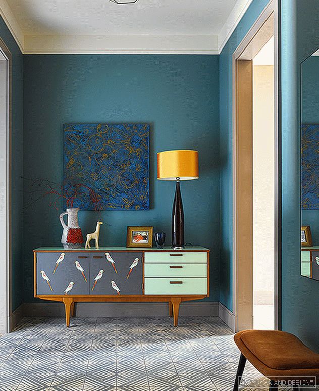 Hall. Chest Lucy Turner. Painting: G. Ananyev. Chandelier Arteriors. On the floor cement tile Pompham design. Lumis lamp. Odesign wallpapers are on the walls: “In wallpaper, color always looks more complicated than in painting,” say the authors of the project Nadya and Givi Ananiev.
 3. Accent wall “Everyone handles color as best he can. The main thing is not to be afraid of him and have fun, ”says designer Karim Rashid. How to make the walls bright? You can paint it, but you can also paste it with wallpaper, they, unlike paint, have texture - they look “warmer”. Modern technique: highlight only one wall and leave the rest white. Or gray. So, by the way, you can adjust the proportions of the room.
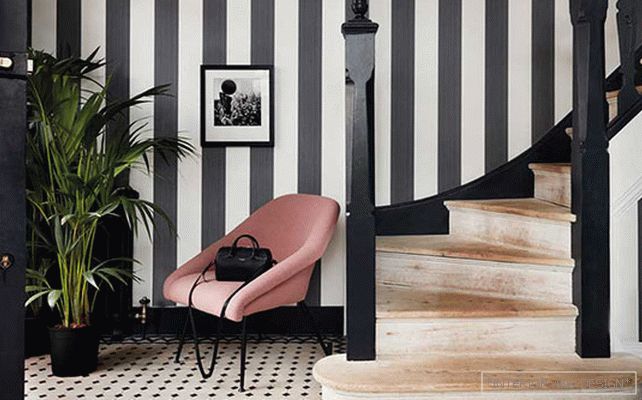 Marquee Stripes Collection, Cole&Son. 2017
 “IS A LARGE ORNAMENT SUITABLE ONLY FOR A BIG ROOM? IT'S A DELUSION. IN A LITTLE HE IS ASKING FOR HIS SCIENTIFIC RELATIONSHIPS AND THUS MAKES ITS MORE. "Designer and decorator Maggie Livien.
“I LIKE WHEN WHEN IN CLEAR OPEN SPACES ARISE BRIGHT SPOTS. FOR EXAMPLE, THREE WALLS ARE WHITE, AND THE FOURTH APPLE-GREEN. OR, SAVE ORANGE. ”Karim Rashid
4. Ornament and rhythm. Active ornament is relevant. But do not give him the whole room. When he goes in a continuous canvas, it tires the eyes, bothers. "Safer" to emphasize one wall or its fragment. The designer and decorator Maggie Livien (Maggie Levien) says about the intricacies of handling large format: “For furniture that is located next to curtains or wallpaper in a large pattern, choose smooth monochromatic fabrics.”
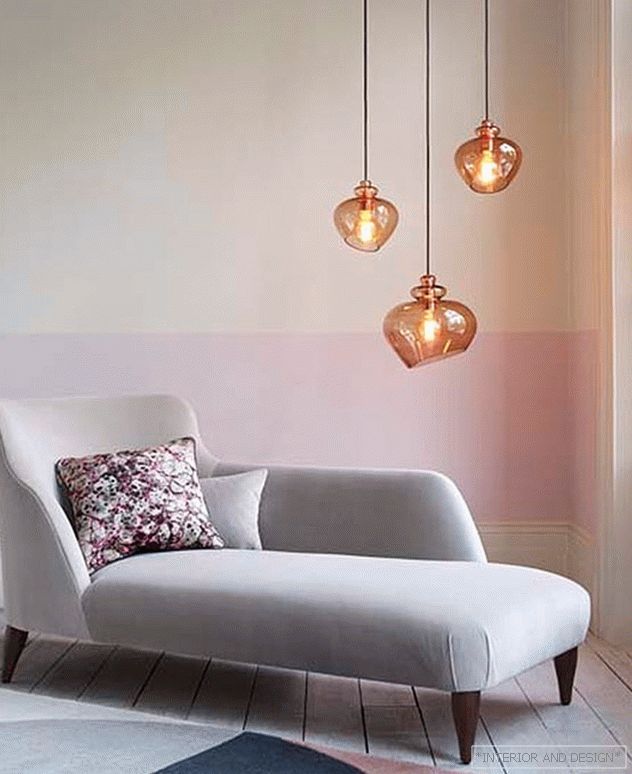 Designer Despina Curtis.
 You can order fabric with the same prints as wallpaper. Only use it moderately and at some distance from the “active” wall. Attention! There is a drawback to wallpaper with a large pattern: to dock images on different panels, you will have to buy extra meters. As well as ornamental wallpaper badly get along with works of art.
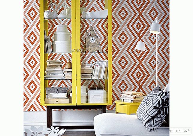 Wallpaper call Grafikiss, Anna Muravina Wallpaper.
 5. The fourth wall: a window. “It is very important how the windows are decorated. There is such a comparison: "Windows - the eyes of the house." Thought is not new. The sequel is more interesting: "Framed with curtains, they begin to shine." The interaction of the fabric with natural light really gives a stunning, every day a different effect. Charm - in dissimilarity. I would not give specific tips on the decor. Listen only to yourself. ” Ralph Anstoetz (Ralph Anstoetz), designer and head of JAB Anstoetz.
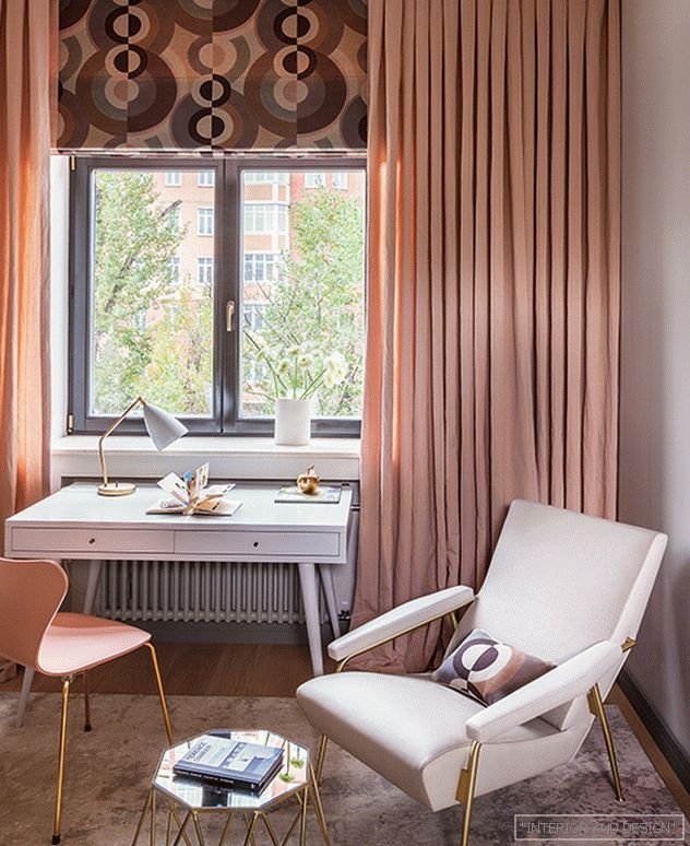 Проект Натальи Масловой. Комната дочери. Письменный стол и светильник выполнены по эскизам дизайнера. Кресло Molteni & C. Портьеры из льна Elitis.
