квартира общей площадью 114 м2 (Москва) Alexander Galkin, Maya Vasilyeva
Passing the gallery
Text: Elena Prytula
A photo: Mikhail Stepanov
Architect: Alexander Galkin, Maya Vasilyeva
Magazine: Na'am (cat) 1999
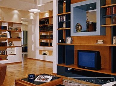
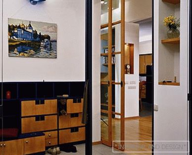
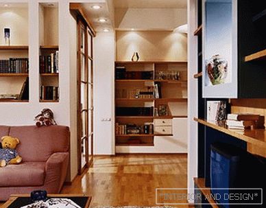
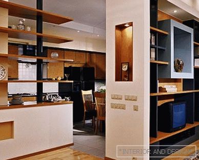
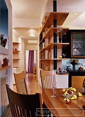
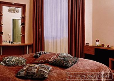
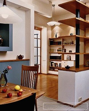
It is not at all necessary that the space of the modern interior twists the visitor like a grain of sand in a whirlpool. Not a dogma and bright colors, forcing the eyes to blink helplessly in an attempt to get used to discord. There are interiors that behave calmly and with dignity, because they know their own worth. And the apartment, which will be discussed, is an excellent confirmation of this. The history of this interior is unusual. The customer, a young man who wished to equip an apartment for his elderly parents in one of the Moscow houses of the beginning of the century, turned to the Moscow architect Alexander Galkin. The curiosity of the situation was that all the work was done not with the future owners, but with a young man. Paying tribute to the flexibility of their taste, I must say that they liked the postmodern interior, and they easily got accustomed to it. Already in the hallway you realize that “rigor” in capable hands does not mean boredom at all. An asymmetrical multi-purpose locker in the hallway is designed "with skill": there is much to throw keys or brushes. The hallway is separated from the main premises of the apartment by transparent sliding doors. The clarity of straight lines makes you focus on the texture of the wood. As a matter of fact, even in the closed state, these doors do not in the least prevent the space from flowing further into the library hall. It is this hall that is the "reference point" in the interior. The availability of space for many books was one of the few wishes of the customer. Therefore, shelves and shelves have become the leitmotif of the entire interior, encircling the walls of the living room, office, and even penetrating the kitchen. So, from the library hall you can go to the left - and find yourself in a private zone, or to the right - into the guest zone. Strictly speaking, guest rooms, comprising a hall with a hallway, a living room and a kitchen-dining room, form a single space. All partitions and doors are more decorative than practical purpose. For example, an unusually spectacular element is a wall for video equipment, indicating the boundary between the living room and the kitchen. The first thought is that this wall ideally performs its function: on the side of the living room there are equipment and books in its niches, and on the kitchen side there are shelves for various jars, lids and other pleasant kitchen trifles. A through window in the thickness of this wall gives the entire guest space an extra "light and air". The almost complete "permeability" of the entire guest space gives a feeling of amazing calm and freedom. This interior, as conceived by the author of the project, is close to Scandinavian design. And it's not just the soft, "natural" colors. It is more about the very approach to things - the desire to make them such to use them for decades. The ceiling deserves special attention. Made of plasterboard, it has several levels denoting different areas of the interior. Moreover, each level difference is underlined by halogen lamps. All the colors of the interior - and guest, and private areas - in harmony with each other. This is important because almost all the rooms are viewed through the library hall, making up a kind of spatial-color collages. Probably, in this ability to create harmony lies true skill. And people gradually get used to the house, fill it with things and memories, which means life itself ...
 Passing the gallery

