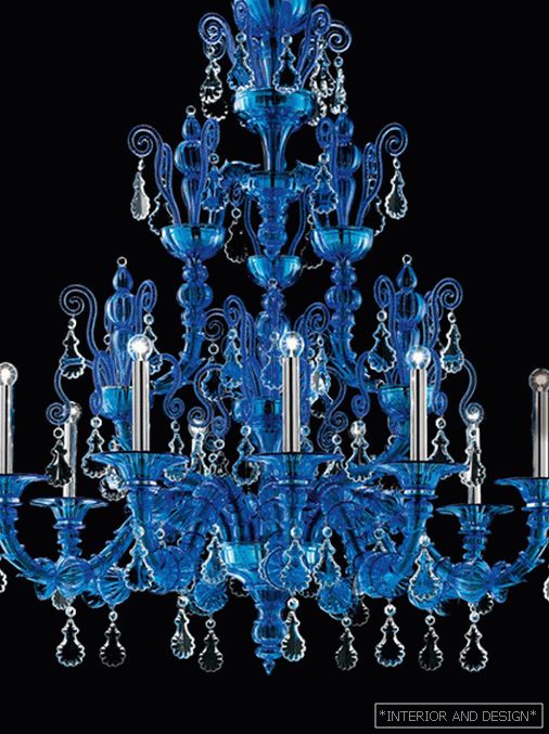
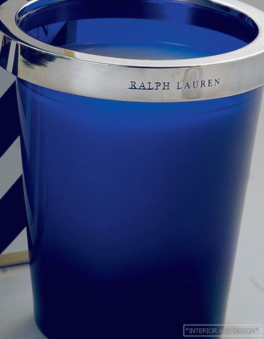
Ultramarine color

 Passing the gallery
 Leading headings: Marina Volkova
Magazine: N4 (170) 2012
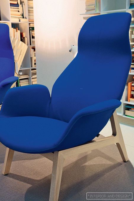
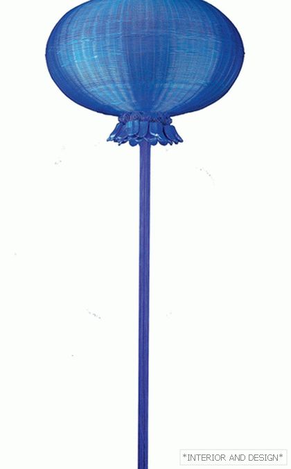
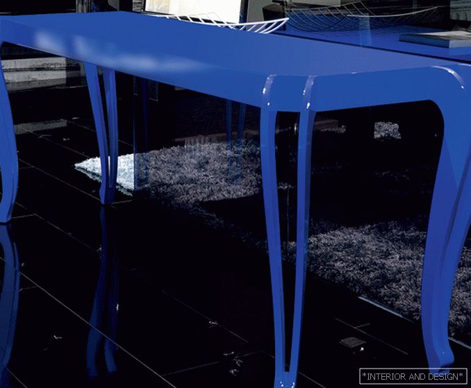
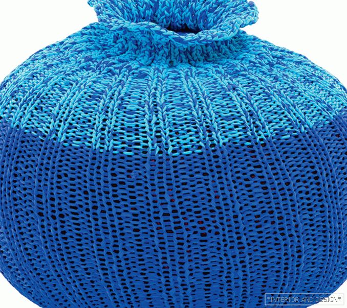
Last year, the design was relevant to the color of turquoise and sky-blue, in this there were new shades of blue - ultramarine and gray-blue (the one that the British call navy blue, by association with the sea abyss and the color of sailors' jackets). Ultramarine in painting is a bright, active paint. Initially, there was only a natural dye, which was extracted from lapis lazuli, a variety of lapis lazuli. The process was long and laborious, and the product was worth its weight in gold. In the XIX century, they invented a method of producing artificial ultramarine (the French chemist Guimet was even awarded for this).
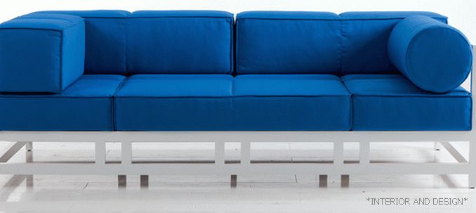
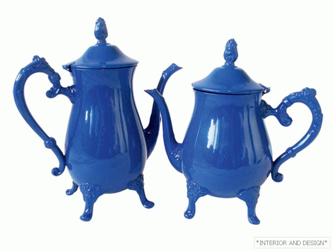
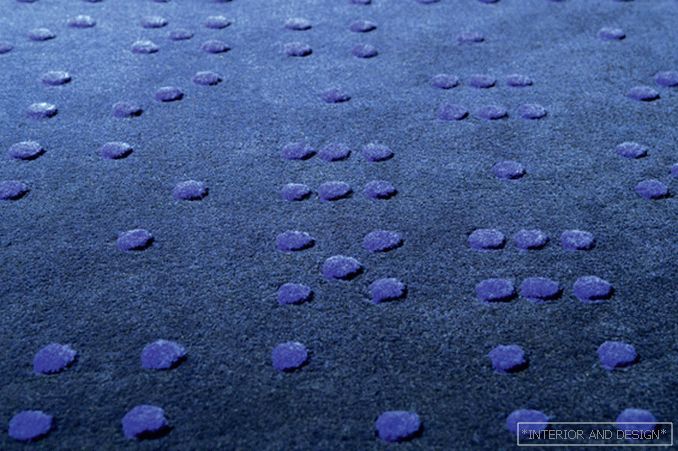
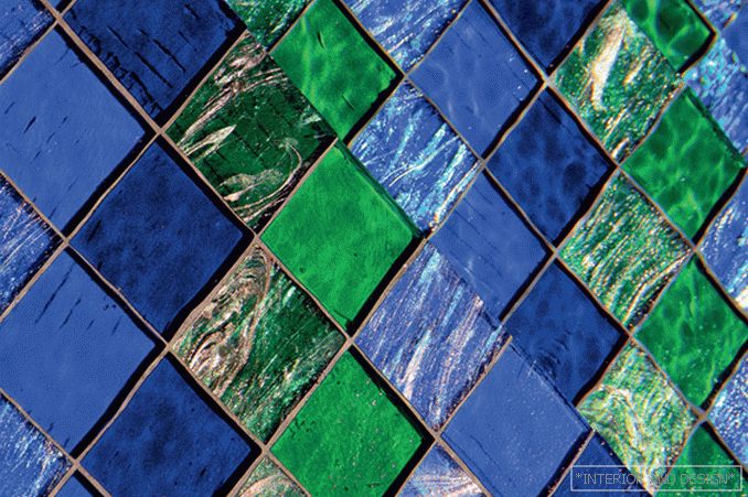
This color was in demand mainly in hot countries - in the Mediterranean and the Maghreb (North Africa - Morocco, Tunisia, etc.). He is fresh, invigorating and playing in the sun. In psychology, he is considered a relaxer, dissipating attention and extinguishing emotions. Which, on the one hand, is good. On the other hand, it can give the opposite effect - to upset and drive into depression. Therefore, decorators advise to combine ultramarine with warm colors and use in rooms saturated with natural light. It is good both for bedrooms (remember about relaxation) and for offices where you need to concentrate and say “no” to emotions. Win-win combination - blue plus white. Also recommend choosing related light shades - pale blue or turquoise. So fashionable interior purchases of the past season do not have to be retired at all: they will easily get along with the decor of the season that has come!


