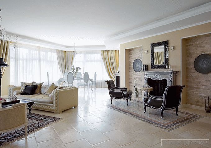
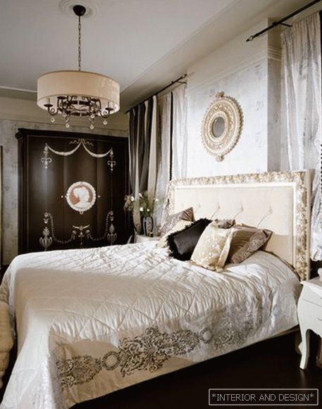
Biscuit, brandy, coffee with milk, cream, chocolate - so the author of the project Julia Orlova describes the color palette of this comfortable classic interior
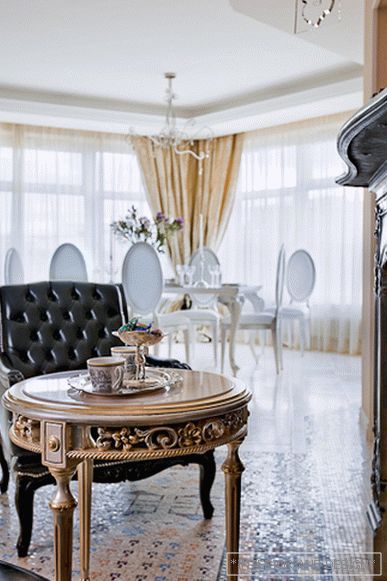
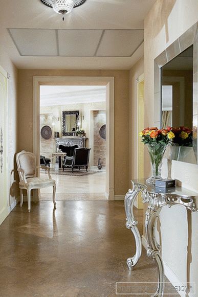
The colors in this interior are supported by equally appetizing textures. This is the living room floor, similar to white chocolate (it is lined with marble tiles with specially treated edges so that the similarity with the chocolate bar is even more convincing). This is the floor of wenge in the bedrooms, which, according to the authors, resembles black chocolate. This is a slightly rough texture of the walls, decorated with a special finish, similar to shortbread (the metaphor is read with a certain amount of imagination and in the context of other "goodies" of this interior). “From the very beginning, customers clearly defined their preferences,” recalls Julia Orlova. “They imagined a classic interior, cozy and elegant at the same time, in a brownish-beige tones, but I suggested expanding the palette with other warm colors, shading them with silver and black (and thus creating a special image for this apartment)” . Customers liked this idea so much that they took an active part in the selection of suitable accessories.
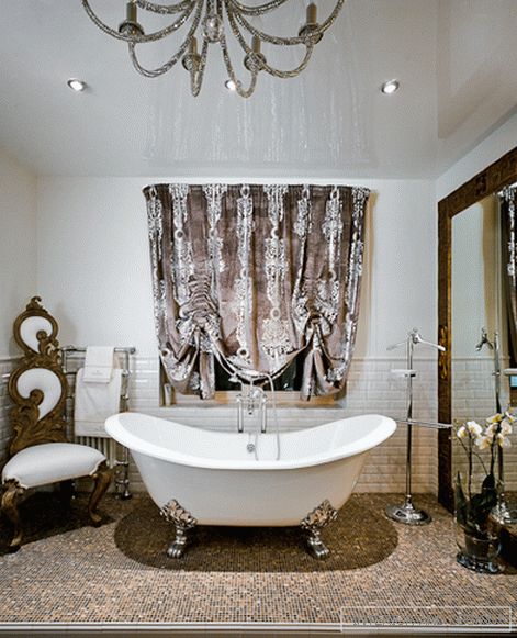
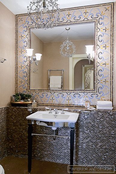
So mirror DEVON&DEVON in the black frame, which at first they wanted to hang in the bathroom, took place above the fireplace in the living room. A fireplace with a portal made of cast iron, topped with a layer of silver, looks like an old Victorianbut it is a modern thing. But silver dishes in niches and oriental jugs are authentic antique items from the owners collection. I must say, in this interior they began to play in a new way: here they are read like things in a conditionally colonial style, gently emphasizing Victorian fireplace theme. And, for example, the ceiling in the bathroom is decorated with a lamp, as if assembled from mirror beads. The hostess found him: she offered to replace them with a more stringent chandelier. “We decided it was even better,” says Yulia, “because this room will not be hindered by additional brilliance and liveliness. And to some extent this is a curtsy to the lamps in the living room, whose pendants with mini-bulbs embedded inside shimmer with all the colors of the rainbow. ”
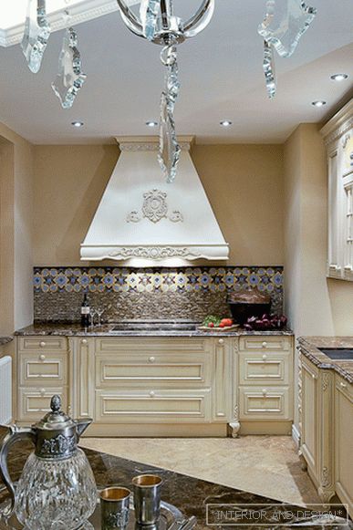
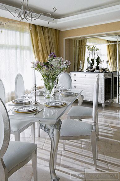
This, by the way, is quite an avant-garde approach to the classical theme. But let's not forget that the classic was not an end in itself here, but only a means to form a comfortable environment for the owners. Here much has been done in spite of. For example, in the kitchen, the usual window was converted into French, from floor to ceiling (contrary to modern - with some curtsy of constructivism - the architecture of the house itself). But, most importantly, the very layout of the apartment is modern, similar to a fan. Here there is an open space in the living-dining room, and a huge, fully glazed bay window in the living room, and modern engineering ... At the same time, the function does not scream about itself, does not call (according to the immortal expression of Le Corbusier “Form follows function”) the form whatever it is to follow yourself ... Because the owners are comfortable in other forms, classical, and they prefer wood and marble to glass and metal.
Julia Orlova: “Classics can be very different. When a customer says “I want a classic interior,” it is not always easy for an architect to figure out what he really wants. In this case, customers from the very beginning imagined an image of the future interior, and I, in fact, developed the general line indicated by them. Many decisions were made by us together. I am happy to work on this project. ”

 Passing the gallery

