Color solution "optimistic" interior: the right shades of red and green
 Passing the gallery
 Text: Julia Sakharova
Magazine: Decor N11 (111) 2006
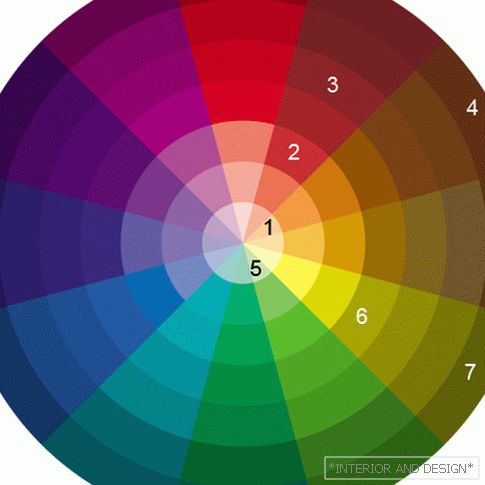
The main color of this interior, dominant and point of reference - red. The architect chose a complex coral shade of red (2). The color is very active, therefore
In the same segment of the color wheel as red lies maroon and lingonberry (3). The architect added objects of this color to the interior to enrich the color gamut. This, for example, a velvet pillow on the couch, upholstered bar stools, curtains in the dining room.
In the next segment there is another color, acting here as a companion of red and burgundy, - brown (4). This is the color of dark polished wood - furniture, parquet. In combination with red and burgundy brown creates a feeling of luxury.
If brown lies on the edge of the color wheel, where the thickest, densest colors are, then the color of the tea rose (1) is located in the very center of the same segment. Objects of this particular color can be very tactful to dilute the alliance of brown, burgundy and red. Tea rose colors furniture upholstery in the living room.
According to the laws of harmony, the best pair for red is green. The architect chose muted, very delicate shades of green - gray-green (5), pistachio (6), marsh (7). Interestingly, as in another group of colors, colors (6) and (7) are in the same segment of the color wheel, and (5) - in the next one.
It should be noted that the selected tones of green are not directly opposite the selected red, that is, they are not exactly those taken, not quite strictly complementary colors. Strictly additional to our red would be emerald green.
However, emerald green paired with coral red would be good if it were presented with few details. Alice, on the contrary, wanted the interior to have a lot of calm green color, so she chose quieter, warmer and slightly “powdered” shades of green from the adjacent segments of the color wheel.
page 2 of 1<< Предыдущая страница


