apartment with a total area of 107 m2 Evgeny Polyantsev, Ekaterina Movchan, Maria Silver Atypical, compositionally complex apartment interior, made in a modern style
Passing the gallery
A photo: Vitaly Nefedov
Text: Vasily Lifanov
Architect: Sergey Makushev, Ekaterina Movchan, Evgeny Polyantsev, Maria Silver, Olga Kirpicheva, Maria Bazyleva
Builder: Alexander Belokopytov
Magazine: H (43) 2000
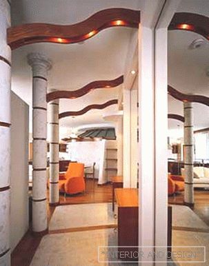
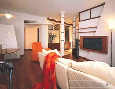
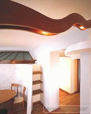
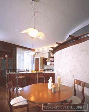
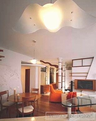
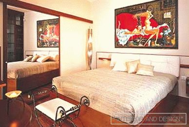
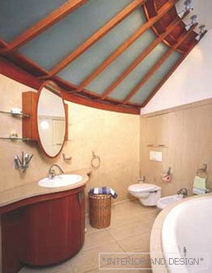
Architects like the life principle of customers very much: to choose "your" professional for an arbitrarily long time and carefully, but having once chosen, to trust him completely, 100 percent As usual, let's start with the original data.Customer family: mother, father, daughter (years 16), son (years 13).Apartment relatively small area (109 m2), with one internal bearing wall, and therefore - the possibility of redevelopment.Wishes: Customers wanted to get an apartment in a modern style, rather atypical, compositionally complex and, at the same time, cozy. At the same time, the interior space looked as spacious as possible, and this requirement was dictated, on the one hand, by the size of the apartment, and on the other, by the fact that there were often guests in the house. There was a special wish: the parents wanted to keep their bedroom as far as possible from the teenage rooms. What was done. Now adults and children are resting on different "coasts" of the apartment. "Equator" - the inner bearing wall - divides the apartment into the "nursery" and "parent-public" halves ... Parents even agree to put up with the fact that their bathroom is not in the bedroom, but at a distance - next to the children's bathroom - so much for them The issue of peace of mind is important.New apartment configuration It was based on the foregoing: an internal corridor connects teenage rooms and bathrooms, and this is one hemisphere; the second "hemisphere" contains a single area of the living room-kitchen-dining-room and an isolated parent bedroom ... Thus, the number of internal walls and partitions in the apartment was reduced to a minimum, and the "air impressions" were significantly increased.On the expansion of sensory perception of space various interior solutions-attractions also work. Among the latter is the entrance hall, which, thanks to the colonnade, seems longer. The tempting effect of a false perspective is created by the fact that stylized columns are not placed parallel to the wall, but diverge or converge. In the very narrow place there are mirrors, which makes it visually wide. A sense of more space than it is in reality is achieved by enlarged interior detailing. For example, the architects interpreted the wall of the bedroom and the wall with the windows into the courtyard as one. So it looks because of a single eaves, a single picture of cabinets, doors, internal windows, uniform proportions of shelves. Another wall is generally turned into a stylized rotunda with a glass ribbed roof and a semicircular wall covered with artfully aged plaster. There is a parental bathroom, more like a separate small room with a boiler hidden in a niche, a washing machine and a mini pantry.The main color of the apartmentits background is white. Maximum neutral and again "spacious". Additional color - cozy woody brown. They traced all the graphics of the interior ... Yes, we can safely say: this interior is graphic. And plastic. Due to the abundance of active and compositionally diverse parts and forms (rotunda, columns, etc.), combinations of straight lines and smooth silhouettes, as well as a dialogue of smooth and deliberately textured surfaces, as if touched by time.Parents bedroom, one can say - a room of one picture, a picture of Viktor Zaslonov. It is in her bright semantic and coloristic accent, which gives a sharp taste to a calm atmosphere. The entire public part of the apartment, along with the parents' bedroom, is solved in the same stylistic and figurative way.Daughter's room, at the insistence of the mother, was supposed to be pink, "girlish." However, the architects managed to implement a compromise. Curtains and pillows on the couch - in a small pink flower, and balances their moderately avant-garde picture of the artist Natalia Vilkovskaya with the image of Tyani-Pushing in the section. The rest of the interior space is rather neutral. Warm tones, minimum items. Cozy, spacious, stylish ... However, the same can be said about the whole apartment.
 Passing the gallery

