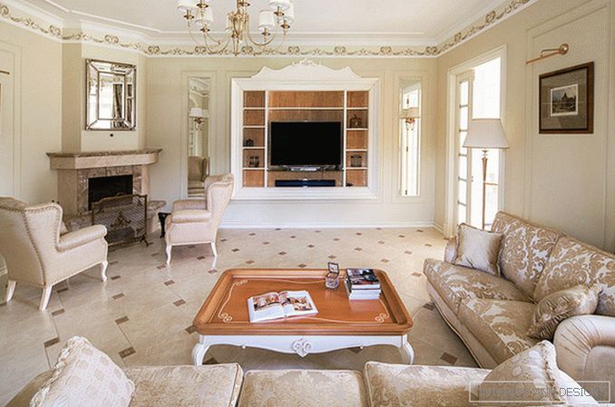
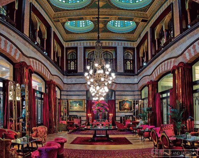
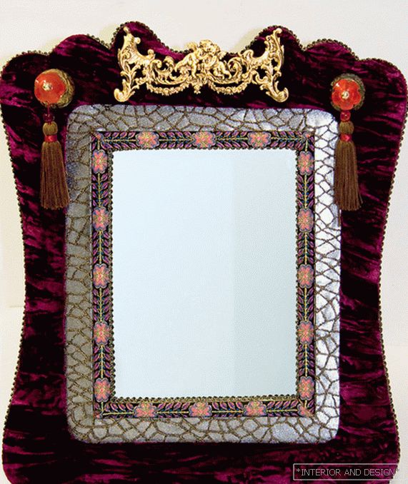
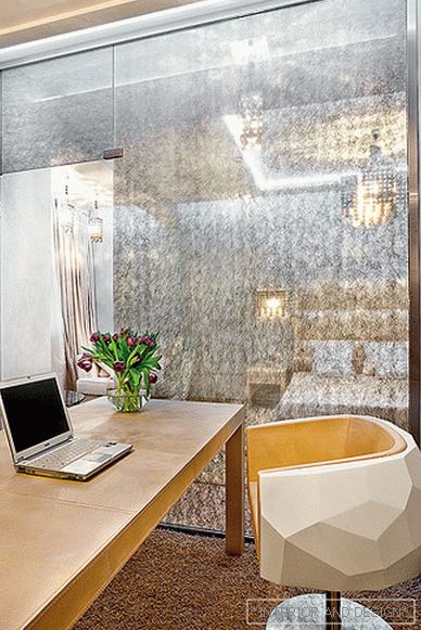
All the serenity of a family holiday is reflected in the interiors of this country house thanks to the calm classical performance and pastel range of the brightest tones.
 Passing the gallery
 Project author: Oksana Elkina
Magazine: de Luxe Classic N1 2014
The history of the creation of this interior began with the desire to transform it with the help of decor and new curtains. However, the invited designer Oksana Yolkina proposed to remake the outdated design of the house. At the same time, the planning solution almost did not change, only the functional purpose of several rooms changed and the terrace was joined, which became a full-fledged room — a spacious dining room. All that remains of the old interior is a skillfully made forged staircase. It used to look like an alien element here, and now it sets the stylistic tone. According to the author's sketches and drawings wall panels, doors, caissons on the ceiling in the hall, built-in wardrobes were made. They are made of solid wood and painted in the color of cream with the effect of light patina. All these details have created a characteristic rhythmic pattern inherent in the modern version of the classical style. The unity of the interior solution can be traced in the active use of wooden painted furniture with the inclusion of parts with a natural honey shade. This is fully represented in the living room — the first designed room, by the example of which the designer demonstrated to the customers the principles of the future interior and all the key decorative themes. For example, the floral ornament of a painted ceiling frieze, repeated in the carved details of furniture, in the upholstery of sofas and armchairs, in curtains on the windows. But the whole impression of the interior would not have been achieved without a careful selection of furniture, light, and then decorative objects, including mirrors and engravings.
It is worth noting that the interiors of all rooms are built not so much on color as on tone accents. Only light transitions of color are allowed: a little brighter — a little warmer, and also a play of textures — from brilliant satin to deaf dull. The exceptions are the dining room with a slight greenish tint of the walls, which echoes the greenery of the garden behind the large windows, the bathroom on the second, private floor, and the children's room for the girl, who chose a picture of roses on the pistachio background as the interior decoration. The difficulty of creating a monochrome design lies in the fact that the same shade looks completely different with changing lighting, so in order to find the very basic pastel color in which you can see the slightest shades of gray and green, you had to make a lot of options, samples and painted on the walls.
Read the full text in paper or


