apartment with an area of 124 m2

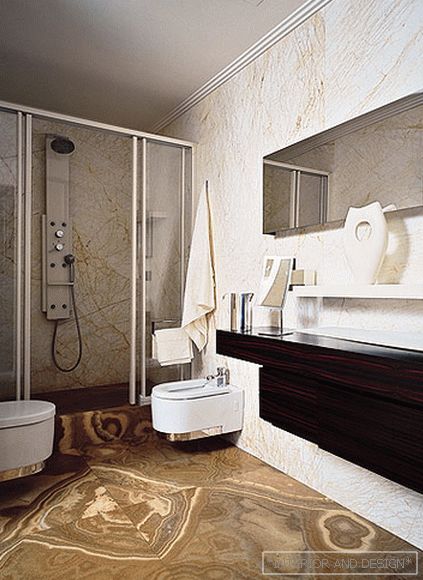
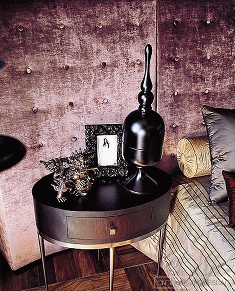
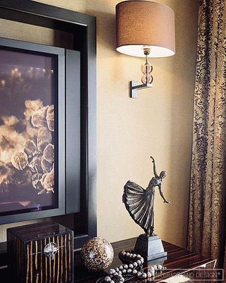
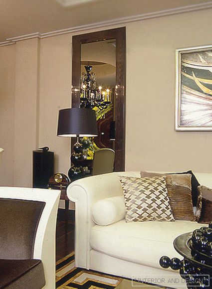
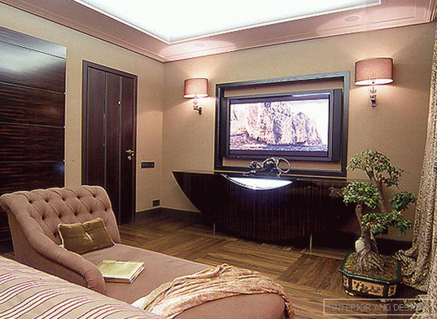 Passing the gallery
 A photo: Evgeny Luchin
Interview prepared: Olga Vologdina
Stylist: Yevhen Shuer
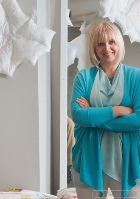
Project author: Irina Malkova
Decorative finish: Natalya Turygina
Magazine: N (120) 2007
Why exactly
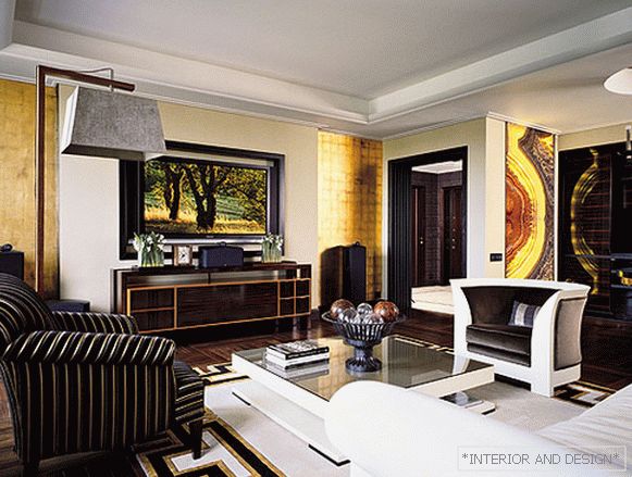
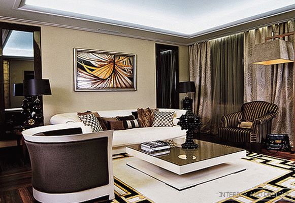
- The first thing the customer said: "I want a round bed, a bar counter and no walls." In the process of discussing the style, I realized that he likes fashionable, modern interiors. On this and stopped. However, when I arrived at the object, it turned out that the apartment is located in a classic mansion. With a garden, with a main entrance, wrought iron bars. It was difficult and even strange for me to imagine that minimalism would appear in this beautiful house overlooking the canal. I believe that the interior should, if possible, harmoniously fit into the architectural environment. However, the purely classical interior of the owners did not fit. People are young, dynamic, often go to clubs, restaurants, and somewhere they even wanted to transfer the club atmosphere to a house. They began to search, studied literature, looked at a bunch of magazines. As a result, we stopped at
SALON:
- Not at all. This is not
S: How is the living space built?
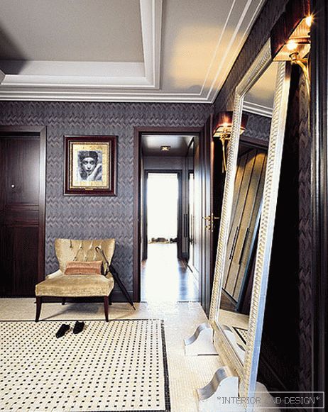
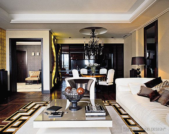
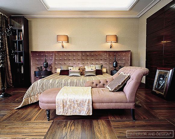
- Since the apartment is small and the hosts often receive guests, it was important to separate the reception area from the private one. Private apartments (bedroom, bathroom, dressing room) are located in the part of the apartment farthest from the entrance. Public areas (living room with dining area and kitchen, guest bathroom), as well as a children's room are located closer to the hallway. The space turned out to be mobile, transforming. Although there are no children in the family yet, we have provided a children's room. As it is located near the living room, the walls are additionally soundproofed. In general, whatever interior I do, always adhere to the classical layout. Here, too, all the lines are aligned along axes. The main axis passes through the center of the apartment, and when you open the doors of the sleeping area corridor, beautiful enfilade prospects open up before you.
S: Tell us more about the decor.
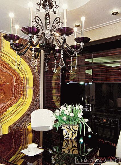
- I really love it to be cozy, to have many beautiful, diverse and pleasant to the touch textures. I also wanted the theme of luxury and wealth not to be read in the forehead, but manifested gradually. For example, in the living room is a table from
This is a family house, but the interior is still masculine in spirit (the spouse took a greater part), there is a lot of black in it, simple shapes, clean lines. Therefore, I left it a little unfinished, so that later the owners could furnish it to their liking.
Project author
Accessories for shooting provided by salons


