apartment in the attic floor (St. Petersburg)
 Passing the gallery
 A photo: Peter Lebedev
Interview prepared: Yana Ivanchenko
Architect: Aleksandra Deeva
Magazine: Decor N9 (109) 2006
Alexandra, is it difficult to create an interior with a historical past behind the facade of a modern house?
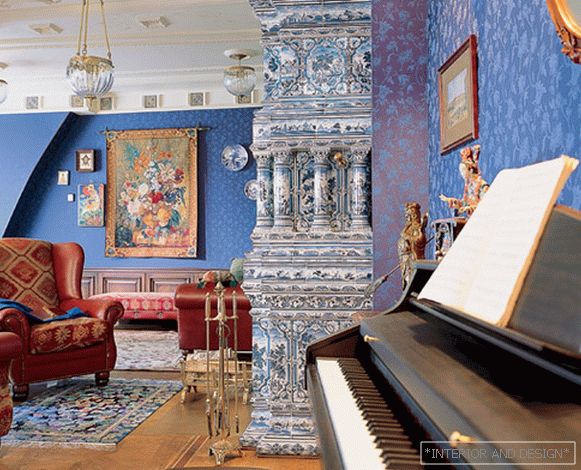
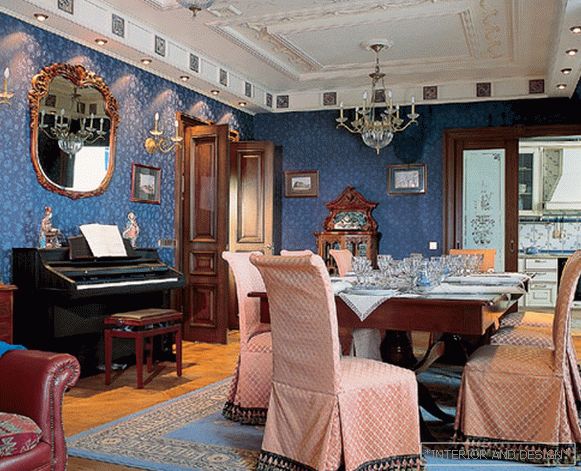
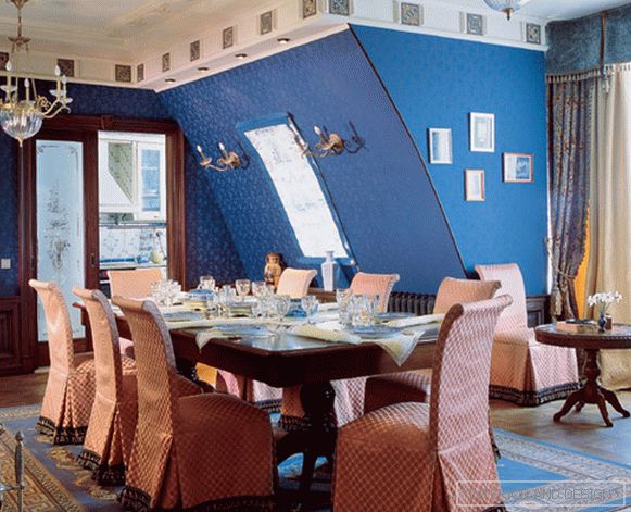
- Yes, there was a certain difficulty. The whole appearance of the house, in the attic of which this apartment is located, does not dispose to the development of the image that resulted in. The rooms here (instead of the usual rectangular rooms) in terms of make up a segment of a circle. But the customer asked me the main direction for the search - to create a comfortable interior in a classic way. Together with the owner of the apartment, we stopped at the Peter's style as the basis. Therefore, it was necessary to somehow enter the strict classical layout in the living room space, which is part of the semicircular gallery of the house. In order to hide this feature and bring the room as close as possible to the classical scheme, I divided the ceiling of the room into sectors of different shapes. In accordance with them, in the living room, due to the arrangement of furniture and furnishings, several thematic zones were formed: a library, a sitting area by the fireplace, a dining area with a large table. So I managed to avoid the feeling of the alienity of the classics in the space of a modern apartment.
S: Do you, as an architect, have the closest classic or do you have other preferences?
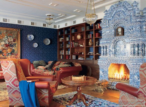
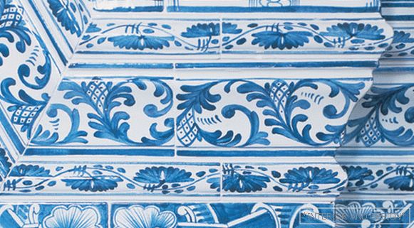
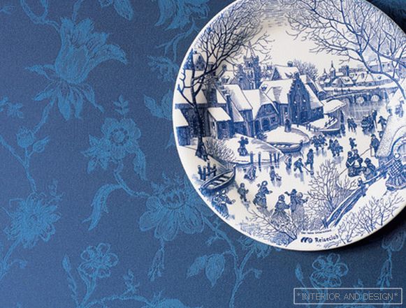
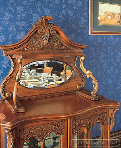
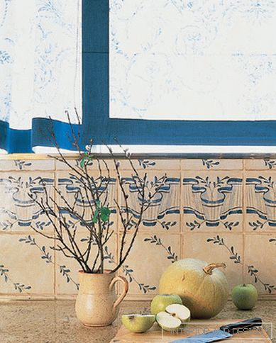
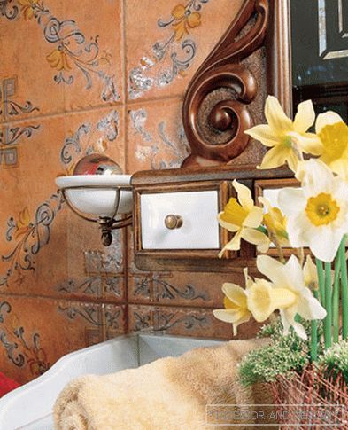
- The style of each private interior is the personal wishes of its customer, the game according to its rules. What is close to him in spirit, I try to reflect in the idea of the room. But I was especially interested in designing this interior, because the theme itself seemed very attractive to me: Peter's style, its development and its prototype — the Dutch interiors of the times of Peter the Great with their expensive fabrics, carpets, Delft ceramics, wooden wall cladding, exposed dishes. My task was to combine together many elements of the decor and decor, so that the ensemble would be truly solid. In addition, there is a lot of manual work. In tonal wooden Italian-made library, our local craftsmen made wall panels and closed cabinets, which became the basis of the library cabinet. A large tapestry panel with a bouquet of flowers in a carved frame placed an emphasis on the wall in the library area. The fireplace got the look of a real tile stove. The same craftsmen, who were engaged in its decoration, made ceramic tiles that decorated the cornice of the living room ceiling around the perimeter. Over time, in the continuation of the theme of a tiled stove, cobalt plates were placed along the walls. The customer himself took an active part in creating the image of his future interior, but fully trusted my taste.
S: The interior makes an impression as if several generations of the same family lived here. Are there many old pieces of furniture?
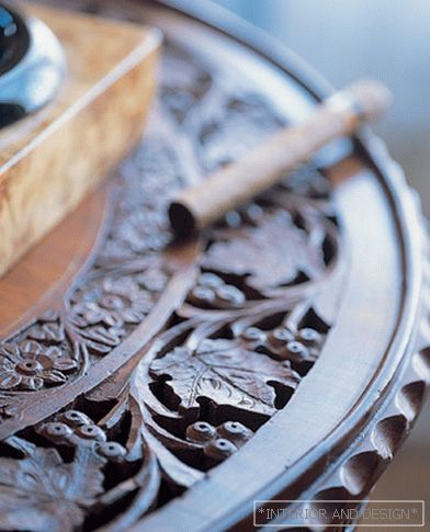
- In fact, this is stylization. The figured console at the entrance to the living room and a carved round table near the fireplace-stove - all these are modern handicraft items, which successfully fit into the interior. Italian chandeliers of rock crystal, covered with gilding on metal, from one collection, but especially in each segment of the ceiling are different. It emphasizes the different zones of space, does not get bored with the eye and allows you to avoid unnecessary pomp. Border spotlights tinted bronze with the effect of aging. Aged stacked parquet on the floor is made according to the drawing of the XIX century. On top of the picture, the owner of the apartment himself picked up the carpets to create a very special spiritual mood here. This apartment has an expressive character, and for this reason, it is not suitable for everyone as a habitat. For example, an esthete, who is very scrupulous in his requirements, will do. He also leads a measured lifestyle. And here you can just relax by the fireplace, spend time at an interesting book, at the piano.
page 1 of 2Следующая страница >>

