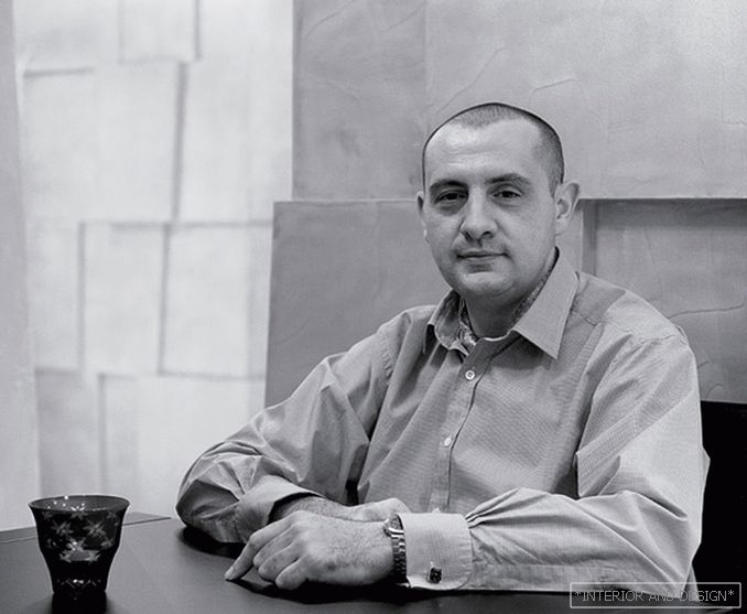
Architect Dmitry Shumidub о буйстве цвета и сдержанности в интерьере
 Passing the gallery
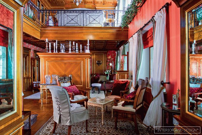
 A photo: Mikhail Stepanov
Interview prepared: Julia Sakharova
Magazine: Decor N8 (174) 2012
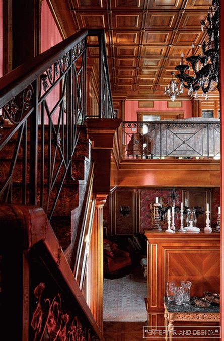
“Hall and lounge should set the mood. Take, for example, the two-light space of the living room and staircase hall (on one of my objects in the Moscow region). Here, warm natural tones - terracotta and natural wood - are responsible for the mood. A caisson ceiling, a boiserie, a staircase with leather railings, a column of wood ... All these DETAILS DISCOVER THE MAIN THEME - the theme of life in nature, away from the city. In private rooms, it is solved differently.
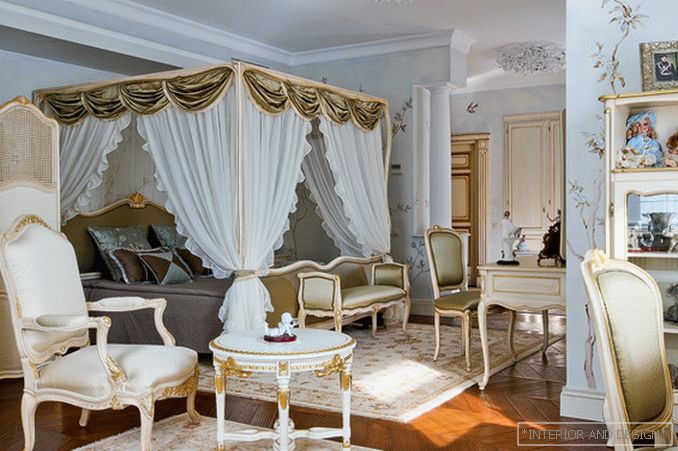
The bedroom of the hostess on the second floor is decorated in calm, white and blue colors. They are perfectly combined with a golden shade of the parquet floor. Incidentally, the English style is not only rich colors - terracotta, dark green, ocher, but also combinations in the spirit of Wedgwood porcelain - blue, greenish, pale turquoise with white.
The owner of this house, a charming woman with delicate taste, collects dolls of the author's work. We decided to place them in the cabinet area of the bedroom in a closet with open shelves. DOLLS - A PRIVATE EXAMPLE. It can be anything - porcelain, silver, hunting trophies, engravings, paintings ... Be sure to find a decent place for your home collection!
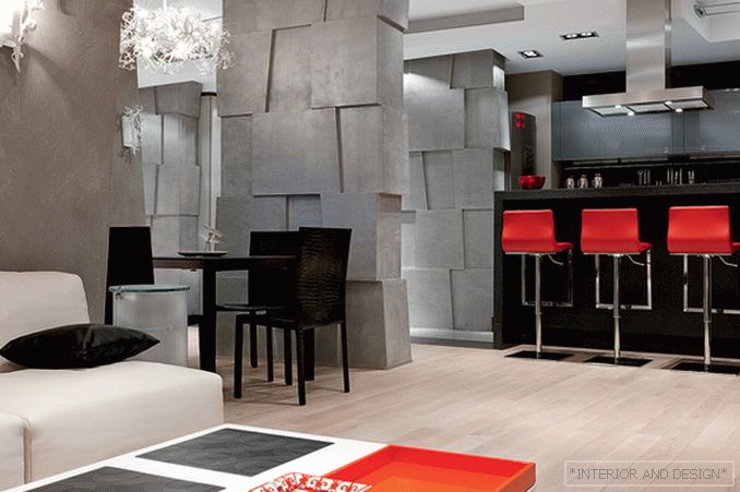
Beware of the idea of arranging a local “color explosion” in the classic interior: it is contraindicated to him. But modern space often needs bright accents. In one Moscow apartment we are with my co-author
Finally - a universal advice for those who love color and diversity: in order not to disturb harmony, IT IS VERY IMPORTANT TO KEEP IN THE HEAD A FINAL INTERIOR PICTURE. Personally, I do. ”
 in moscow: ten years later")

