apartment with a total area of 185 m2

 Passing the gallery
 A photo: Peter Lebedev
Text: Nikolay Fedyanin
Stylist: Irina Teslya
Project author: Vladimir Lukyanov
Magazine: N6 (117) 2007
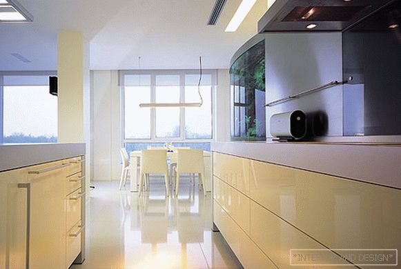
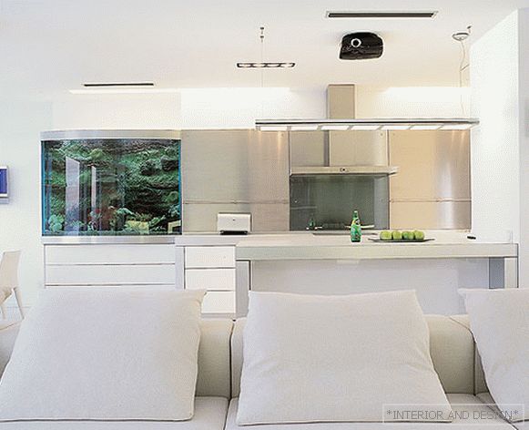
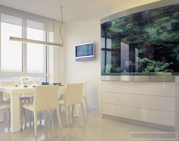
This interior began with a clean slate. More precisely, from open space in which there were only columns. According to the original project along the western wall, on both sides of the living room, there should have been two bedrooms. But it was a pity for the architect to deprive the apartment dwellers of the beautiful view of the Neva and the park across the river. So he decided to turn one of the bedrooms into a dining room and not to build a partition between it and the living room. The author of the project also refused the partition between the living room and the kitchen. As a result, the living room space has become a spacious open space with a beautiful landscape outside the window. "Such a view in the city is worth a lot," explains
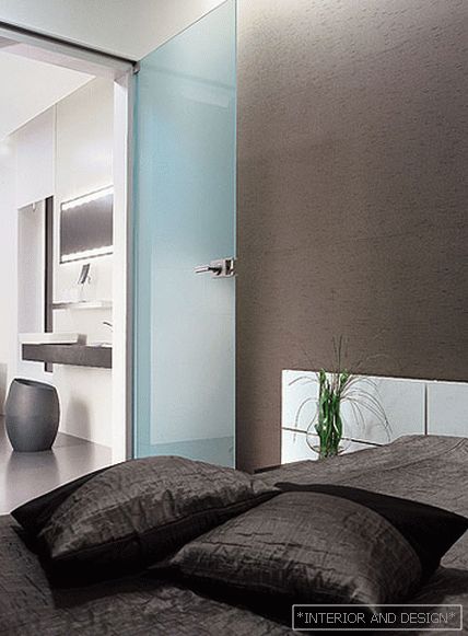
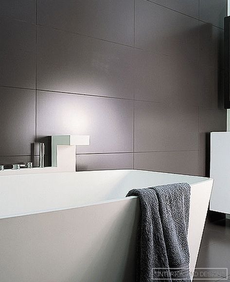
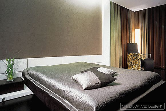
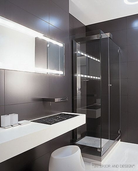
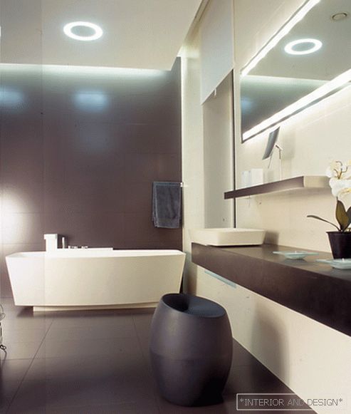
When designing other rooms, the architect also tried to make them more open. Two small rooms adjacent to the living room, he combined into one large bedroom. A bedroom near the entrance of Vladimir, on the contrary, narrowed. To free up the hall space, he moved the wall, behind which is the second bedroom, a little further into the living room. A bathroom near the entrance, which at one angle moved into the space of the bedroom, moved to another place, directly opposite the entrance. And in the hall there was a place for a dressing room. Since there are no partitions between the living room and the hallway, the wardrobe does not clutter the space at all.
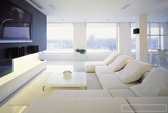
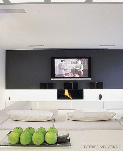
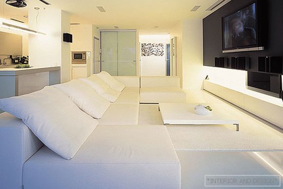
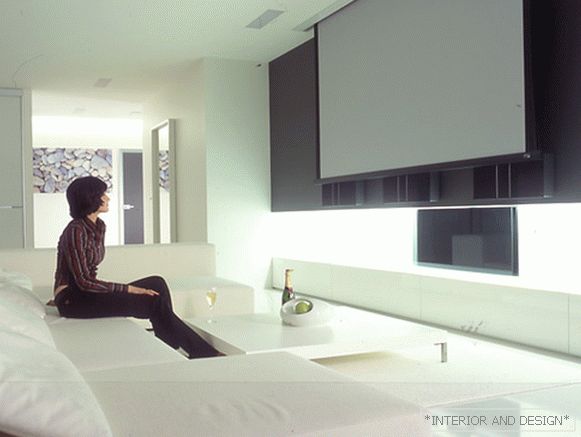
The main element in the interior of the spacious living room has become a wall painted in dark gray. In the niche of this wall is a fireplace. In fact, the architect turned the familiar graphic scheme upside down. We used to perceive the fireplace as a large, tangible volume protruding from the wall. Vladimir, on the contrary, wanted to make it less noticeable and not cubic, but rectangular. The fireplace in this interior seems to be hidden under a wall that hangs over it like a rock. To enhance this visual impression, the architect painted the wall in dark gray. The niche in which the fireplace is located illuminated with a bright light, and under it set low white storage system.
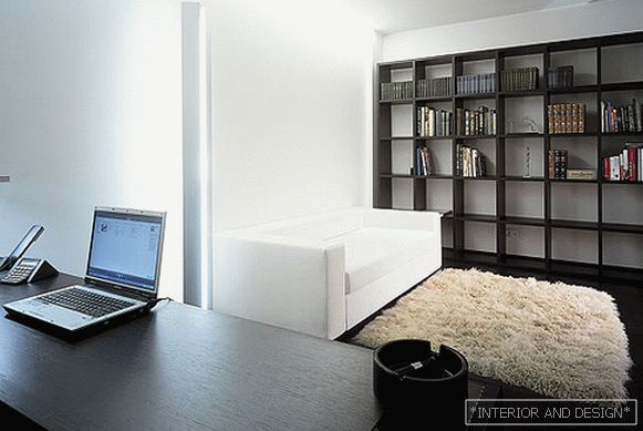
In short, the interior turned out to be in the spirit of pure, strict purism: simple shapes, simple volumes, straight lines and a mean, ascetic color scheme. In such an interior, the objects created by the classics of minimalism fit perfectly - a large sofa Extra Wall, which was designed for the factory
Project author


