Moscow apartment with an area of 180 m2

 Passing the gallery
 A photo: Dmitry Livshits
Interview prepared: Yana Ivanchenko
Stylist: Inna Voznyuk
Florist: Sergey Malyuchenko (Botany Flowers Studio)
Project author: Marina Volkova, Yulia Gerasimova
Ventilation, air conditioning: Boris Arabadji
Construction Manager: Oleg Liang
Textile: Olga Pashagina
Painter: Alexander Artamonov
Magazine: (130)
About the apartment where the family lives with two daughters, says the architect
SALON: What do you think is the main advantage of this interior?
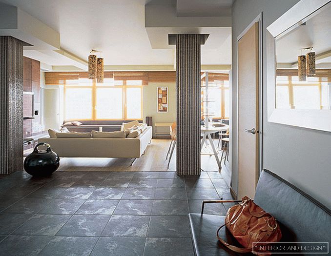
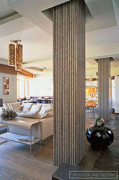
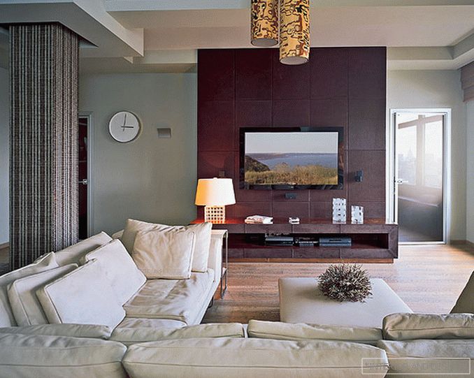
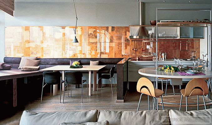
- Of course, the large windows of the living room overlooking the center of Moscow. We even increased them specifically, lowering the height of the window sills (of course, observing all measures to preserve heat). The apartment is in a new building, there were no partitions, only two columns opposite the entrance door and load-bearing walls. We decided to keep this space to the maximum. The free living room includes a seating area with a large white sofa near the TV plasma, a kitchen with an oval bar and a dining area. Unfortunately, in one place the walls of the house form an uncomfortable acute angle, but we managed to turn this lack of planning into a big plus. Instead of window sills, we made soft seats covered with leather and put pillows. In the corner by the window a comfortable triangular bed was obtained - and now it is a favorite place of all family members. Here you can relax, sit with a laptop on the Internet. The bed extension is a custom leather bench. It stands at the same wall as the dining table, which can be placed along the wall and perpendicular to it. Instead of a chandelier tying him to a certain point, we hung a lamp here, which is fixed in the desired position. The author's panel of work by Alexander Artamonov is located along the entire wall from the kitchen to the window itself. It is made of large sheets of copper of different shades, on which images of architectural elements are applied.
S: Did the customer easily accept your ideas, such as transparent bathroom walls?
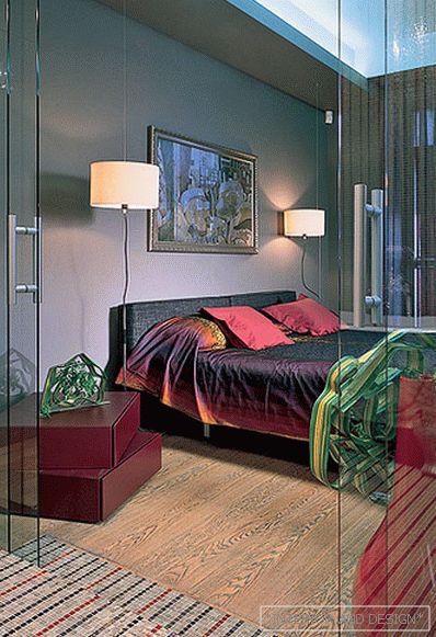
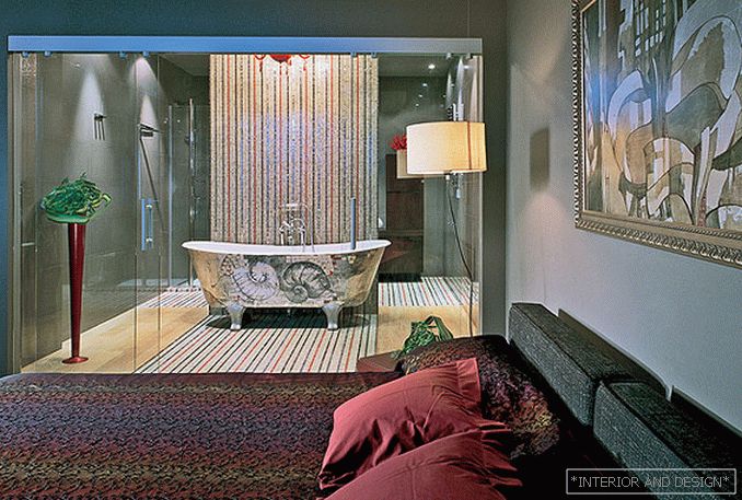
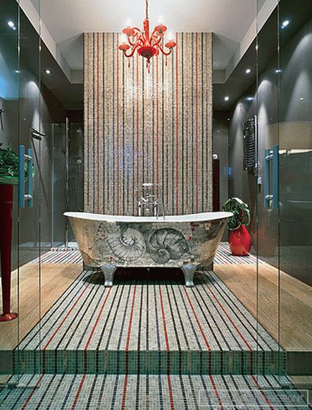
- As soon as we started working on interiors, we realized that he trusts our taste. Although about the configuration and appearance of the bathroom really worried that they would not understand and refuse. But he immediately liked everything. Since the plumbing had to bring communications, the entire bathroom was on the podium. The floor is decorated with the same oak plank as in the bedroom and in the living room, and in the center there is a mosaic panel. The same mosaic is decorated with a wall-screen, behind which there is a san node and a shower in the far corner of the room. The view from the bedroom falls on an unusual bath, standing in the center of the podium in front of the screen. We lacked in this room things in a different style, and the customer just assumed that the bath would be on its feet. By the way, lying in it, you can watch TV through a transparent wall. It is fixed on a special elevator, the angle of inclination of the screen is adjustable from the console. We hung a baroque red chandelier over the bathroom, and our friends later presented the high floor red vase to the customer.
S: How do you see the further development of the apartment interior?
- The owners have already purchased an old piano for the living room, where their daughters will play. I would add a couple of antique dressers to it - one of them asks to be in the pier between the windows. But it seems to me that you should not bring too many distracting details here. The main thing is to preserve the feeling of free space in the interiors.
Customer opinion: "I am pleased that the apartment has a feeling of spaciousness. I really like these large windows with window sills, which are not windowsills at all, but soft seats. I usually relax in my office, but when I come into the living room, I settle down with the children It is convenient that there is a table next to it. When guests come, we arrange it, bring additional chairs and direct the lamp so that it illuminates the entire table. The copper wall panel beautifully reflects the artificial light in the evening. such comp ozitsy of copper, as we have at home, I have not met anywhere else. "

