Architect Tatyana Boronina on how to create something more than just an interior for life
 Passing the gallery
 A photo: Mikhail Stepanov
Interview prepared: Julia Sakharova
Magazine: Decor N3 (169) 2012
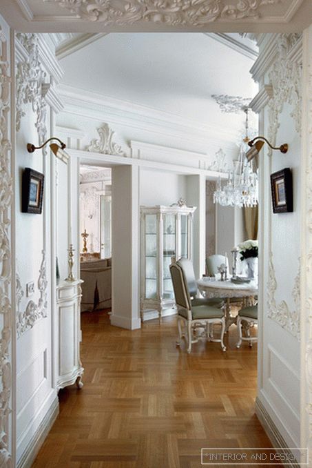
ALWAYS SEARCH TO CREATE SOMETHING ORIGINAL. How, for example, appeared stucco patterns on the walls of the apartment in the "Parisian" style? First, we took the French prototype ornament, we created our own on the basis of it. Then the artist joined, who sculpted these forms and in the process of modeling he contributed something of his own.
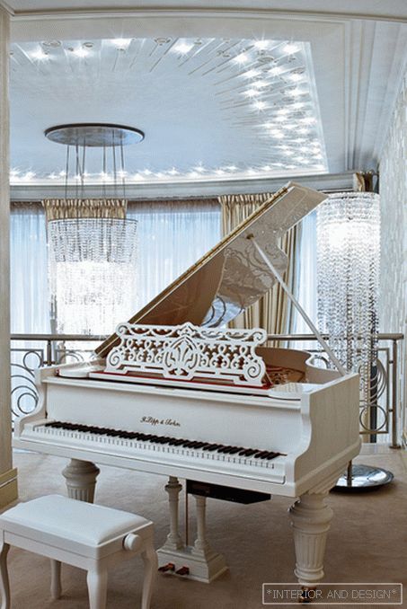
WHAT TO DO TO COLLECT A “VERTICAL” SPACE? Such, for example, as a two-light living room (on the balcony of which is the music room)? You can, for example, with the help of a stucco ceiling and a long, on two floors, crystal chandeliers. A cascade of shining crystal pendants and live music is no longer just an interior, but a music-specific composition.
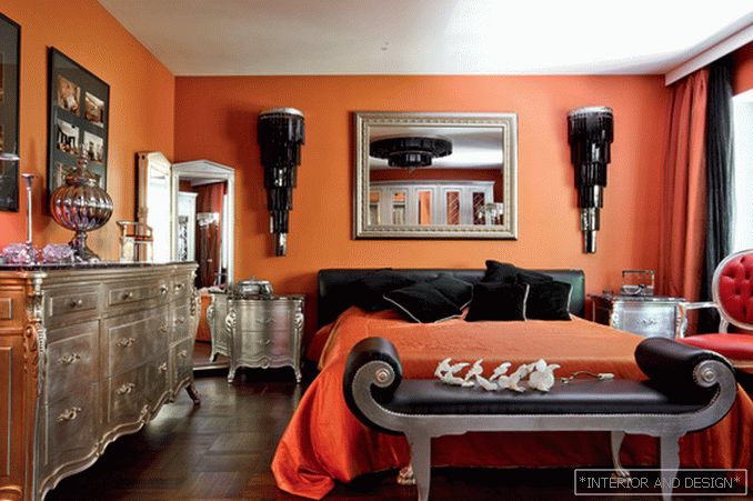
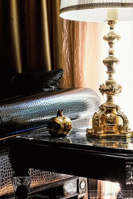
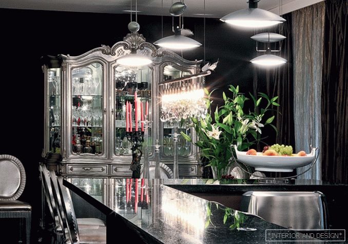
I work with all colors, choosing what is close to the owners. So, for the interior in the suburbs, black and silver were chosen as the main colors. But in order to break this monotony somewhat, we needed some unexpected decision, and in the bedroom we made terracotta-colored walls. With silver furniture and black lamps, they look very elegant. The gold accents in the living room are as unexpected as the terracotta color in the bedroom. So be sure to break the monotony of the interior!
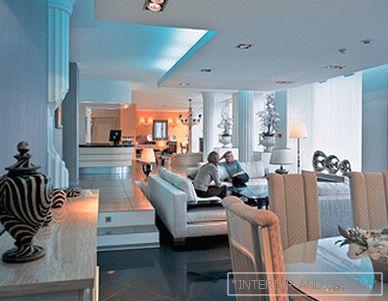
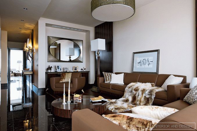
ABSOLUTELY IMPROVED IN THIS SENSE ADMISSION OF CONTRAST. An example is the modern interior, whose palette is almost monochrome (colors vary from beige to dark brown). The concept of this interior is built on the opposition of concise forms and luxurious materials. The floor is made of natural stone, the walls are illuminated panels of ebony. And also - crystal chandeliers, mirrors, fur blanket.
A good interior is always more than an interior. It is not reduced to a function, nor to any other particular. He demands a deep relationship to himself, understanding from the point of view of space, time, associative series. For example, the black and silver interior is associative. He obeys the exterior. There is a forest around the house, so our interior is as dark as a forest oak grove. And silver and gold are like sun glare on trees. ”

