modern two-level apartment (208 m2)
 Passing the gallery
 A photo: Dmitry Livshits
Stylist: Julia Krugovova
Text: Alexey Ustinov
Designer: Irina Sapronova
Project Manager: Vera Gerasimova
Painter: Elena Rezaeva
Magazine: H (109) 2006
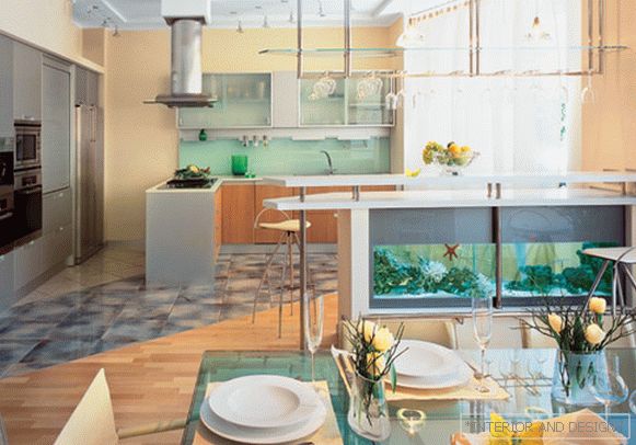
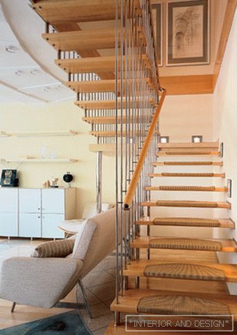
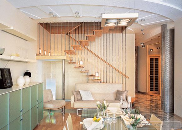
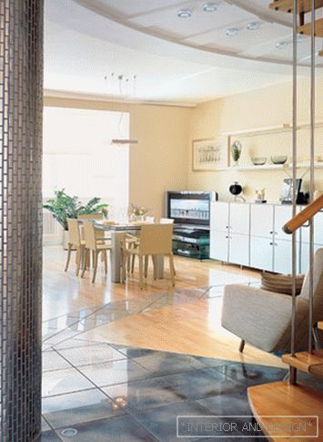
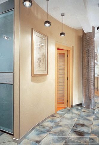
At the heart of the layout of a two-story apartment is the shape of a semicircle. The center is a staircase to the second floor. Around this center, on different radii, are the semicircular walls of the dressing room and corridor. More distant rooms have a standard, rectangular shape. Where the corridor enters the dining room, the lines of the semicircle continue in the floor drawing. This drawing is laid out in various segments of parquet and tile zoning space.
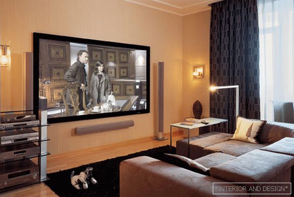
The colors chosen are fairly calm: light beige, light gray. But nevertheless the architect
According to the design studio project
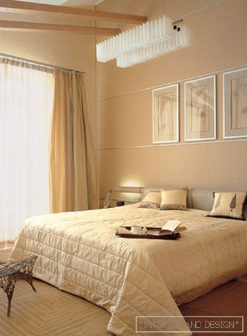
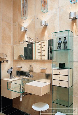
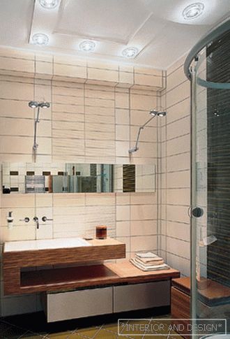
The project as a whole was designed to make guests feel: it is spacious and unusual here. Furniture has the same effect. For example, in the kitchen a lot of glass furniture, which looks very light. All kitchen appliances removed in a special niche. The rooms are only squat storage systems and small open shelves with light. There are no massive cabinets or racks. The curtains in most rooms are multi-layered, but very light and almost transparent. There is a lot of light and not enough furniture - this decision successfully echoes the nature of customers who lead an active lifestyle and follow design trends.
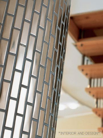
There, where it could be boring to look, added some details. But so that they do not oversaturated the space, but only placed accents. For example, a glass "apron" with lighting in the kitchen, a designer chair in the bedroom or a large frosted glass lamp in the dining room. A kind of highlight among such accents is a large aquarium, mounted in a bar in the kitchen.
According to the architect, no need to pay attention to any one aspect, any single idea, even if it seems to be the most important one. Whole project
Project author


