The color solution of the interior: the colors of the earth with bright accents
 Passing the gallery
 Text: Julia Sakharova
Magazine: Decor N9 (109) 2006
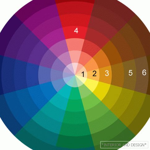
Primary colors - the so-called colors of the earth - shades of brown, ocher. And the shades are lighter, pastel - beige, creamy. If we look at the color wheel, we see that they are located in one segment - from light beige to dark brown.
And 1 - this is the lightest pastel tone. BUT 7 - the darkest. Tone 1 The author used for the living room and dining room walls, as the light tone of the walls in combination with the white ceiling visually increases the space, as if pushing the walls apart. In the bedroom, the tone of the walls is darker 2, because here I wanted to create a feeling of cozy space. This task is supported by the choice of textures: in the living room and dining room - paint, in the bedroom - textured linkrust.
7 - it is the color of the floor and furniture, the natural dark brown color of wenge wood. The combination of such multi-polar tones, like light beige and dark brown, lying within the same segment, looks very elegant. This is the first step to creating the color feeling of a luxurious interior.
The main color antithesis is enriched with shades of ocher - in upholstery of upholstered furniture, carpets, pillows, tablecloths and gold highlights on the baroque table legs 3. So this is the second step.
But this interior would not be itself, if it were not a shock accent - the lampshade is bright red 4. In the same segment with red there is burgundy, and in the living room it is represented by individual details - this is a blanket and a pillow with feathers.
The ratio of all these colors corresponds to the so-called analog circuit, it uses the colors of one or two close segments of the color wheel.
But in this interior there is a hint at the harmony of complementary colors. Recall that for red extra is green, and for ocher it is blue. Green here is represented by the color of indoor plants. He enlivens the overall palette and gives the picture completeness.
page 2 of 1<< Предыдущая страница


