apartment of 230 m2

 Passing the gallery
 A photo: Dmitry Livshits
Interview prepared: Marina Volkova
Architect: Irina Sapronova
Project Manager: Vera Gerasimova
Magazine: (125)
Architect
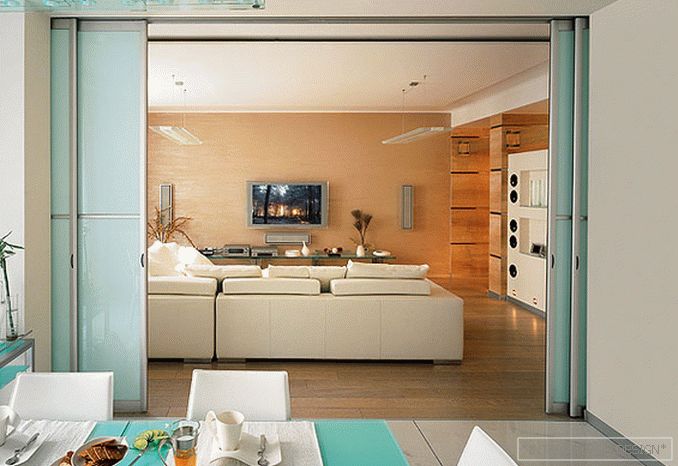
- I confess I was delighted. I would not say that I have specific style preferences, but clean, hard hi-tech sounded fascinating! However, the more we were engaged in the project, the more obvious it became that just a clean style would not work. High-tech, in my opinion, the style is predominantly masculine, tough, brutal, rather cold. It can not be called cozy. Style uniformity can become monotonous and even boring. I have always been more interested in interiors with admixtures, inclusions of elements of different styles. So gradually, the high-tech in this apartment became less and less rigid. Although the main characteristic remained unchanged - geometric, linear interior. And the most modern. It is impossible to imagine customers surrounded by classics. The classics are always magnificent, elegant, with an abundance of details. We sought for brevity.
SALON: What is left of hi-tech as a result, and what is its mitigation?
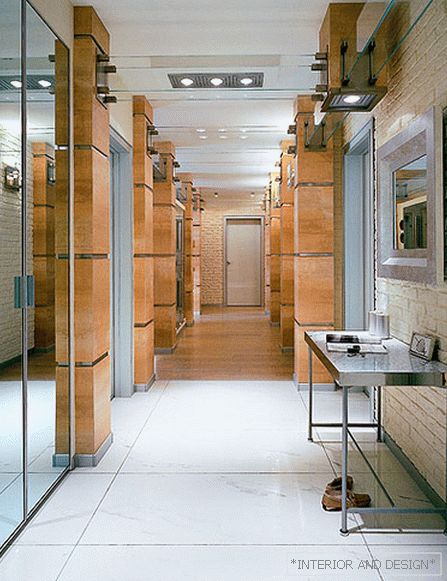
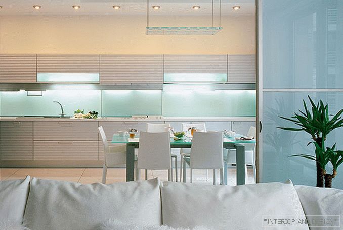
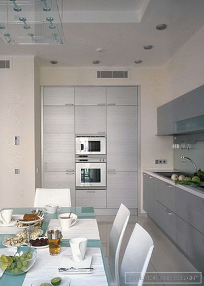
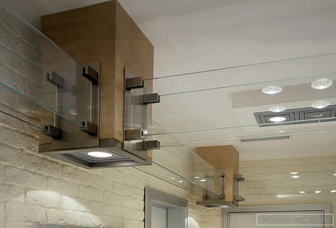
- One of the most stylistically clean spaces is the kitchen. The aluminum surfaces set the tone here, and glass and leather are used for them in pandan. Initially, a purely high-tekov corridor with white porcelain stoneware floors, columns — columns of chopped forms, taken with tiles, the surface of which imitates rust, and stainless steel in large quantities were assumed. But this option seemed too hard and dark. So the corridor became brighter, more mirror surfaces appeared here, which also work to visually increase the space, the rust effect disappeared, and steel structures, I-beams, which were supposed to be under the ceiling, were replaced with bleached glass.
S: The softest room in an apartment is probably a bedroom?
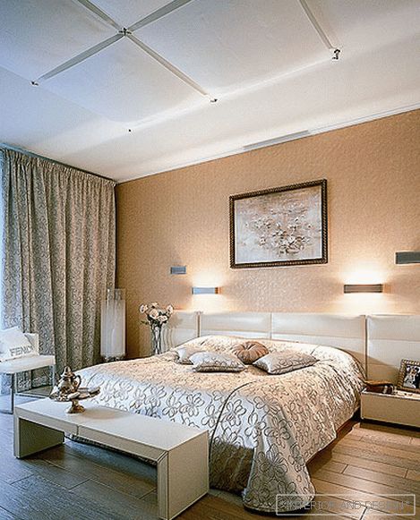
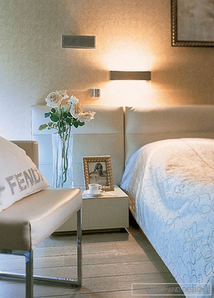
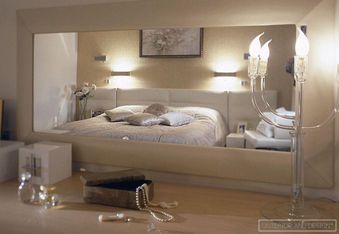
- Indeed, the bedroom was very romantic. In principle, this is a room, which generally should be as calm as possible, adjust for relaxation and rest. Here, this feeling is created by a cozy, calm color (baked milk and shades of pink). Although the shape of the head of the bed is clear, linear, but at the same time it is upholstered in leather - it turns out something like soft pads. Here we even had an element of glamor, because for the bedroom, in my opinion, this is not at all superfluous. Glamor turned all textiles. In particular, the curtains and bedspread are embroidered with lenses.
S: But the office, on the contrary, as bright as possible?
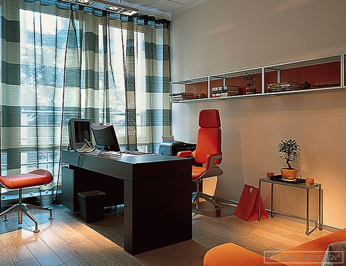
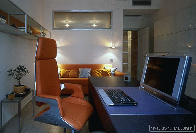
- Yes, and in the working area it is justified. Bright colors, in this case it is primarily orange, do not distract from work, on the contrary, stimulate, give energy. Colors affect people of different age groups in different ways. So, orange is considered the most useful for an adult, it improves mood and is responsible for vigor.
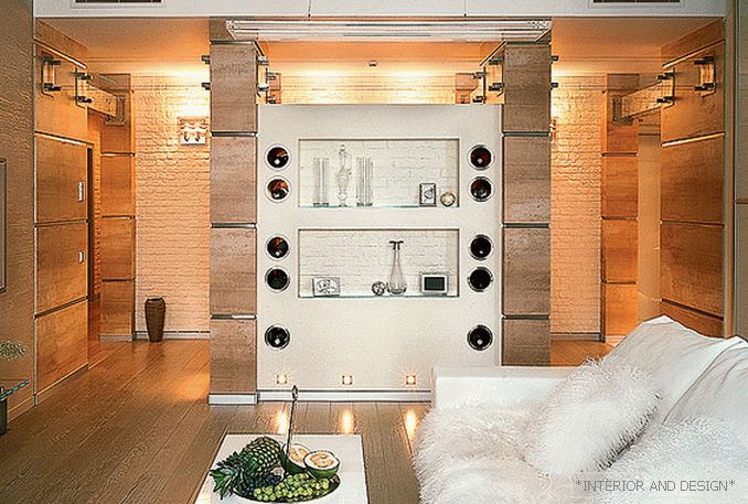
S: Tell us, what is this unusual design in the living room corridor?
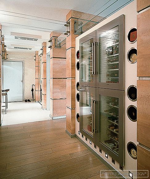
- This is a wine cellar: four wine cabinets, the doors of which overlook the corridor and make up a geometric composition. Initially it was assumed falshkamina. The owner collects rare wines and wanted to show his collection - so the fireplace turned into a wine collection. On the sides of the cabinets are round through holes - pipes, inside finished with stainless steel. Strong spirits can be stored in them, with respect to which it is not necessary to withstand severe temperature conditions.

