apartment of 270 m2
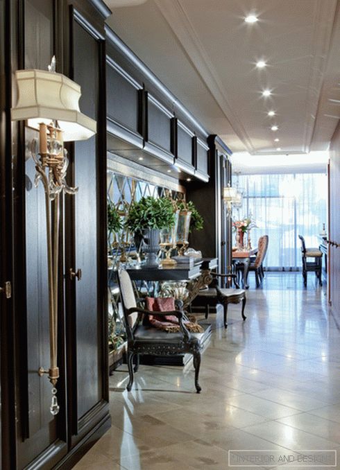

 Passing the gallery
 A photo: Dmitry Livshits
Text: Alexandra Terentyeva
Project author: Tatyana Mironova
Architect: Andrey Kontorovsky
Magazine: N1 (167) 2012
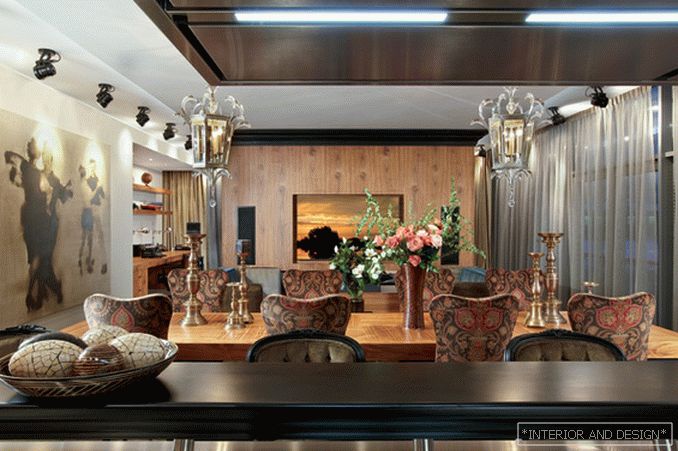
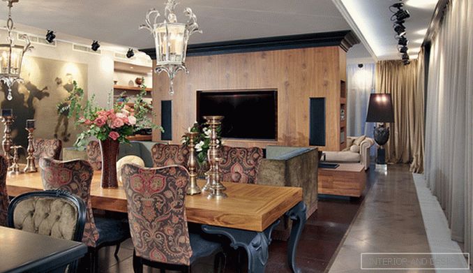
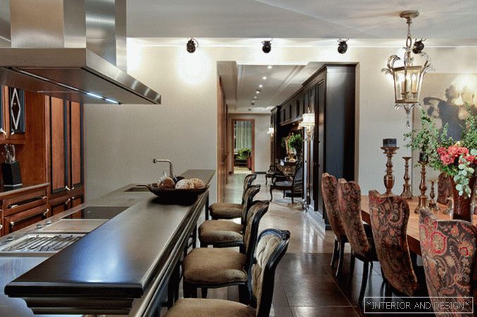
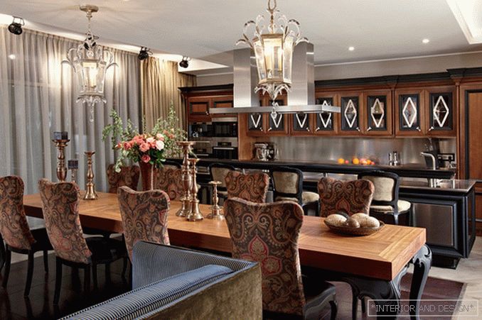
The apartment is located in a modern house with panoramic windows. Therefore, it was especially important to correctly plan the space so that the interior walls were tied to the window joints. U-shaped layout retained. A long open hallway connects the two parts of the apartment - private and public. The living room, the dining room and the kitchen are located in the common space of the leisure zone - this was the demand of the customers from the very beginning. In terms of this zone consists of two rectangles inscribed into each other. All pieces of furniture are located on the area of the inner rectangle. The kitchen island, as well as the sofa group, corresponds to the length of the dining table. The rack, constructed according to a special project, separates the area of the home cinema and the office from the public space is responsible for the specified dimensions.
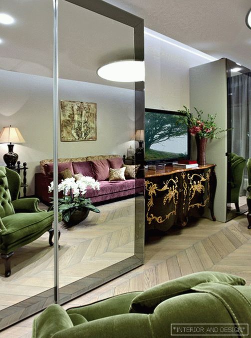
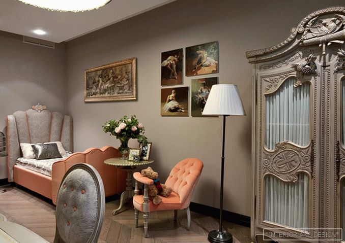
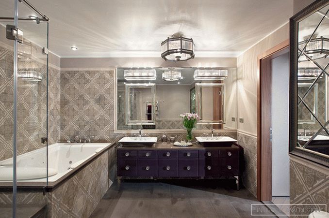
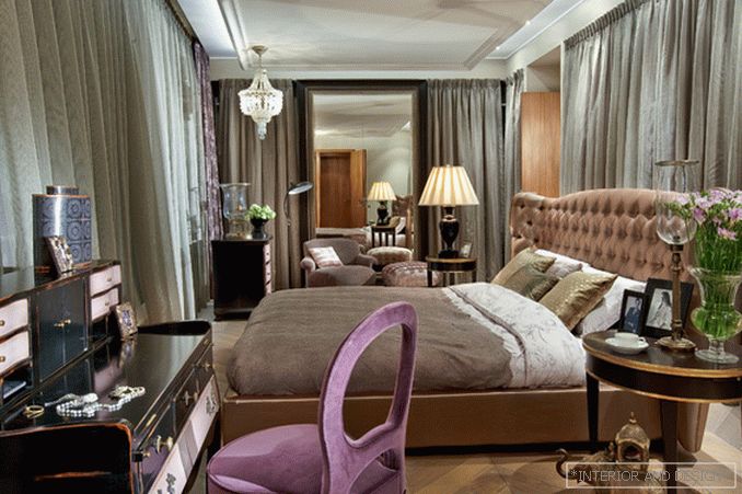
The entire left side of the apartment is private territory. There are two children's rooms, a guest room, bathrooms and the heart of this zone - the master bedroom. The central part of the ceiling is lowered and underlined by the lighting around the perimeter, which makes the bedroom space more intimate and cozy. Curtains of warm gray color hide the wardrobe located along walls. It was this soft, warm shade of gray that became the key for the whole coloristic solution of the apartment. Despite the dominance of gray in all rooms, the apartment is not perceived as monochrome. The furniture brings juicy color accents that look especially bright against a neutral background.
Contrast and unusual combinations of textures give the interior a special charm. The floor in the hall and in the corridor is lined with a gray-brown stone. He also frames the central part of the public zone, which, in turn, is trimmed with leather slabs. In the corridor opposite the black paneled cabinet in a classic style is a minimalist walnut wardrobe. The combination of wood, painted in black, and wood of walnut color can be traced in the design of the public area. Dining table of non-standard length (almost four meters), created according to the drawings


