Moscow apartment with a total area of 147 m2 Vera Butko, Anton Nadtochy
Passing the gallery
A photo: Dmitry Livshits
Materials prepared: Olga Vologdina
Project author: Vera Butko, Anton Nadtochy
Architect: Olga Sokolova
Magazine: N1 (68) 2003
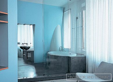
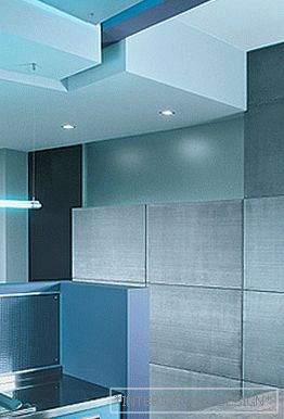
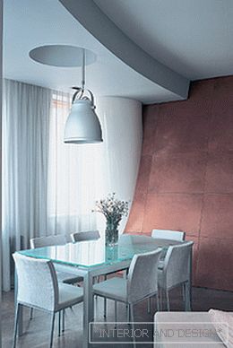
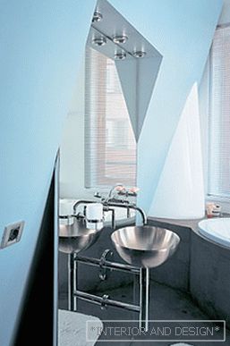
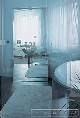
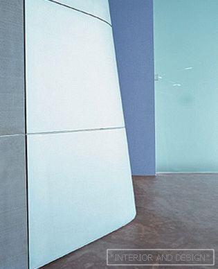
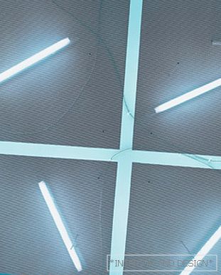
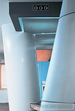
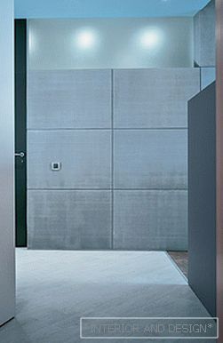
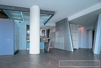
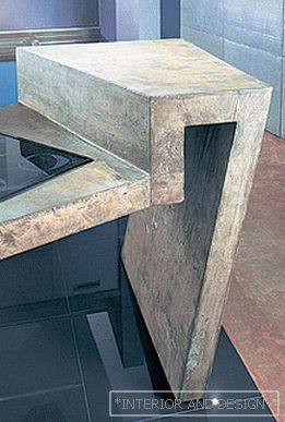
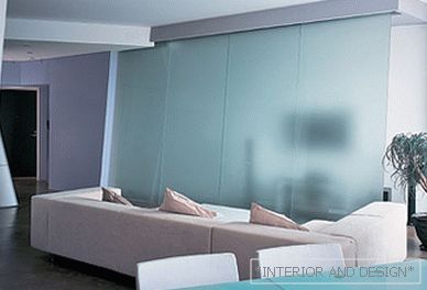
Anton Nadtochy, winner of the Architectural Award 2002 in the nomination "Apartment Interior" reflects on his understanding of architectureSTYLE I think it is not entirely correct to talk about our style. We are opposed to any formulations. In architecture we like first of all a formal language, and the less literary specifics (images, names, definitions), the more useful for architecture. We have certain ideas, abstract images that we are not trying to express in literary terms, but we translate into architectural language: the language of spatial composition, materials, light. Any of our objects is a private application to the formal concept, improvisation on a specific function described by the customer: the number of bedrooms, bathrooms and other things ... Any style is already something fixed, frozen, not tolerating deviations. This is strongly contrary to the nature of our creativity.SPACE For us, it is paramount, it is most important. We are trying to make it modern: in our understanding, it is complex, multi-layered, dynamic, rich and functional. You always want to create a feeling of greater volume, organize it not just as the sum of corridors and a set of rooms. Therefore, a complex configuration is often caused by a functional need and an attempt to escape from the corridors. We also like how some volume, some line flows from room to room. And it's not even a special love for this kind of techniques. This is one of the ways to structure the living environment, then the space gets a more complete form. You see, the concrete floor has gone under the leather wall and as if it continues to live in another room ... Sometimes a calm process of overflow is replaced by more radical splashes. For example, an inclined column near the window "cuts through" a semicircular wall and appears on the opposite side ... in the bathroom.LINE Usually we choose a certain line or volume. In this case, it is a square (kitchen module), which, as it were, “starts” into space and becomes an organizing start. In it "dive", from it "emerge" smaller volumes, it gives the chance to see the next elements differently. Everything develops around it. And the rest of the elements somehow “cling” to this square, which is highlighted by color, lighting, floor covering, and perforated aluminum ceiling, reacting to its presence. In this apartment we were attached to existing walls, and since the walls were all at different angles, our partitions turned out to be relative to each other at the same angles. And if we consider that some of them are also semicircular, then such an uneasy composition has developed. In addition, there are many elements: columns, leather wall, glass partition - not strictly vertical. Such slopes and bevels - an attempt to get away from lethargy, vagueness and regularity. The space turned out to be dynamic, lively and not dull. And for us this is perhaps the most important thing.MATERIAL There is always a chance to create a free layout and highlight the characteristic volume elements in color, light, material. In our projects there are almost always multi-material, multi-texture solutions. In this apartment, concrete and aluminum, steel and leather, glass and wood participated in the experiments. But more important for us is not what materials are used and how many are, but how ... (from a formal point of view). Our material is not a decorative painting, but a method of isolating spatial elements: partitions, volumes, columns, etc. They interact: fit or cut into each other, complement, contrast, transform ... For example, the smooth texture of polished granite is even more emphasizes the coarseness of concrete in the central module of the kitchen, and the metal mesh is shaded by the warmth of natural-made leather. The seeming coldness and "poverty" of the concrete floor in the living room is compensated for by a long-haired wool carpet. The oblique partition of frosted glass can almost completely move, revealing the home theater hidden behind it, and you enter the bedroom area through a turning wall of warm beech. Natural (as architects say “honest”) materials cannot be imitated by anything, they are natural and unique. So despite the abundance of concrete, glass and metal, this interior turned out to be positive, friendly and quite homely.Anton Nadtochy: “Sometimes we are asked to define the interior style in which Vera and I work. We try not to think about the wording: the name for us is a minor factor. You can call it modernist, urbanistic, deconstructive and minimalistic, and you may be right. For us, the design living environment is always a game: with space, form, volume ... Our architecture is modern, paradoxical, informational saturated. "

 Passing the gallery

