Petersburg apartment (268 m2) in the house of the XIX century Vladimir Lukyanov
 Passing the gallery
 Text: Olga Gvozdeva
A photo: Peter Lebedev
Stylists: Tatyana Bakanova, Yulia Korzhova
Project author: Vladimir Lukyanov
Designer: Vera Lyzhina
Magazine: N4 (104) 2006
The apartment is located in a building with a rich history. Its first owner was the famous field marshal Munnich, and in the 40s of the XIX century the house with two wings was rebuilt according to the design of the architect Alexander Pel, a student and assistant of Montferrand. It differs from the majority of buildings in the center of St. Petersburg with the wealth of not only the facade, but also its inner side. In the courtyard there is still a park surrounded by a wrought-iron fence (a replica of the Summer Garden trellis). It is here that the windows of the main premises of the apartment, which is at the disposal of the architect, come out.
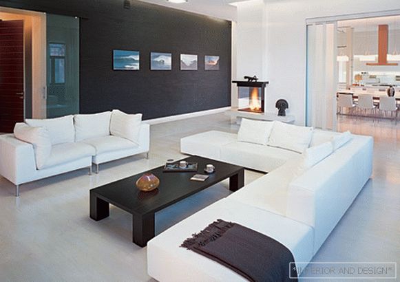
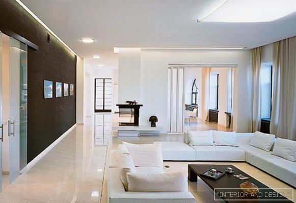
But despite the fact that the historical "outline" strongly demanded to turn to the classical style, the architect acted differently. Modern design was chosen as a stylistic reference, and white was the basis of the color range. Seven-meter spans of overlap allowed to maximize the open space.
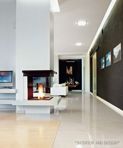
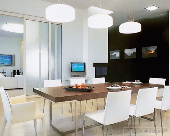
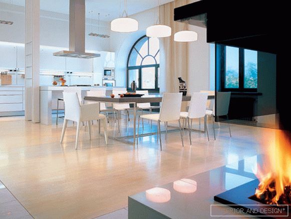
Most of the apartment is occupied by the living room and kitchen-dining room. The total area of these zones is 130 square meters. m, but still the architect chose to separate them with a sliding partition, which, when opened, hides inside the wall. A fireplace is built into the same wall. Its location to the side of the central axis of the interior brings some dissonance to the symmetrical composition, but the fireplace can work on three sides at once, dividing and simultaneously uniting the space. The open firebox is turned to a wall painted black and decorated with photos of the ocean. Authorship belongs to the owner of the apartment - an avid surfer. The photos are colorful, but the interior is still perceived as black and white. White space is lined with thin lines of worktops and window sills, like a drawing paper with a pencil. A series of associations brings us to the idea that the history of this century-old apartment is now being written from scratch. The motto of the new story could be the phrase inscribed on the facade of the house as designed by the architect Pel: "Domus propria - domus optima" ("The best house is your house"). But there was another: "Nothing superfluous!"

