How to create a comfortable space commensurate with a person? What solutions does the interior require in a contemporary style, and which solutions in a classic one? Narrated by Nikolai Tsupikov and Linda Hadjo
 Passing the gallery
 Text: Julia Sakharova
A photo: Frank Herfort
Magazine: Decor N8 (196) 2014
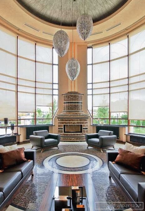
Nikolai Tsupikov: “Today, country houses are sometimes designed with a second light. But when high ceilings, a large amount of space, we need to bring the interior to a human scale. The effect of majesty is good in the temple, but not in the apartment building. If the ceiling height is seven meters, already a lot. For example, in the house we recently made, just seven. Here I had to struggle with emptiness. We designed a multi-layer volumetric ceiling — it ate some of the unnecessary volume. A circle, as if projected onto the floor from the ceiling, creates the illusion of compact space. I recommend using dark accents on a light background: dark color fragments organize and systematize the excess space. In our case, dark fireplace, furniture, mosaic. Ergonomics is not only a problem of “physics”, it is a problem of the correlation of different types of perception. So that objects are objects, that they are understandable, convenient to man. And so that they are located correctly. "
Read the full text in paper or


