two-level penthouse in Moscow with an area of 333 m2

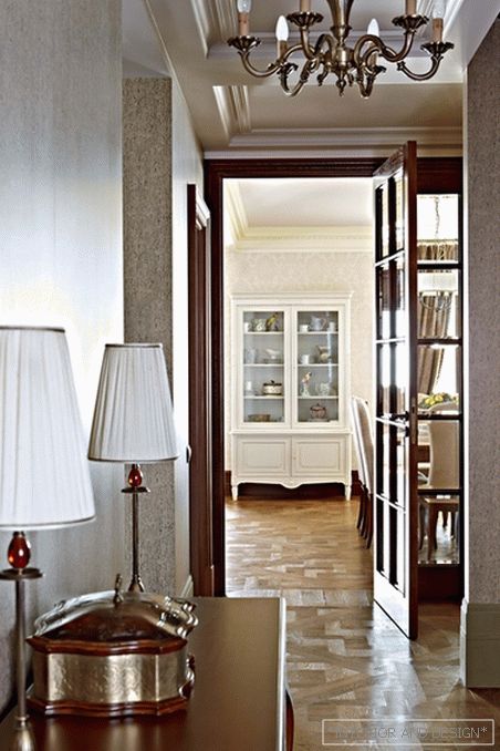
 Passing the gallery
 A photo: Dmitry Livshits
Text: Olga Korotkova
Stylist: Olga Roslova
Project author: Zhanna Kochurova
Magazine: de Luxe Classic N2 2012
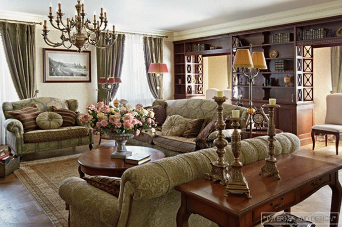
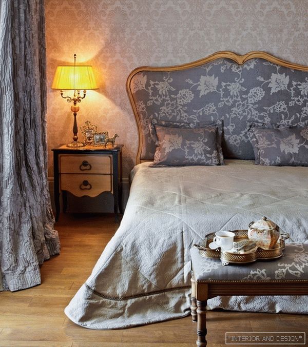
Уютное «обволакивающее» пространство с множеством милых русскому сердцу мелочей, с мягкой зелено-охристой интерьерной гаммой, с обилием деревянной отделки… Кажется, это не у нас и не сейчас, а где-то в окрестностях Лондона, в конце XIX - начале XX века. Architect
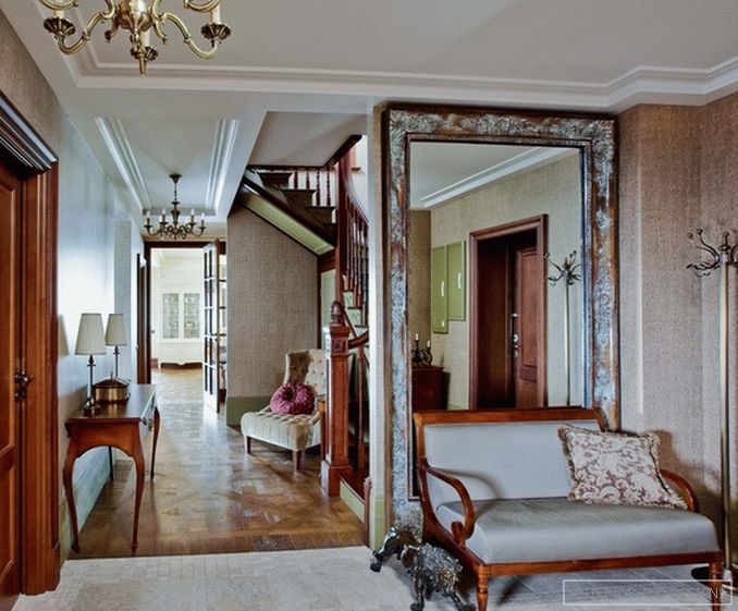
“I prefer to work with English styles,” explains the author of the project. - All English styles have clear basic characteristics, although these features are few. Therefore, the English theme is easily “strung”, like beads, onto one main semantic thread. ” The classical organization of space became the center of the project.
The classical approach is based on essentially simple things: proportions, the system of axes, symmetry and the ratio of volumes. Contrary to the narrow-mindedness, the basis is always architecture, a plan, that is, a scheme, a skeleton of space. “If the volume is built correctly (that is, all functions of the space are thought out, the optimal ways of moving the household, the most convenient ratio of sizes, heights), the style and image will come by themselves, this is a matter of professional intuition,” says
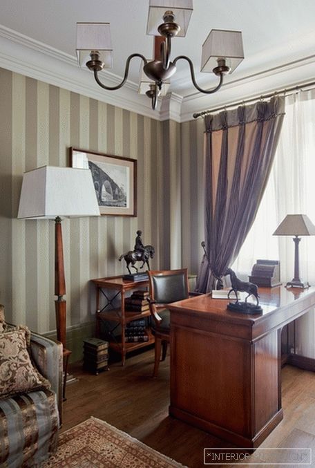
Here, the main tone was the dense, thick color of mature grass - the so-called English green. And the tree - dark natural and light colored - is included in one or another stage setting based on a specific task. At the junction of the corridor and the dining room, the architect used a simple technique - created the illusion that the visitor enters from the hallway into a room flooded with light. To do this, the corridor was “blacked out”, using rich colors, and in the future, where the look should be, they put light furniture. The effect is enhanced by another trick: the space between the two bearing columns is filled with a library, which gives the effect of a continuing space.
English style is easy to grasp - and it is not easy to imitate. A small arsenal of techniques - wide baseboards or panels, developed door trim panels, the ratio of colors, the "allowable" amount of wood in the finish - all these techniques should be carefully applied, measuring the proportion of each eye. Therefore, the English interior every time it turns out its own, the author, believes
Architect


