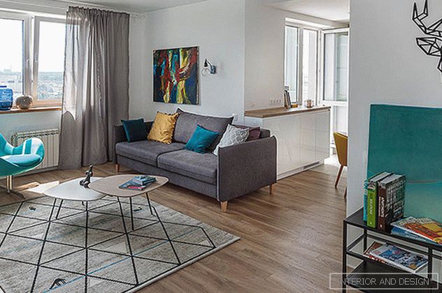
“Customers are a young family with a child, they turned to me on the advice of friends,” says designer Victoria Volkova. - The task was to make a bright interior in the Scandinavian style. But, as we worked on the project, I convinced customers to add color.
By topic: GS Interiors: apartment in shades of sunset
The main wishes were to create a sense of space and a sufficient number of storage systems. My decision was to place a “cube” opposite the front door - a storage system that does not block the view, but at the same time gives a sense of security. Access to it is from two sides - from one side outer clothing is stored, on the other - household equipment. Instead of the original layout with a long corridor and six entrances to separate rooms, we got a spacious living room combined with a kitchen-dining room, two separate bedrooms, two large bathrooms. The kitchen is designed without top cabinets, part of the storage cabinets is located under the window. The living room is separated from the cooking area by a round dining table.
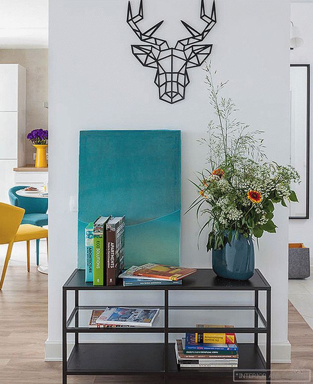
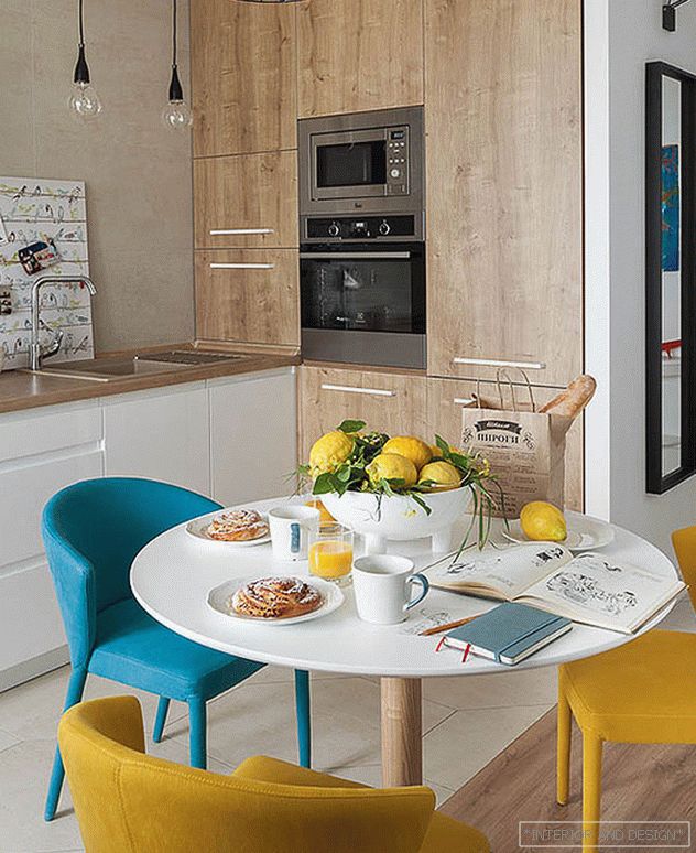
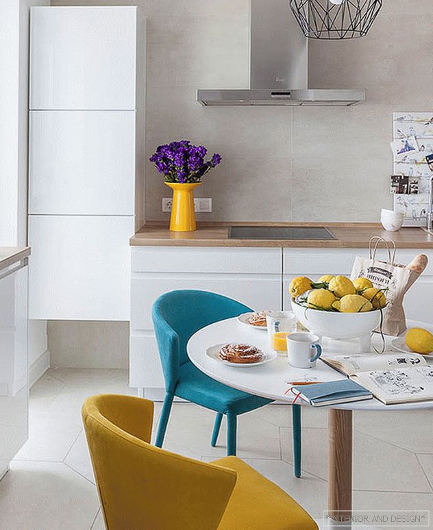
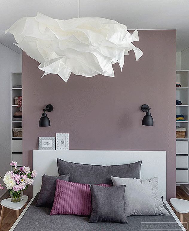
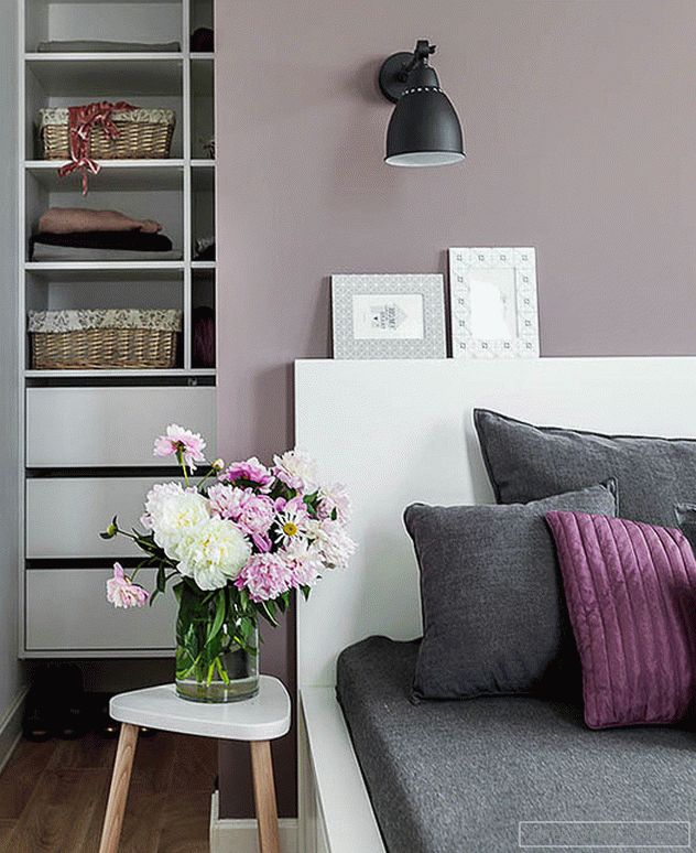
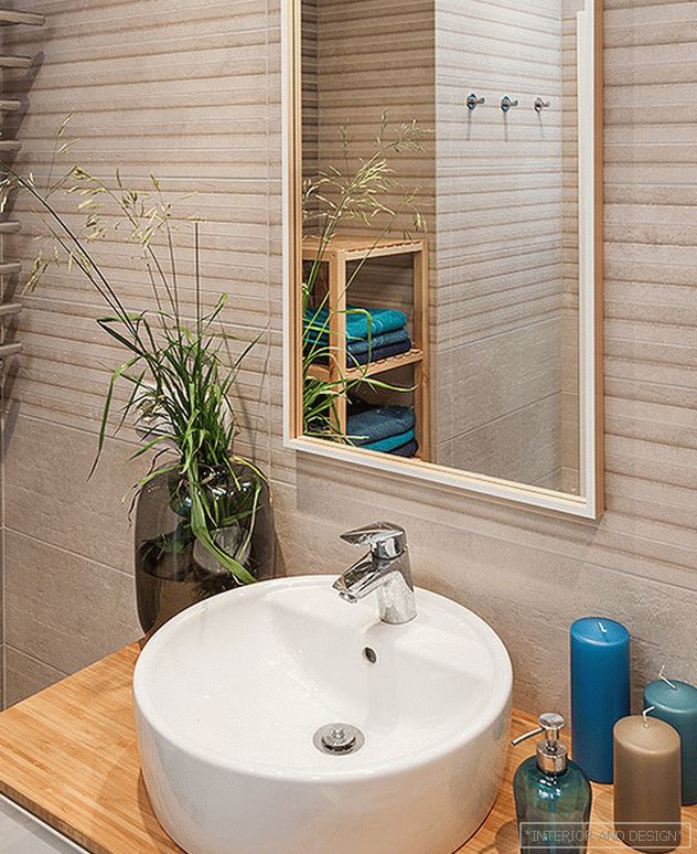
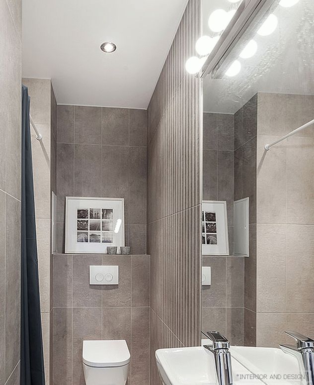

In the fifteen-meter bedroom I managed to place a dressing room behind the headboard. With two windows, the bedroom looks spacious. To visually increase the volume of a narrow bathroom, we decided to use a wide floor-to-ceiling mirror. We finished the final touches of the repair in gloomy March, so at the final stage of decorating it was easy for me to persuade customers to add bright colors to the Scandinavian color. This is how the “sea” wall, bright chairs and the Calligaris chair appeared. The living room is decorated with the work of architect Tatyana Sinitseva. Perky portrait of a sailor - drawing of my girlfriend's daughter. ”
