The combination of colors in the interior is the basis of the design of premises and especially living spaces.
Everything depends on how much the correct color and shade in the room will be chosen! Will it feel comfortable, do you often have to clean up and even want to sleep, eat or dance?
Therefore, it is extremely important to understand the basic principles of interior color, even if you started a turnkey repair at the most eminent metropolitan designer.
We will talk about them today.
The content of the article- The psychology of color: why so and not otherwise?
- The color wheel and the rules for its use in the interior
- Table of color combinations in the interior
- Principles and types of color combinations in the interior
- Analog combination of colors in the interior
- Complementary (contrasting) color combination in the interior
- Triadic color combination in the interior
- A combination of four or more shades
- 12 popular colors in interior design
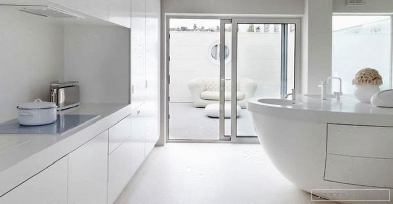
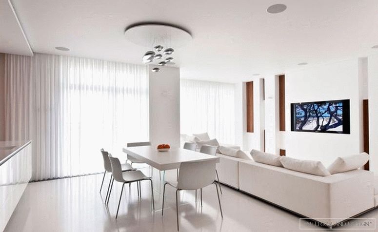
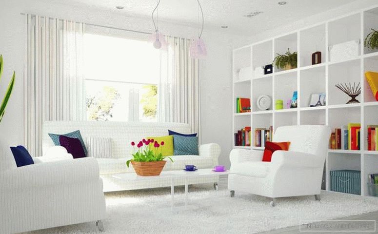
- White
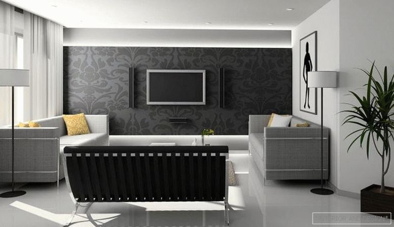
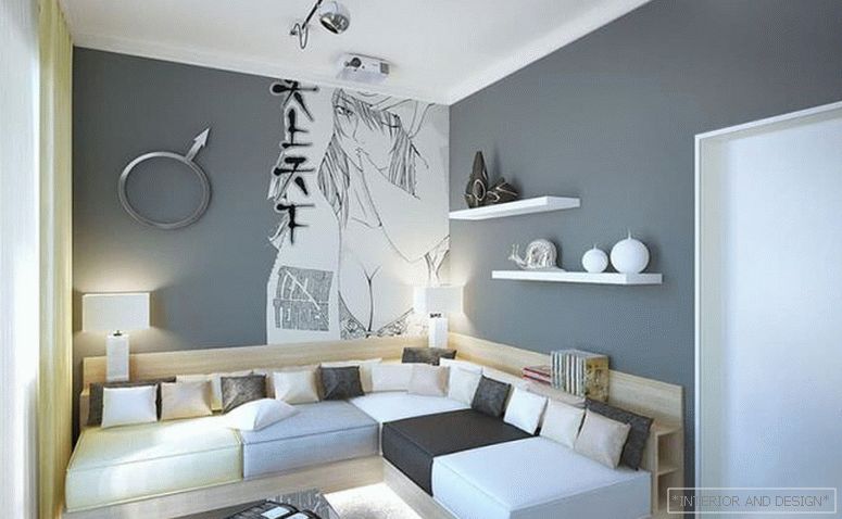
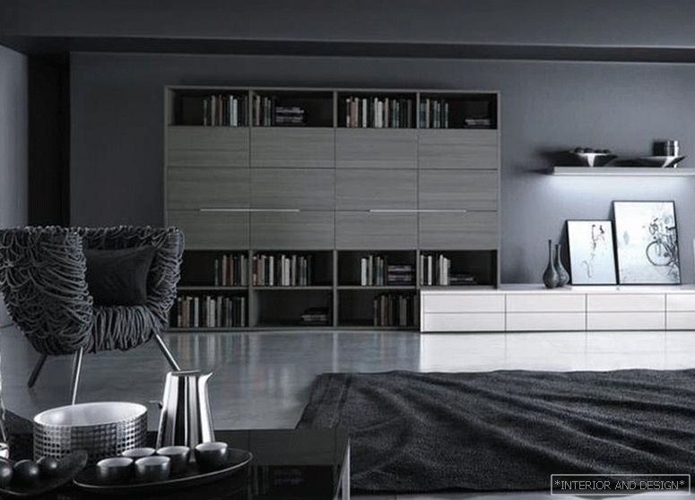
- Gray
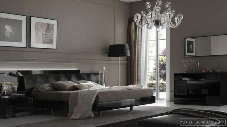
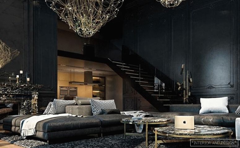
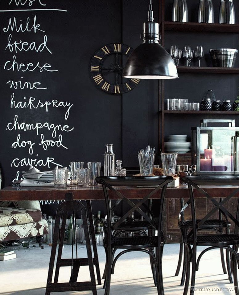
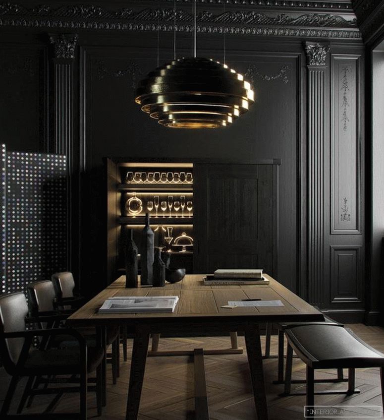
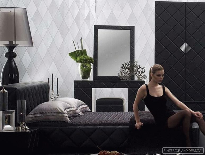
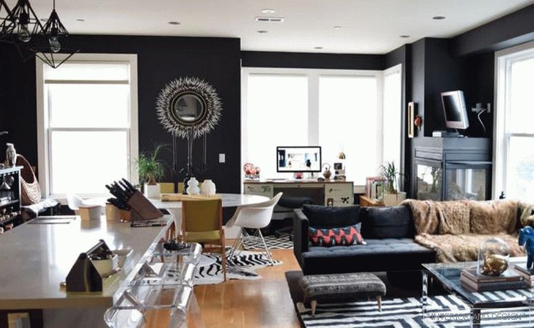
- The black
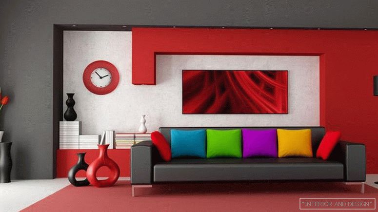
- Red
- Orange
- Yellow
- Green
- Pink
- Blue
- Violet
- Brown
- Beige
The psychology of color: why so and not otherwise?
A well-known fact: our brain receives up to 70% of information through vision.
We distinguish objects by shape, size and ... color.
We like some colors, but we categorically do not accept any. Somehow we want to surround ourselves, and some to see as little as possible.
Why is that?
From the point of view of physics, color is nothing more than light waves of various lengths. Their effect on our brain triggers characteristic reactions in it.
Such an impact is purely individual, but has more or less general trends. In practice, this means that the same color (light wave) can be perceived by different people as different shades.
Remember, in the descriptions of the goods on AlieExpress often prescribed: the color may differ from the actual, depending on the settings of your monitor?
The same with eyes.
If you dig deeper, it turns out that light waves affect not only how we “think” about them at the moment of perception, but how we treat them. There are colors that seem bigger to us, more intense, richer. They are called “warm”. Others, on the contrary, seem to us smaller, calmer, less noticeable. They are called “cold”.
This feature of perception of color can be advantageously used to create the interior of small rooms.
From the point of view of psychology, each of us is a walking set of stamps and personal experience that subconsciously generates associations. It is associative thinking that psychology explains the sympathy of different people for different colors.
The color that some people associate with something good and pleasant, in others causes only the worst memories.
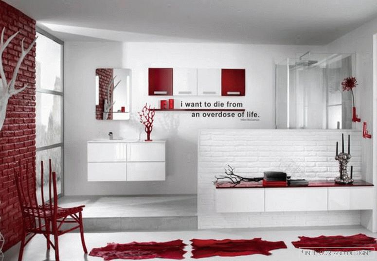
Take for example red: someone associates it with strawberries and summer holidays, and someone with blood and a hospital.
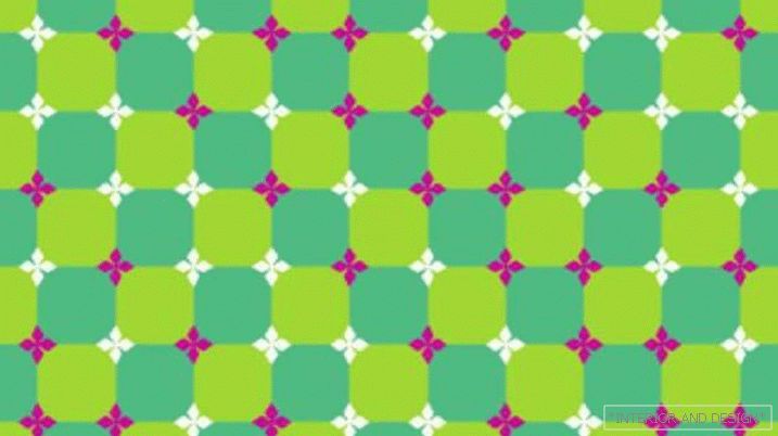
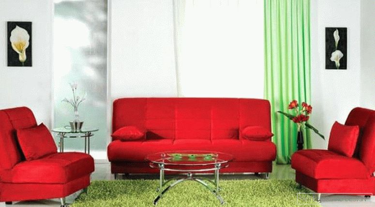
Associations can be enhanced if the colors are in a bundle - green with red or white with red.
Compare:
Sometimes associations are so strong and subconscious that our brain gives what is desired for reality. Remember the epic with the unfortunate dress, the color of which guessed the entire global virtual community? That's the same thing.
It is important to remember about the psychological background of the influence of color when choosing a color palette for the future interior. The designer should be aware of your preferences and (especially!) That is categorically unacceptable to you (it is not necessary to go into details of why). It is also worth discussing this issue with other residents of a room or apartment, if you are not living alone.
There are in this and its pluses.
For example, the interior of the bedroom can and should be (!) Done in a color scheme that acts on you relaxingly and soporific. Most often this is how a light beige color palette affects a person. But there may be exceptions: if you manage to fall asleep only in complete darkness and silence, give preference to the bedroom interior in dark colors.
Bright juicy colors can provoke appetite, so they are appropriate to use in the interior of the kitchen. But strict black and white colors stimulate brain activity, so it is she who is most often found in the interiors of offices.
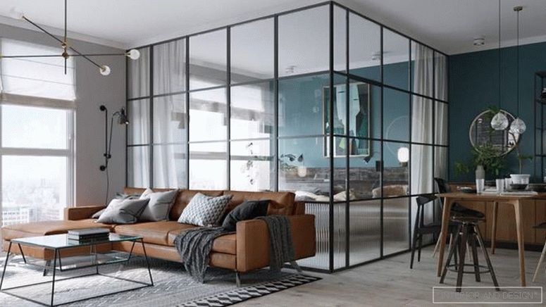
The choice of colors and even shades for the interior is also important because in many respects it is the color that can be the main argument in the choice of a stylistic decision. A dark gamut of natural colors is characteristic of a loft, and a light white-lavender color is typical of Provence. Bright and rich colors will suitably look in the interior in the high-tech, eclectic, fusion, pop-art styles, and natural wood shades - in the classics, country, eco.
It often happens that on the trend wave, it becomes fashionable to create an interior in some style or color. But do not forget that in the pursuit of fashion, you can easily lose yourself. What everyone likes can be an inappropriate and uncomfortable decision for you. And the interior is not a dress, you can’t change it in half an hour. So is it worth the risk?
The color wheel and the rules for its use in the interior
Attempts to investigate and systematize colors were first made by Newton. It was he who made the first color circular model, which was based on 7 colors of the rainbow.
Surprisingly, but a fact: Goethe became a follower of Newton in the study of colors and drawing up the color wheel. And not some random namesake of the great poet, but the author of “Faust” himself. We will not stir up the milestones of his biography and find out whether he made mystical transactions for this discovery, but simply thank Goethe for revealing 3 basic colors — blue, yellow, red — in which other (secondary) shades appear in the process of mixing. : green, orange, purple and all sorts of variations.
The universal circular color model, more commonly known as the color circle or the Itten circle, is a color scale in which primary colors, secondary and tertiary, are used, that is, those that were formed by mixing the first two.
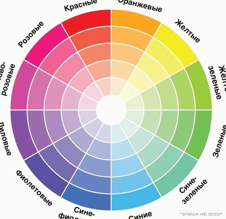
The circle of Itten is a must have for every new colorist, but many famous designers will not part with it even with a rich and rich experience in creating interior design.
Color circle является спасательным для тех, кто от природы не обладает талантом колориста. Основное правило подбора цветов, идеально сочетающиеся между собой, такое: сочетайте друг с другом или цвета из одного сектора (актуально для монохромного интерьера квартиры) или из одного ряда интенсивности (актуально для полихромного интерьера квартиры). О типах сочетания цветов в интерьере мы расскажем ниже.
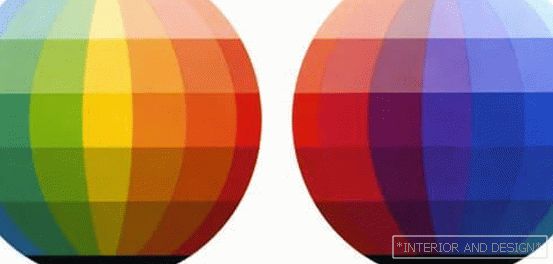
Table of color combinations in the interior
For the most lazy or insecure people, designers have developed entire color combinations.
The meaning of these tables is to not bother and just use the shades that are ideally suited to each other.
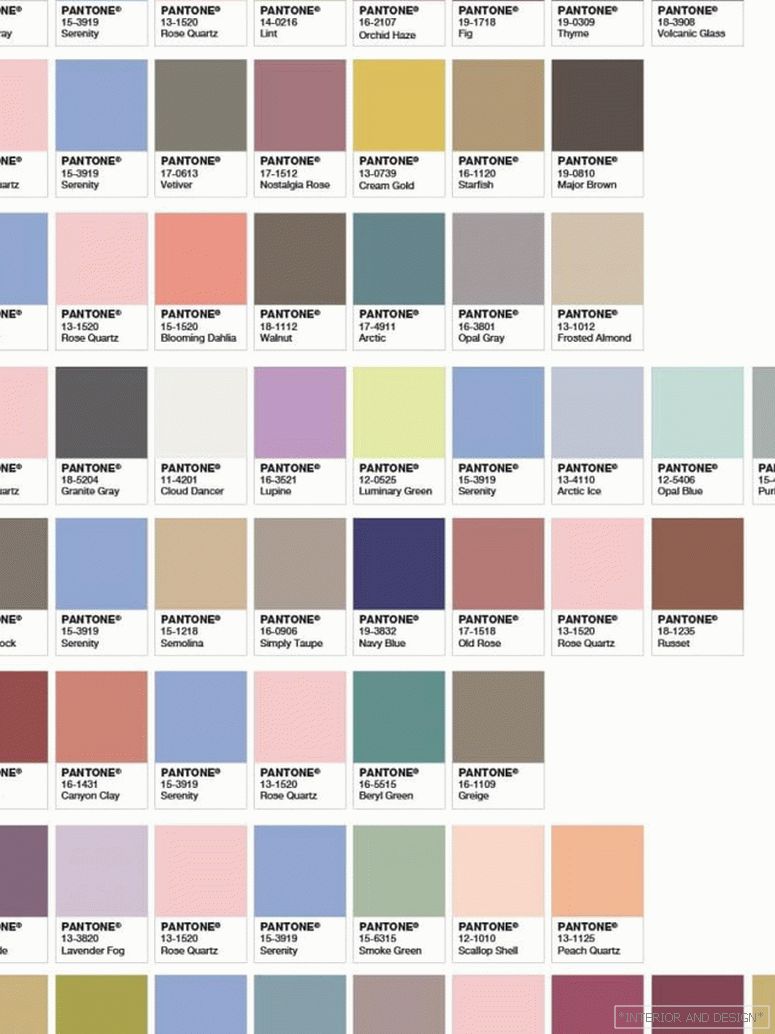
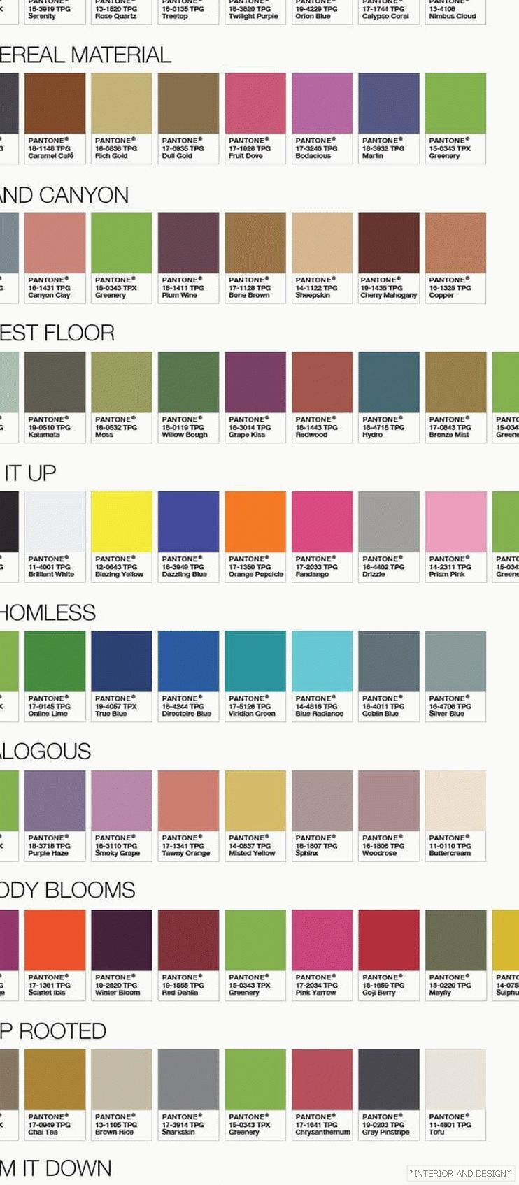
The most common color combination tables are the Pantone Color Institute palettes. Every year this organization chooses the main color of the year and develops entire catalogs of color combinations for it.
(You can read more about the main color of 2018 here).
Pantone tables look like this:
Competitors in the field of creating color combinations of tables are various manufacturers of paints (for example, DULUX). This is a huge plus, because choosing the right base color you can easily find the perfect match for it. As they say, in the same place, at the same hour.
If you are inclined to be inspired by images, then a more creative option would be to use color schemes based on photos.
It is believed that if the picture looks harmonious, then all the colors on it are ideally combined with each other.
Like it or not, you can check for good examples:
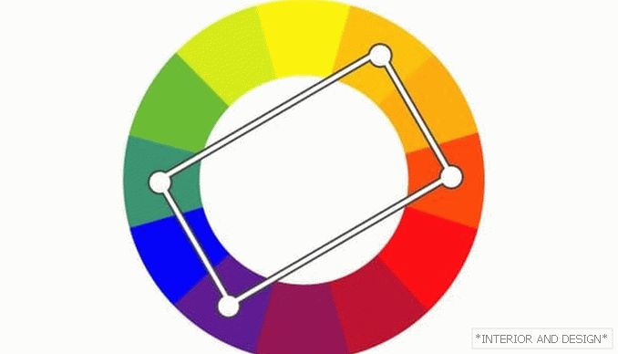
Principles and types of color combinations in the interior
There are several key color combinations.
Analog combination of colors in the interior
The combination of several similar shades smoothly flowing into each other.
In the color wheel, it looks like this:
As a rule, such combinations are often found in nature and are recommended for the decoration of “quiet” apartment spaces (bedroom).
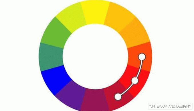
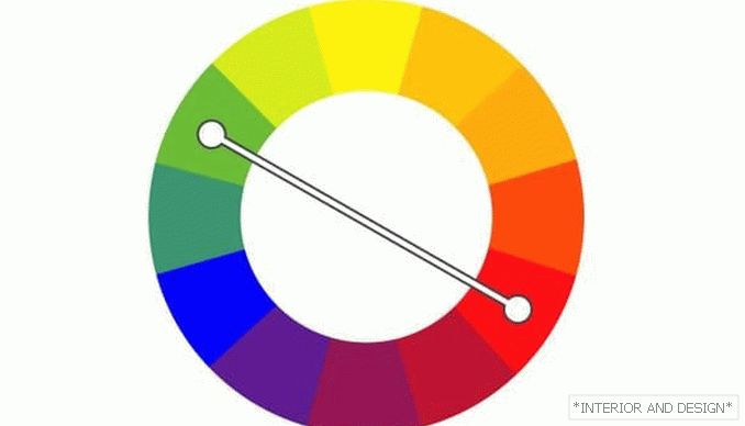
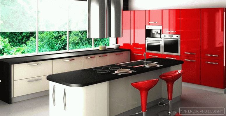
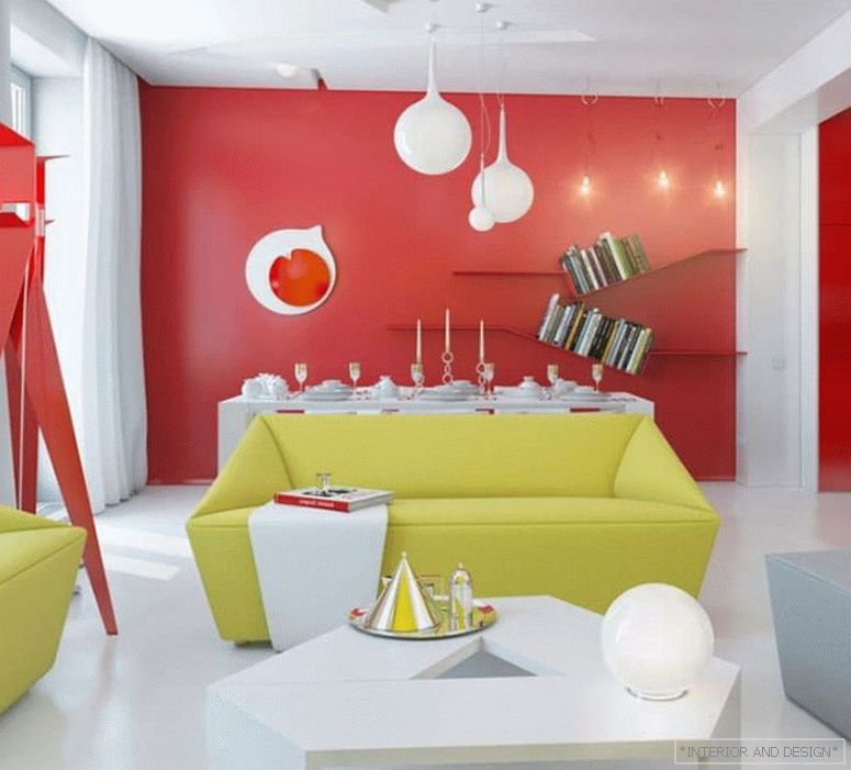
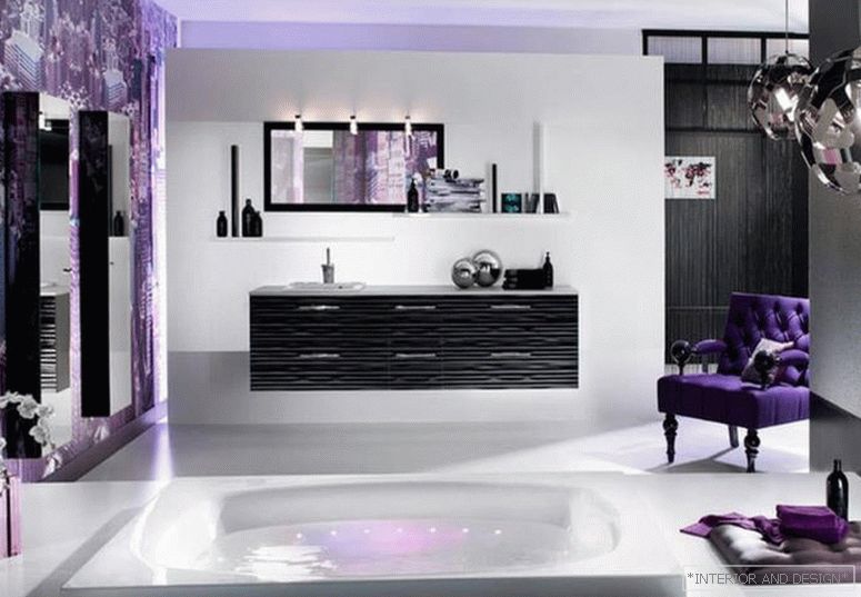
Complementary (contrasting) color combination in the interior
The combination of contrasting shades. In the color wheel, these shades are located in opposite sectors. Best of all, this combination works in a bathroom or bathroom, where there is little room for using a multicomponent color scale, but muted shades do not play a significant role.
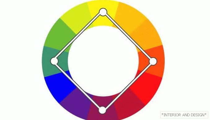
Triadic color combination in the interior
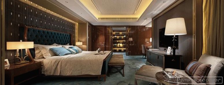
The combination of three shades - is considered a classic and the basis of the foundations of color. It is used in most living spaces in the apartment - in the living room, in the bedroom, in the kitchen.
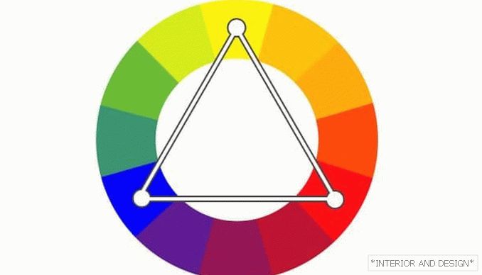
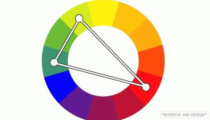
In the color wheel for the combination of the three shades is used a triangle. It can be equilateral or not. In the second case, the third shade is usually used as an accent.
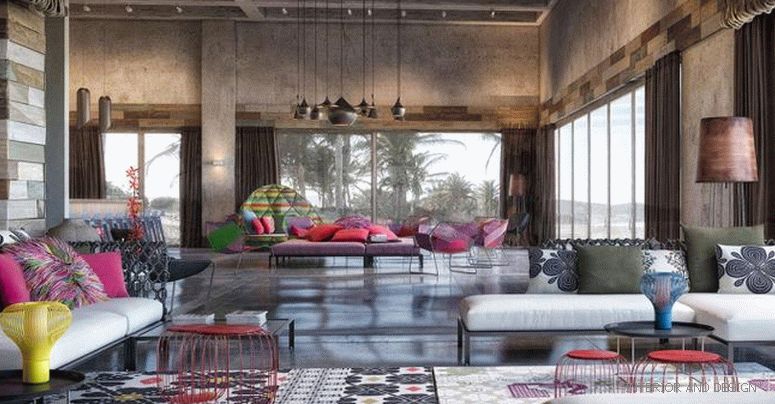
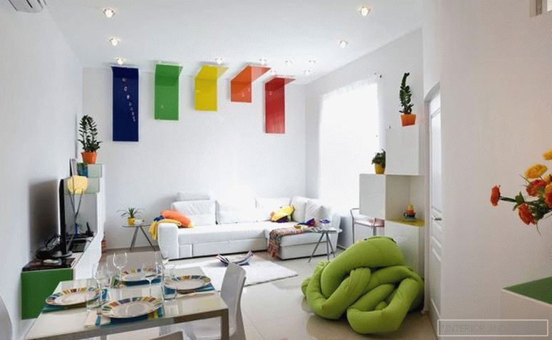
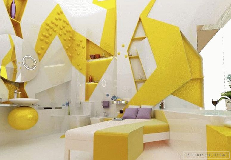
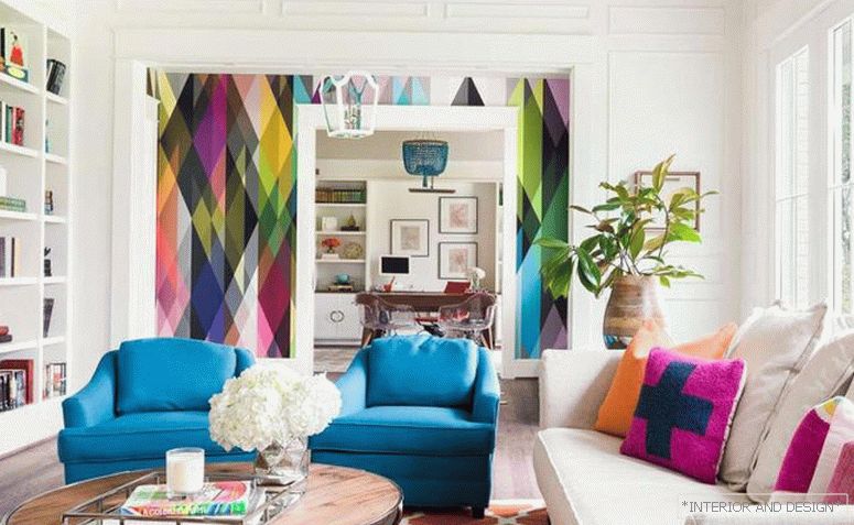
A combination of four or more shades
Polychrome interiors are most often used for children. They are bright, rich, multi-layered, due to the peculiarities of the child's psyche and children's worldview. In the color wheel, such figures as square, rectangle and other polygonal figures can be used as a scheme.
12 popular colors in interior design
White
The most pure and light color, which is often used in the interior as a primary or as a binder for other shades. One of the basic colors of the olive style. A few years ago, it was very popular “in its pure form”, but today designers increasingly agree on the need to combine it with bright, saturated colors.
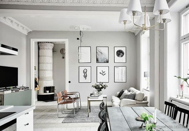
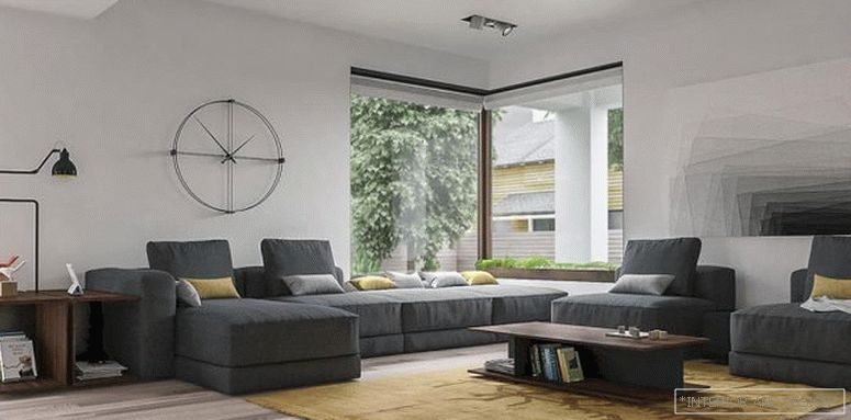
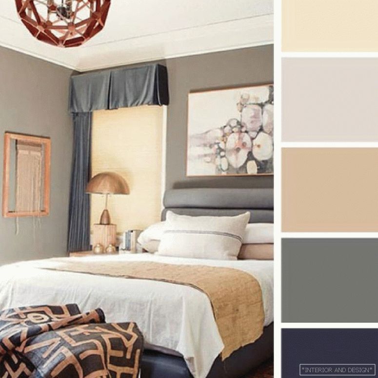
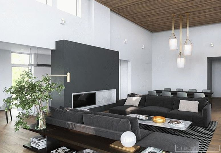
Gray
He became popular in interior design not because of the famous “50 shades”, but only because of its depth and versatility. Characteristic for styles loft, hi-tech, minimalism, industrial. Became popular after the entry into fashion of untreated concrete textures. It is perfectly combined with bright warm shades.
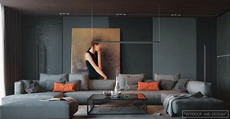
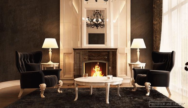
The black
The black - это классика. Уместен практически во всех стилях интерьерного дизайна. Наравне с белым сочетается со всеми оттенками. Часто используется в качестве акцентного цвета, но в последнии годы усиливается тенденция к выбору его как основного цвета интерьера. Достаточно практичен для оформления спальни и гостиной, а вот в помещениях с водой (кухня, ванная комната, санузел) могут возникать трудности из-за белых мыльных разводов на черных поверхностях. Не рекомендуется к использованию в детской.
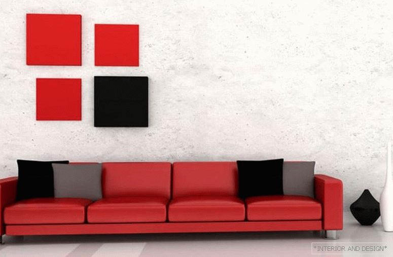
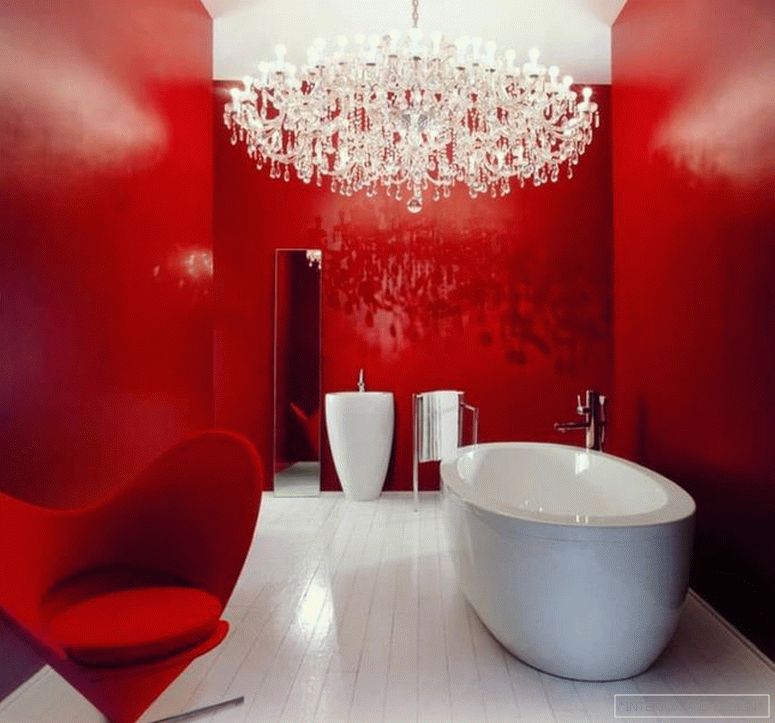
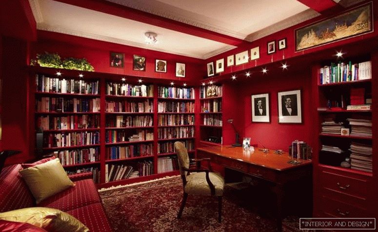
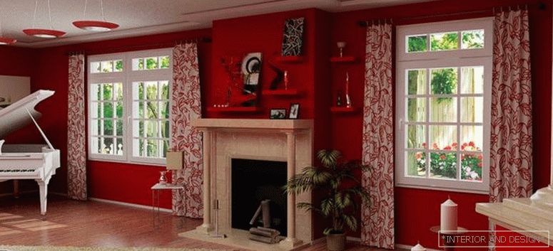
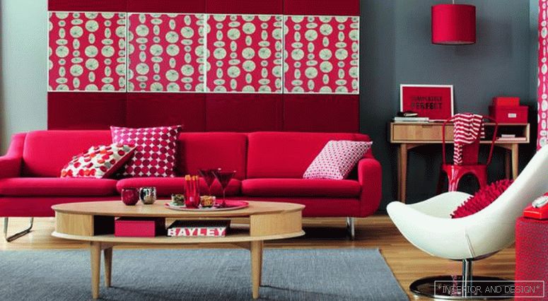
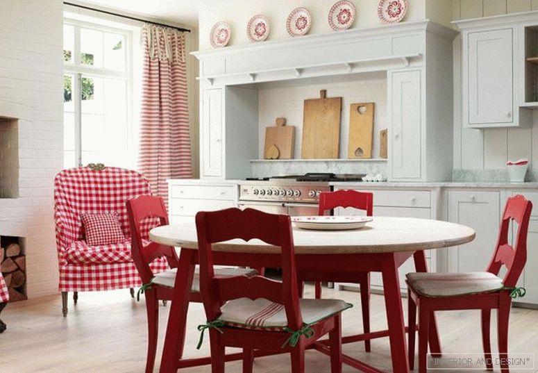
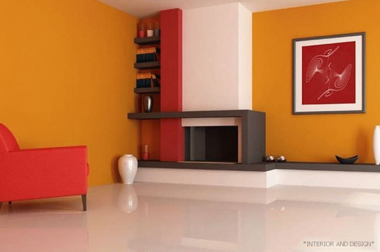
Red
The hottest and most dynamic color. In high concentration it can be perceived as too aggressive, therefore it is recommended to use it as an accent. Suitable for modern and daring styles - hi-tech, eclectic, fusion, pop art.
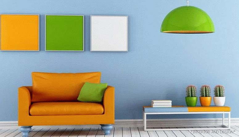
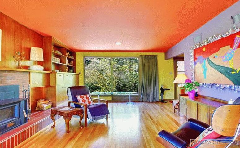
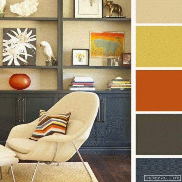
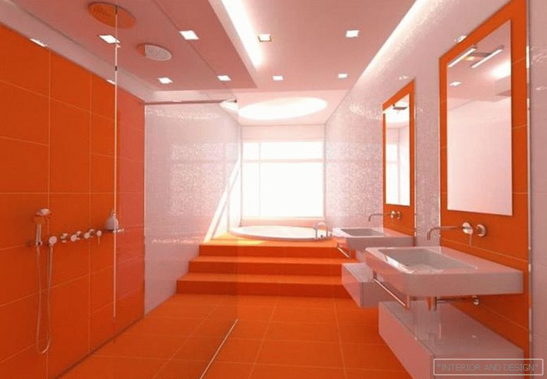
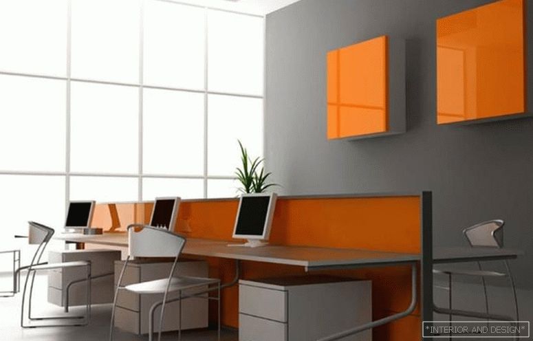
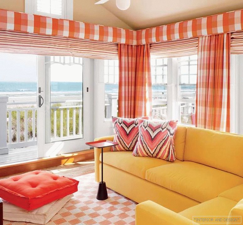
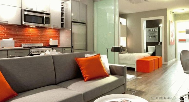
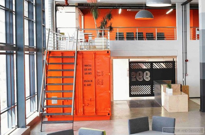
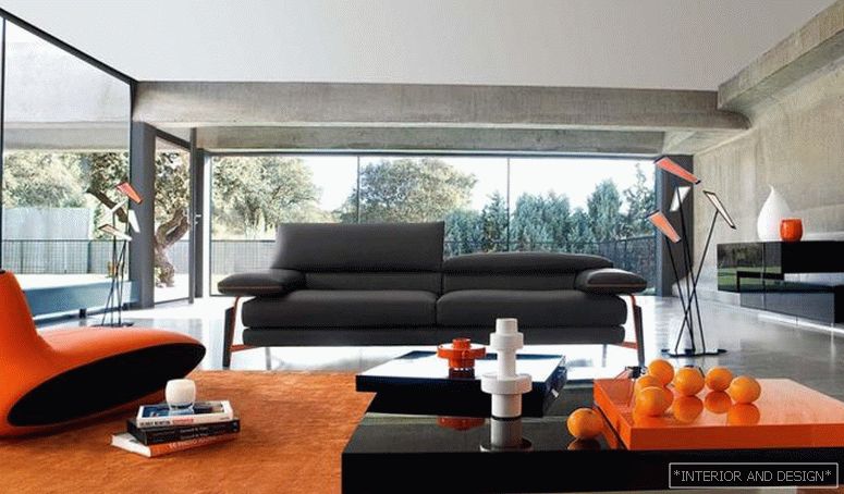
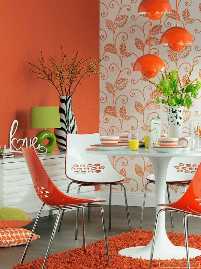
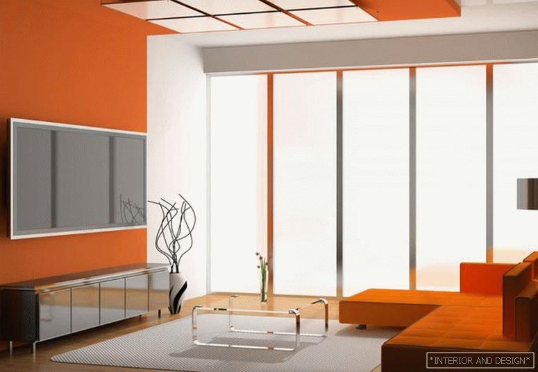
Orange
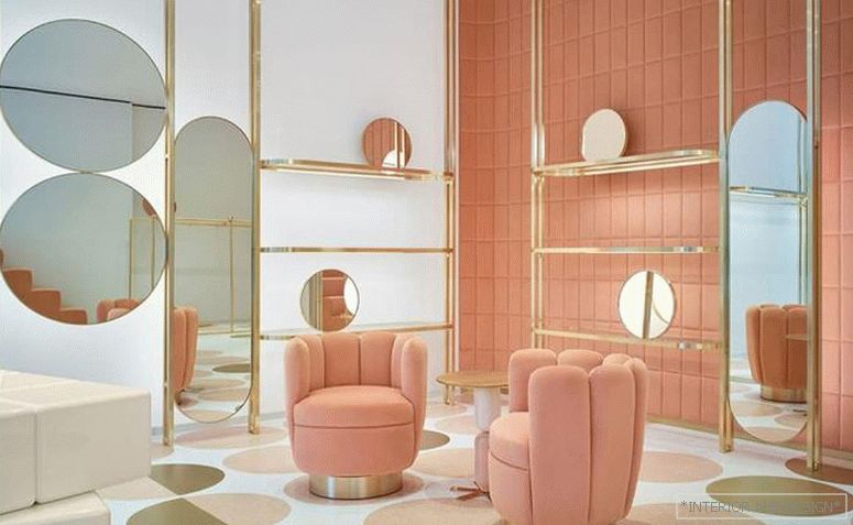
One of the most rarely used shades in the interior. By temperament and dynamics is very similar to red. Rich shades of orange are often used in kitchens, bathrooms, bathrooms, nurseries. For rooms such as living room, bedroom, hallway, designers tend to choose softer and more muted colors: peach, apricot, coral, salmon.
Orange как основной цвет очень характерен для стиля лофт. Однако допускается к использованию только один его оттенок: кирпичный.
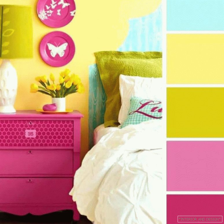
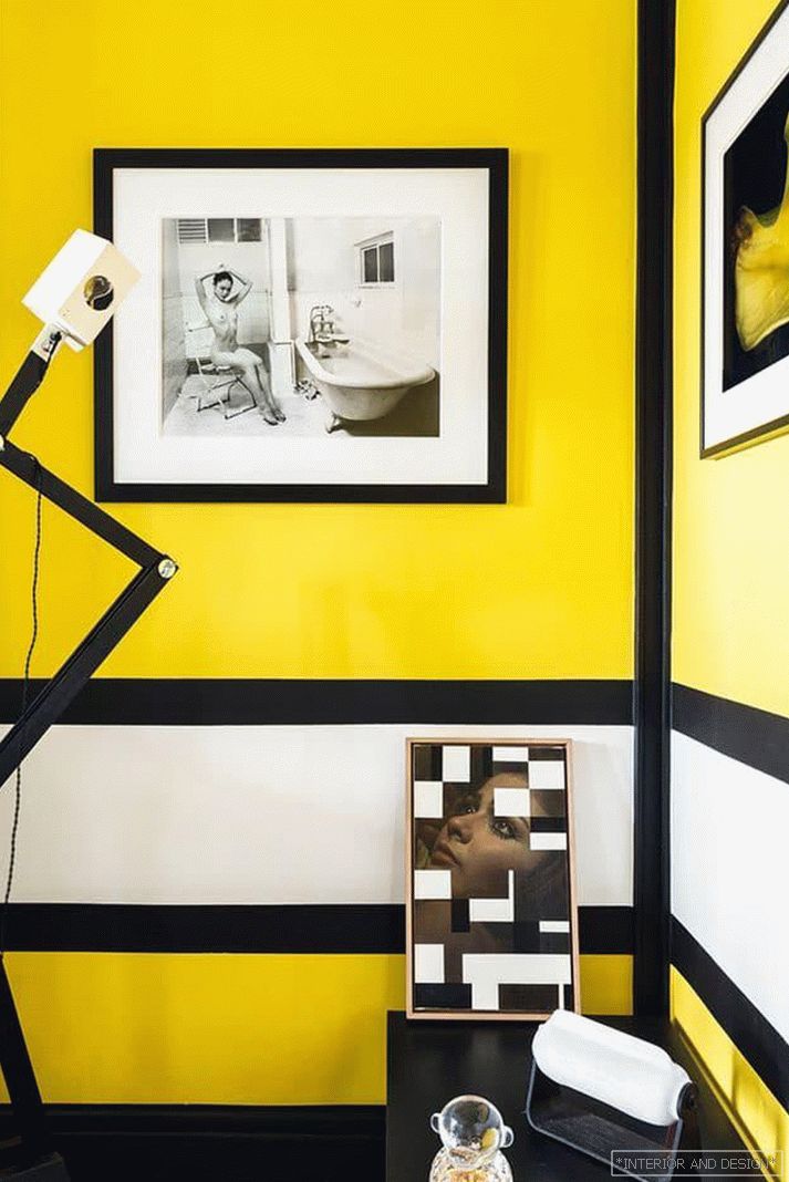
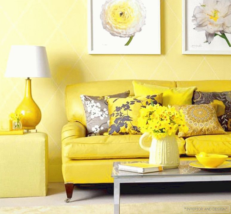
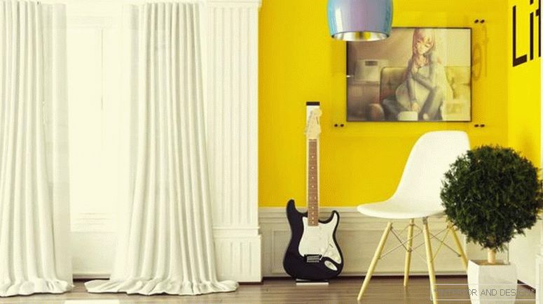
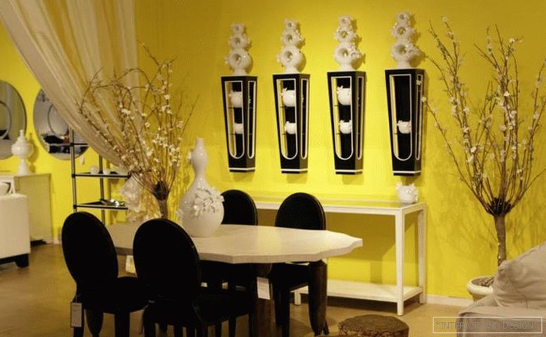
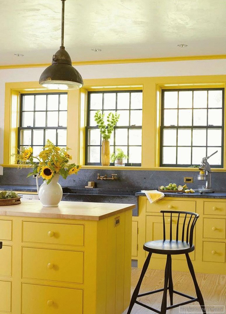
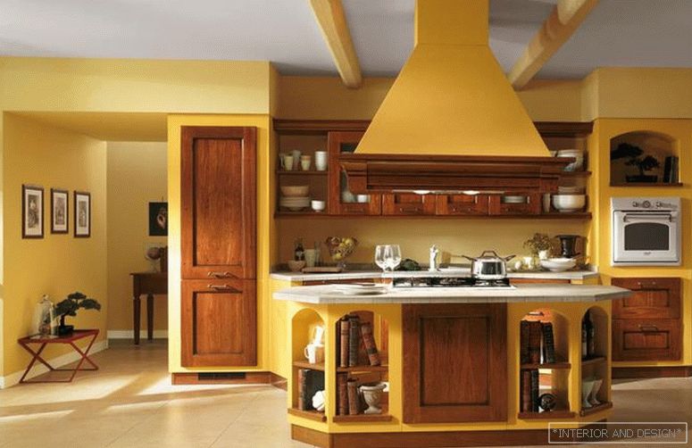
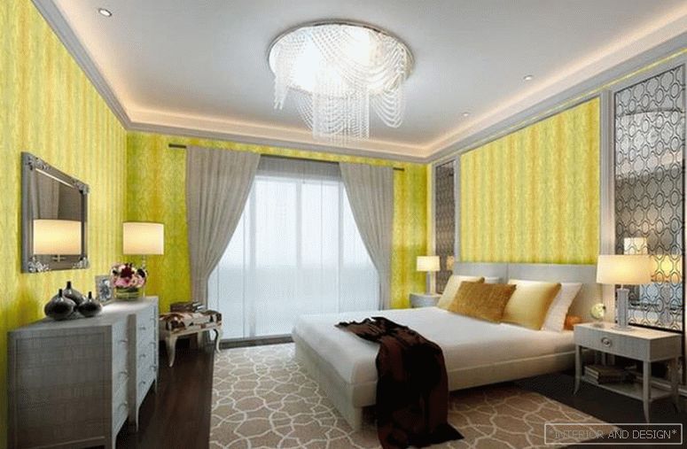
Yellow
Sunny and cheerful - this is how you can describe the yellow color in the interior. The most popular in the design of children.
Yellow perfectly harmonizes with a warm palette of shades, and with a cold one. It visually increases the temperature of the room very much, so it is not recommended for rooms with a south or east side of the house
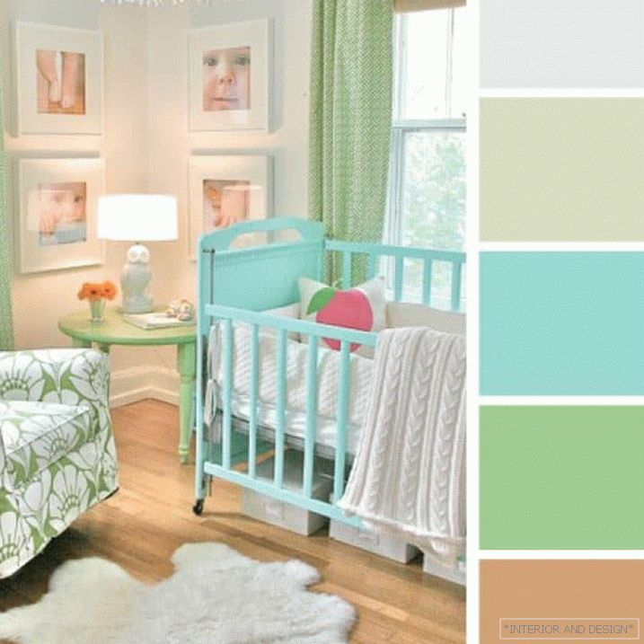
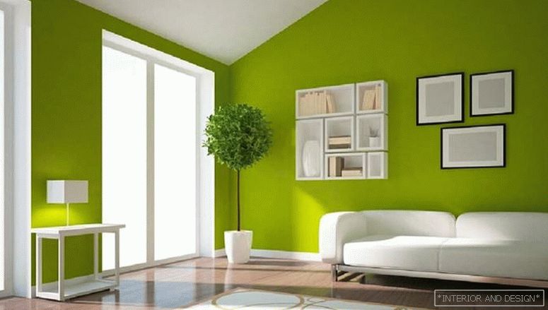
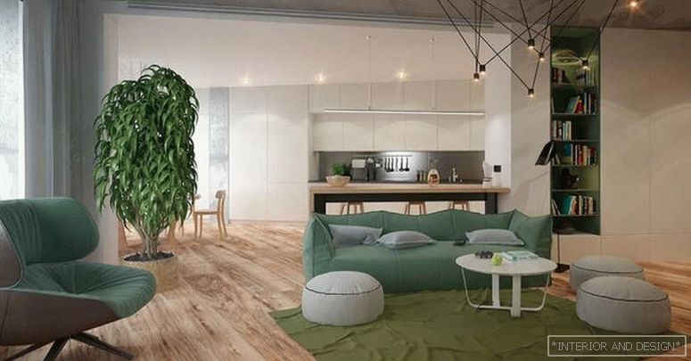
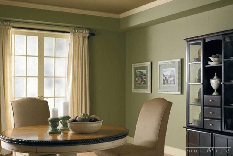
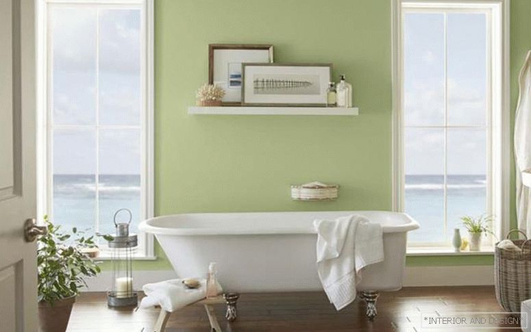
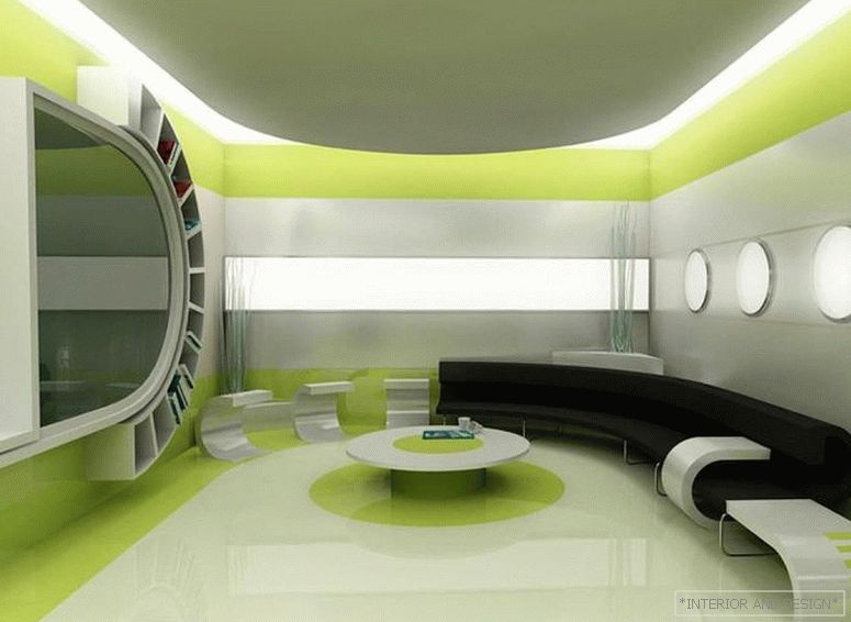
Green
Color associated with harmony, nature and tranquility. Known for its relaxing effects in general and on the eyes in particular. Recommended for the design of educational institutions. It is believed that the interior, made in shades of green, helps a person to reboot, get inspired and get a charge of vigor and energy. Allowed in the design of all residential spaces. Most often used in classic and eco style.
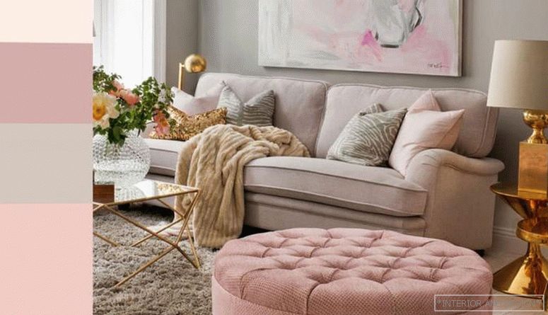
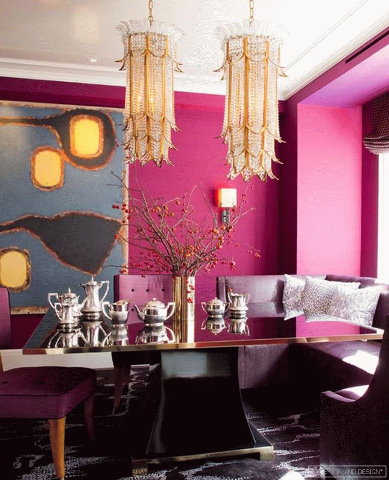
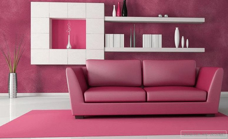
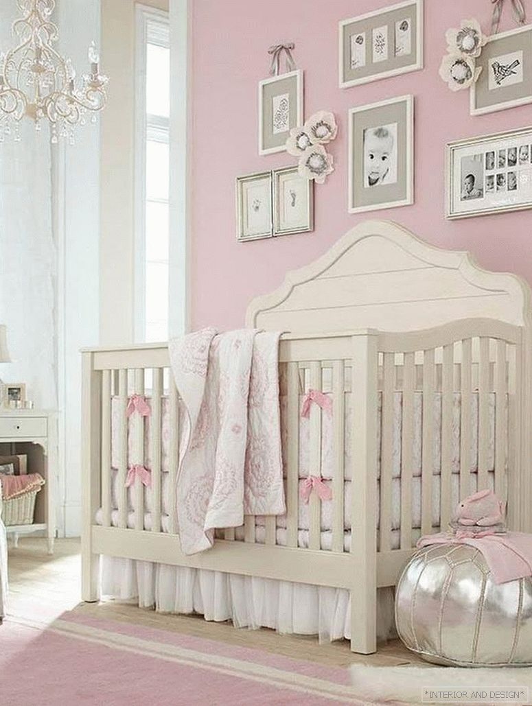
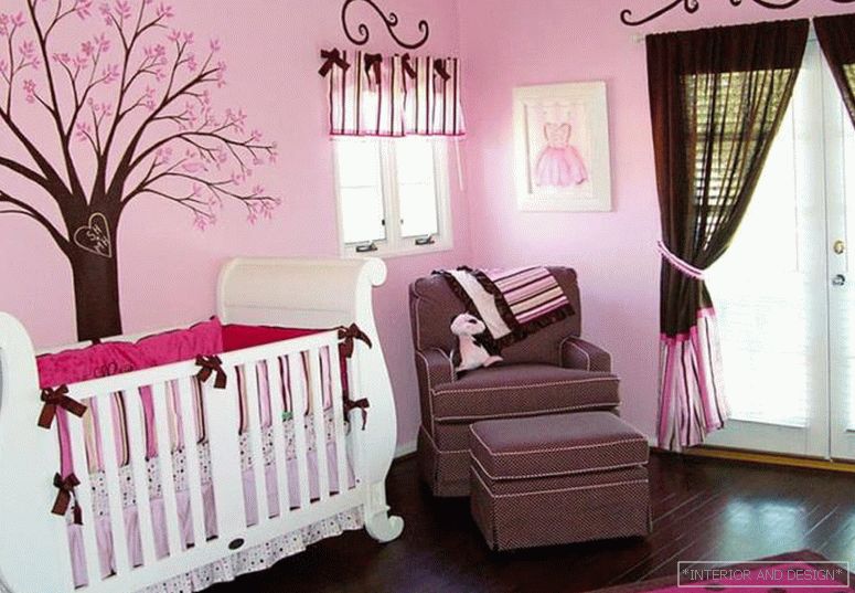
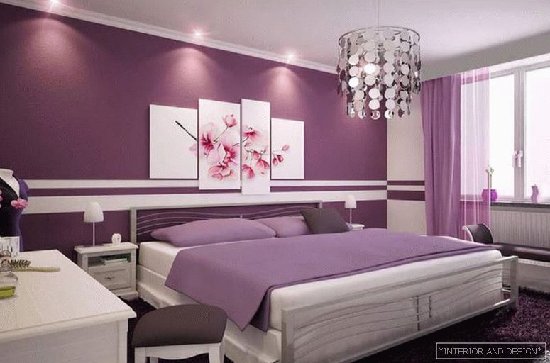
Pink
Gentle, playful and even somewhat infantile. Up to 90% of the bedrooms for girls are decorated in it. It is combined with white, gray, black, red, purple flowers. Used in Provence, Rococo, Glamor, Pop Art and Art Deco styles.
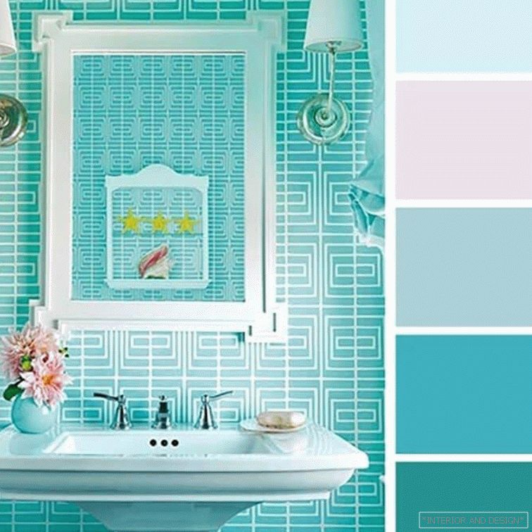
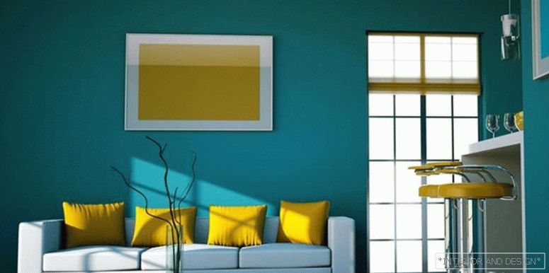
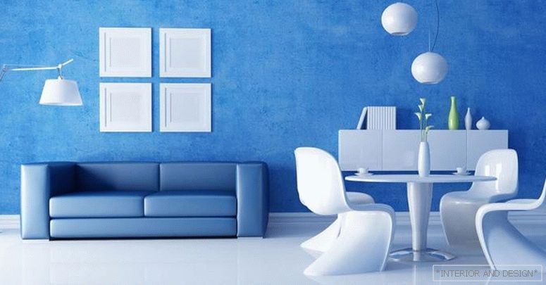
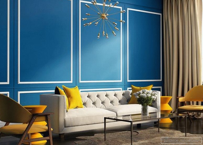
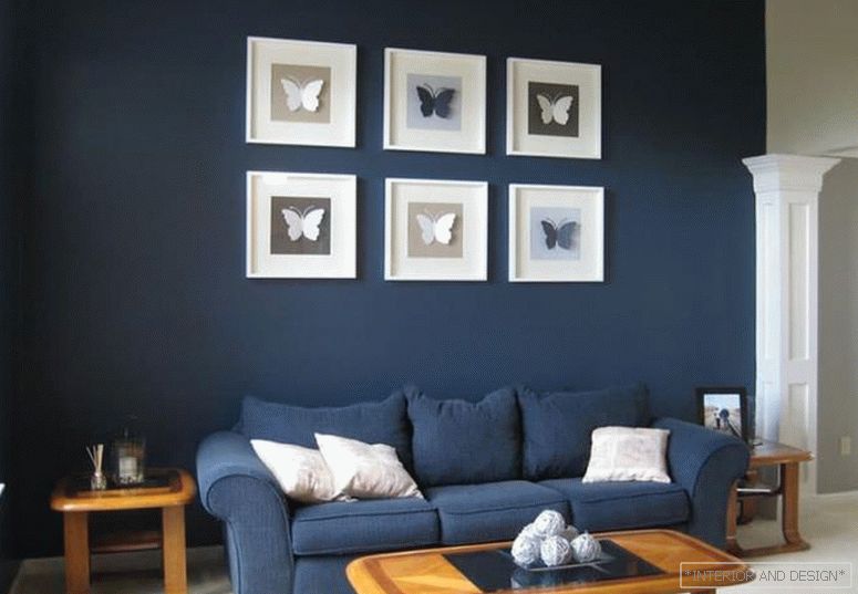
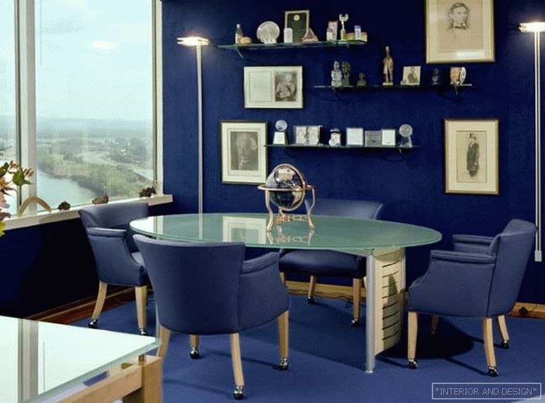
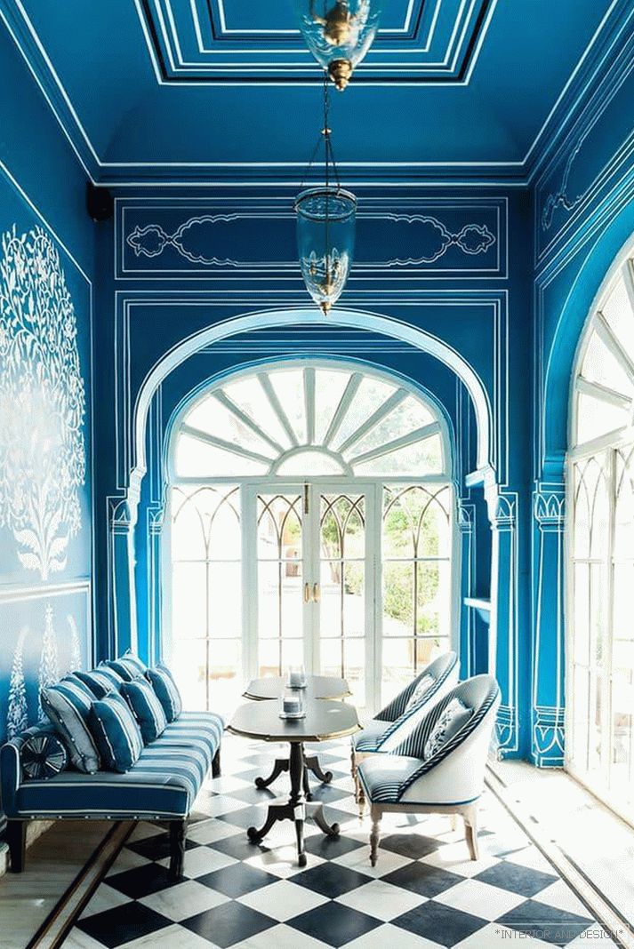
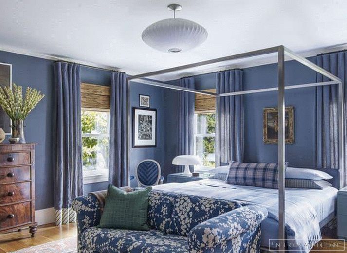
Blue
Blue - это новый черный. Как и серый, достаточно глубокий и многогранный цвет, позволяющий универсально использовать его во всех жилых пространствах. Допускается к использованию в оформлении комнат в любом стиле, но наиболее характерен для прованса, морского стиля, эклектики, хай-тек, арт-деко.
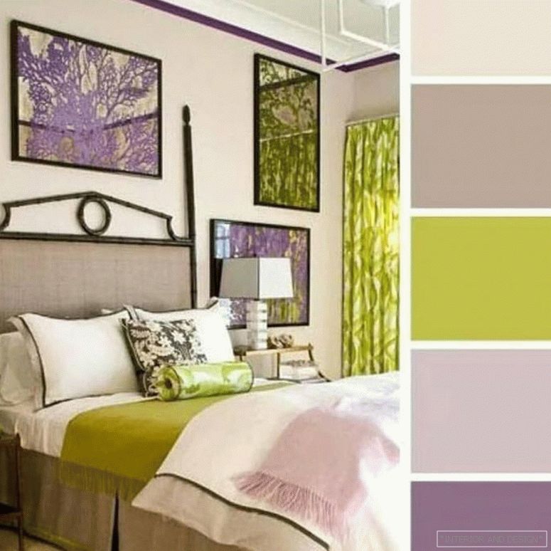
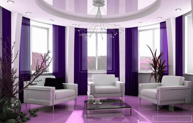
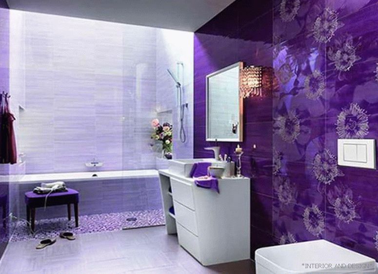
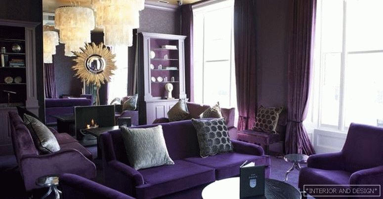
Violet
In 2018, one of the shades of purple was recognized by experts of the Institute of Pantone color as the color of the year. Violet is a rather unusual and unusual color for the design of apartments in the post-Soviet space, therefore it is perceived as an intriguing, mysterious, creative. Characteristic of modern interior design. It is combined with yellow, pistachio, orange, white, gray, black.
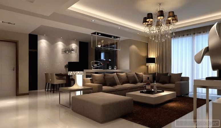
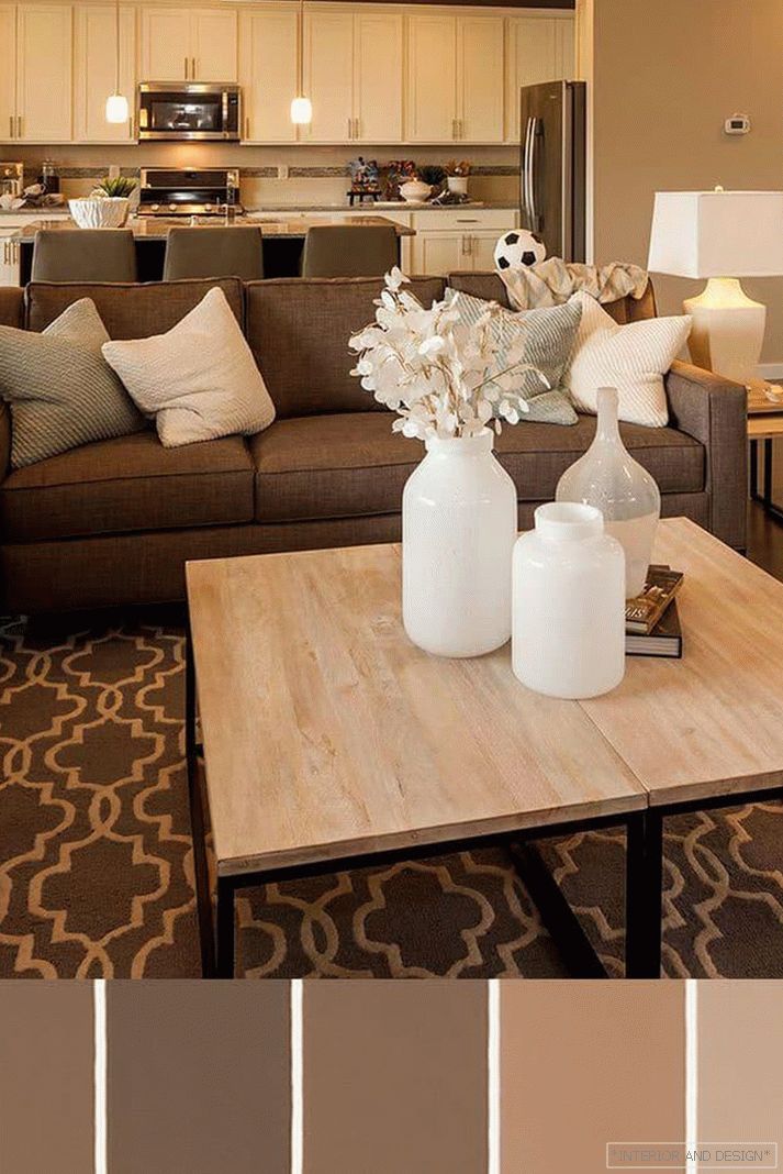
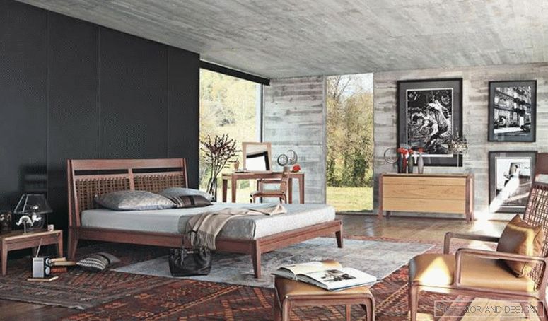
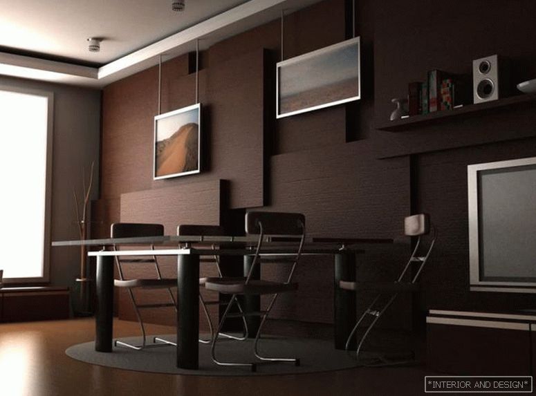
Brown
The universal color of natural wood, so that is the main color of the classic interior. It is considered neutral in all respects.
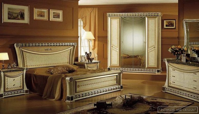
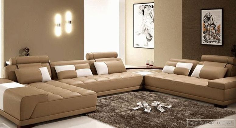
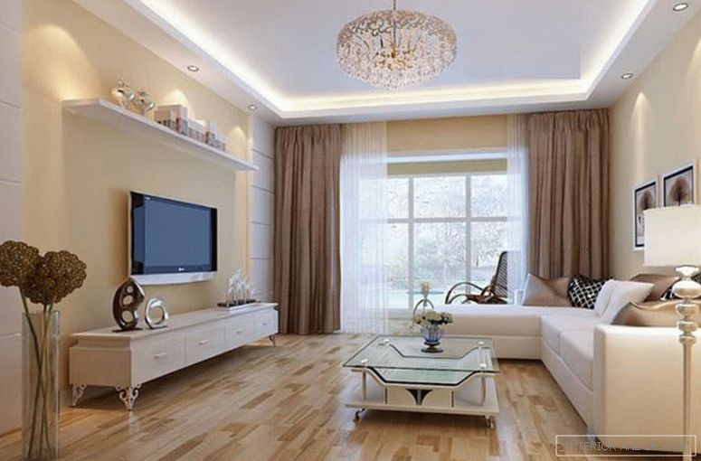
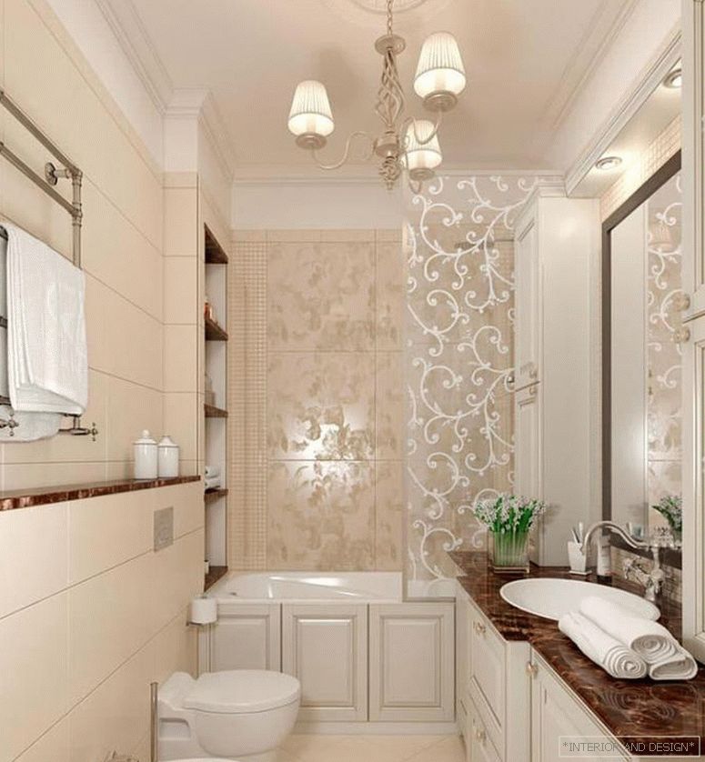
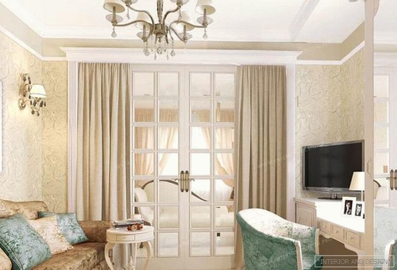
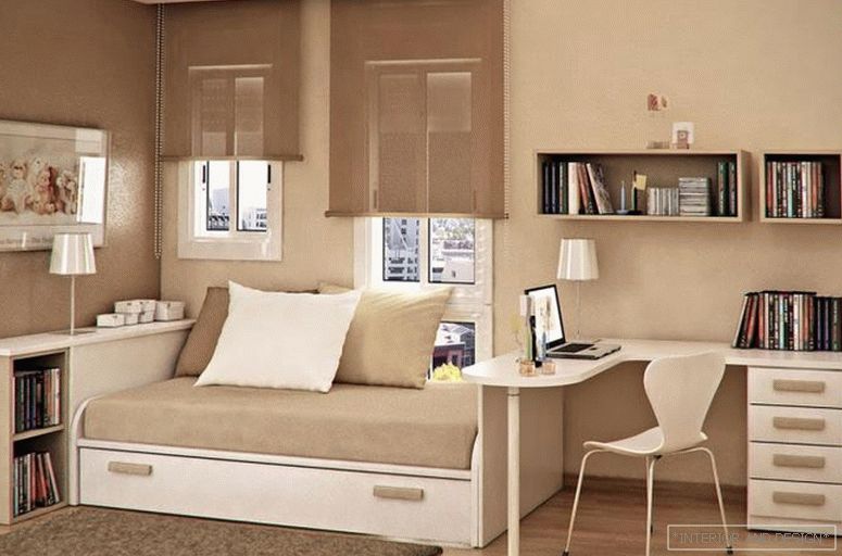
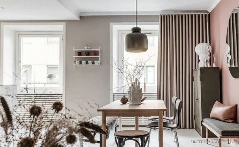
Beige
A softer and sophisticated version of the brown shade. Unobtrusive, pleasant, soothing color. It is often used in the interior of apartments and (especially!) In the bedrooms. Perfectly complements and emphasizes most of the shades used in the interior. Most often used as the primary color in combination with gray, brown, blue or black.