"Forbidden colors for me does not exist, except that white - in my opinion, it stands alone." Geraldine Prieur has a special love for rich colors. In her Parisian apartment she achieved their maximum concentration.
Related topic: Hotel Montalembert: Parisian decor by Pascal Allaman
Her interior projects always provide abundant food for discussion: furniture, wallpaper, fabrics are stunning with an abundance of rich colors and intricate ornaments. Some experts find in her work a similarity with the manner of Elsa Schiaparelli, to others her graphic prints remind Dayan von Furstenberg, others consider that it is “pure Christian Lacroix”.
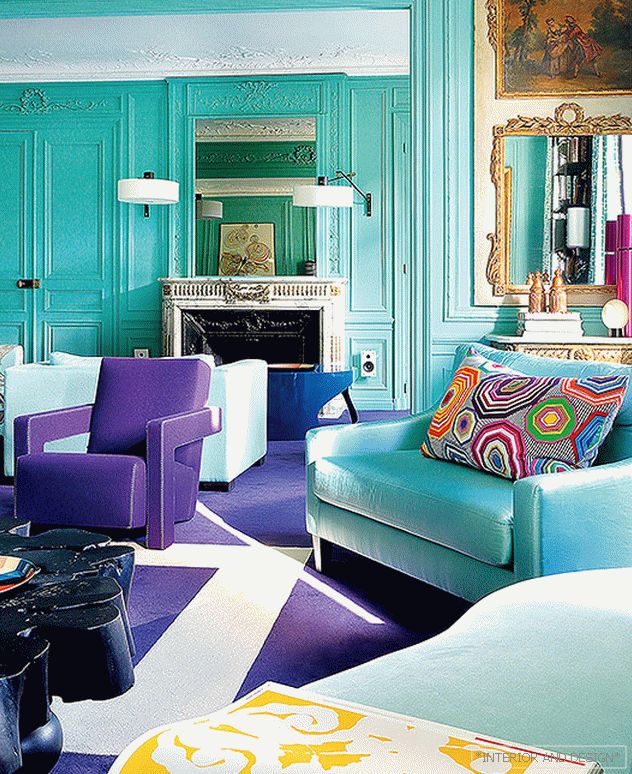
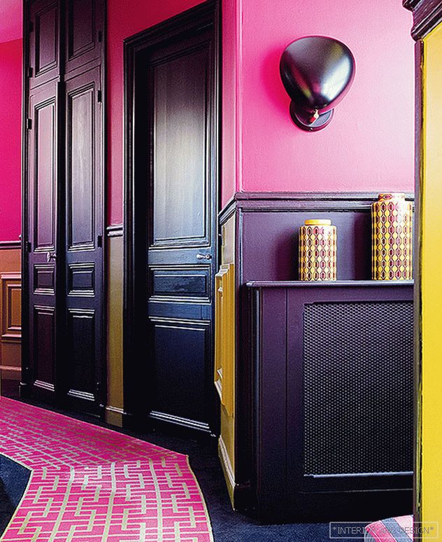
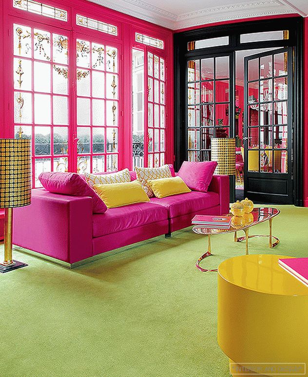
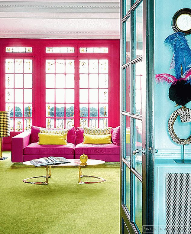
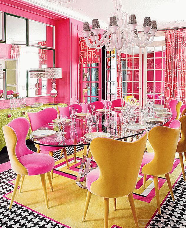
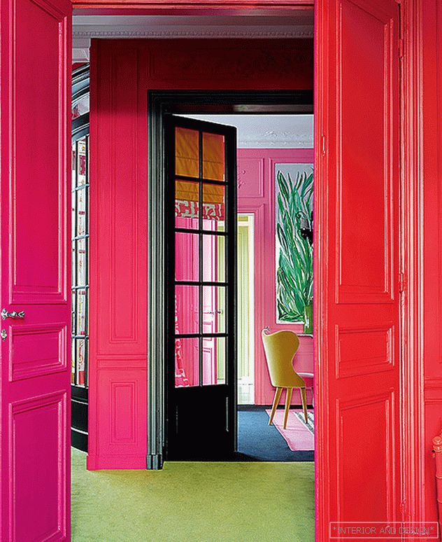
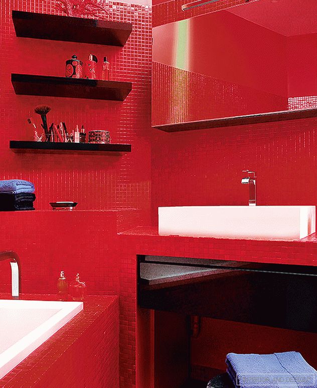
“I have been bathing in color since early childhood,” says Geraldine. - My mother and grandmother were eccentric persons. Both in clothes and in the interior they liked to make a batch of red with plum, yellow with lilac, and all this was spiced up with a pattern for a leopard. Such an environment stimulated my imagination. Already at eight I painted, wrote in colors, cut out applications. And sewed dresses for my dolls on the pattern of my mother's. Then, when I studied at Académie Charpentier and École du Louvre, I began to invent layouts of colors and ornaments, which I successfully sold to publishers of collections of fabrics and wallpapers. At 22, I came to London, where I was delighted by the gentlemen in bowlers, decals with portraits of the queen and the freedom of expression of the British. It was there that I developed my style. And then there was a collection of colored dishes, which was a success in the United States. ”
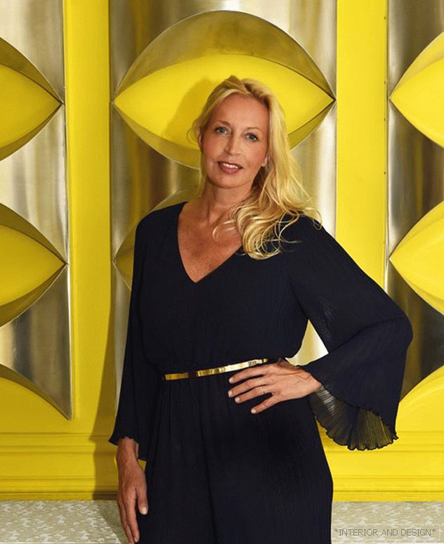
Geraldine is so keen on color that even her studio called Rouge Absolu - “absolute red”. In her own apartment in Paris, where nothing could restrain her imagination, she allowed herself an extreme concentration of color. One can argue for a long time how viable and comfortable such an interior is, but one thing is clear: the owner of the house fits perfectly.
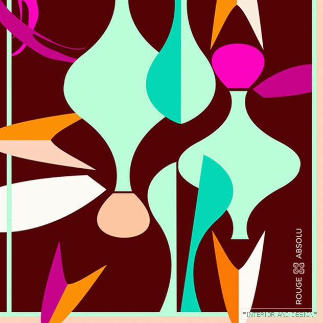
The designer clearly should learn courage and relaxedness in dealing with color. As well as the art of selection of combinations. Geraldine is fluent in a nuanced palette: mixes scarlet, fuchsia, tangerine, rich but delicate pink called malabar, red alizarin (it was previously obtained from the madder root). All these tones are located in the color wheel next to each other, which means that they agree with each other according to the rules of color painting. At the other pole are blue, turquoise, blue, purple nuances - their combination is brilliantly played in the cabin. But what the hostess herself thinks is: “In my opinion, the ensemble of red, orange and plum in the bedroom was especially interesting. Very strong and elegant combination. ”
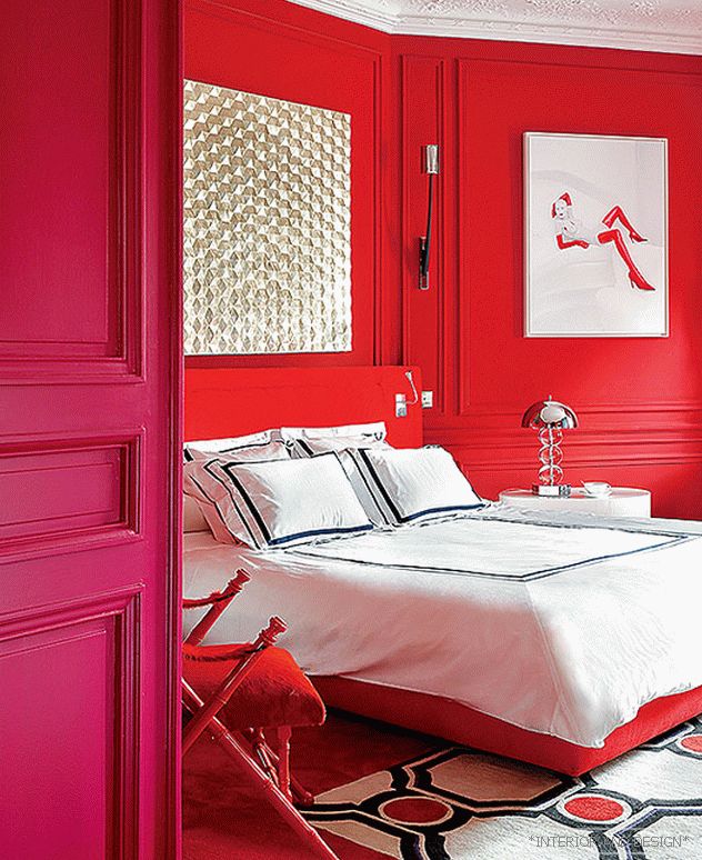
“Color directly affects our emotional state, creativity, performance,” explains the designer. - Warm colors create a feeling of comfort, cold - comfort and peace. I adore facing one another. I usually act instinctively. Another rule: open, active, almost acidic shades are sure to complement the muted, restrained. Such as anise, sand, "prairie" - they are found in nature. And it is also important to remember that multicolor is unthinkable without graphic drawings: for example, the door binders are highlighted in a beautiful dark licorice tone. And in the carpets, fabrics and individual items are geometric ornaments. "
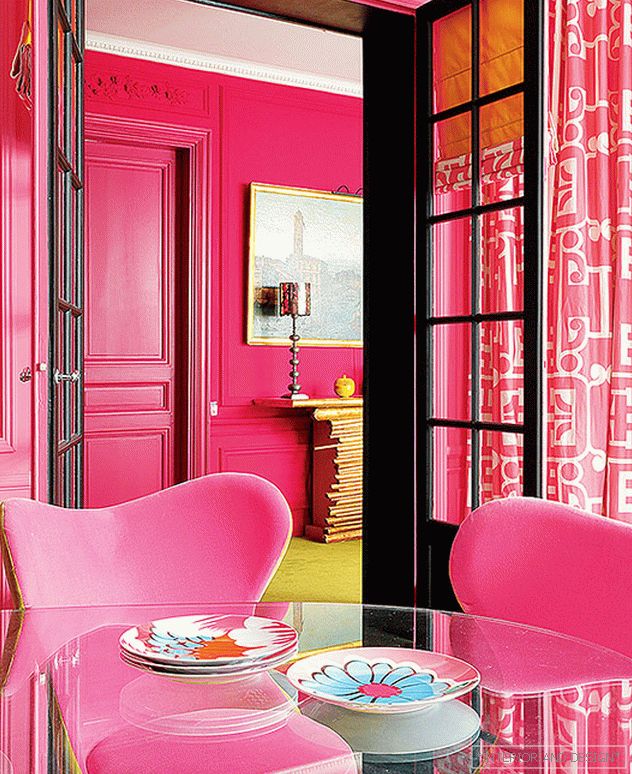
“I start any project by looking for architectural elements that I would like to emphasize. In this case, they were authentic stained glass windows and stucco. The molded decor was painted with gold paint in some places, but I got rid of it. When there is a complex layout of color, gold is clearly too much.
