Experts at the Pantone Institute identified ten colors, which will be dressed in both fashionistas and interiors this fall. These are “autumnal colors reminiscent of leaves in the forest, luxurious plumage and twilight,” deep and rich tones with flashes of unexpected solutions. Among them - the cosmic and mysterious "ultraviolet", called the main color of 2018.
Related: In the color of 2018: things and interiors in the ultraviolet palette
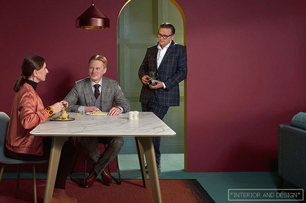 Catalog of the furniture company Pode / Leolux. Netherlands.
 “Designers and consumers are starting to move away from cyclical trends and focus on colors that allow them to express themselves, which are not typical of the outdated division into seasons. We see quite remarkable and unconventional options for the autumn-winter palette, such as “spotlight” or “crocus petal,” notes Litris Aisman, executive director of the Pantone Color Institute.
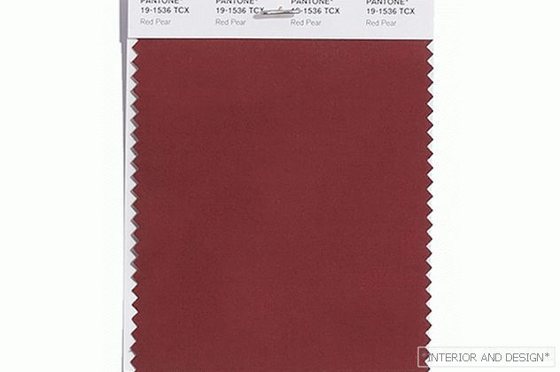
"Red pear" / PANTONE 19-1536 Red Pear. Soft, decadent burgundy with a cool midtone. “Delightful deep red with seductive depth,” describe it in Pantone.
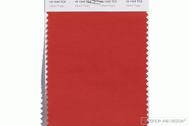
"Brave poppy" / PANTONE 18-1549 Valiant Poppy. The rich color of the gem directly from the classic autumn palette. According to Pantone, “a bold and friendly shade of red, unrestrained in its charm.”
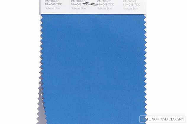
"Blue Nebula" / PANTONE 18-4048 Nebulas Blue. It is an electric, sky blue hue. Pantone describes him as "twilight-like," "thoughtful, star-blue."
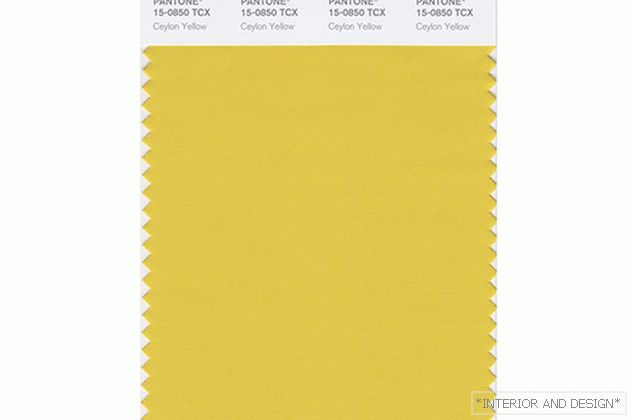
"Ceylon yellow" / PANTONE 15-0850 Ceylon Yellow. Saturated silky shade, somewhere between the color of yellow gold and greenish brass: “spicy and spicy, adding a bit of exotic”
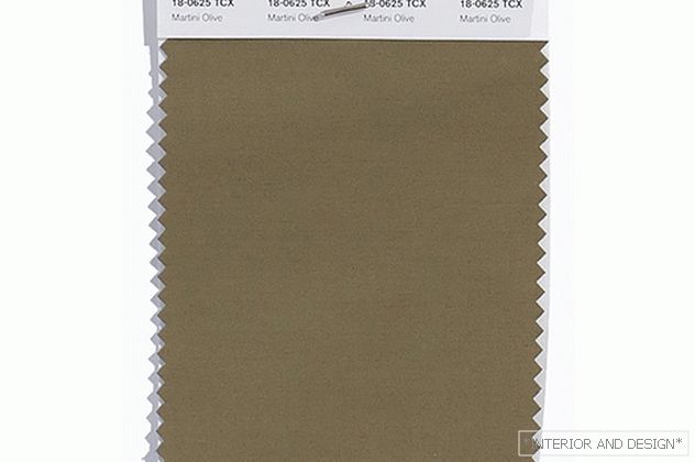
"Martini with olives" / PANTONE 18-0625 Martini Olive. “Calm, complex, urban green, which adds depth to the autumn-winter palette,” this is how it is described in Pantone.
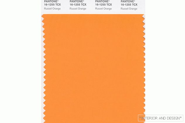
"Red Orange" / PANTONE 16-1255 Russet Orange. Orange shade, more red than yellow. Pantone associates it with nature, fallen leaves in the forest and notes its warm, earthy character. Russet Orange claims to be one of the main "organic" shades of today.
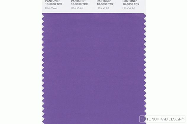
"UV" / PANTONE 18-3838 Ultra Violet. The main color of 2018 is a bright, mystical, color of spirituality and a non-standard view of life. Tint of purple with a deep blue subtone. “Inventive and creative, Ultra Violet illuminates the path to the future,” says Pantone.
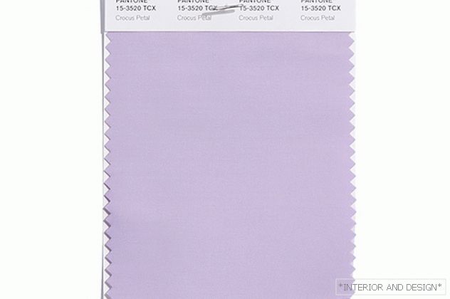
Crocus petal / PANTONE 15-3520 Crocus Petal. Gentle, cute, but at the same time energetic shade, the perfect companion for "Ultraviolet." In Pantone, it is called a “cultivated and refined shade that adds a light and airy spring mood.”
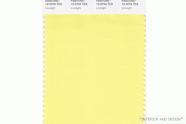
"Spotlight Light" / PANTONE 12-0740 Limelight. Light shade of yellow, poignant and hearty. Pantone describes it as "vibrant and effervescent, savory yellow-green that attracts attention."
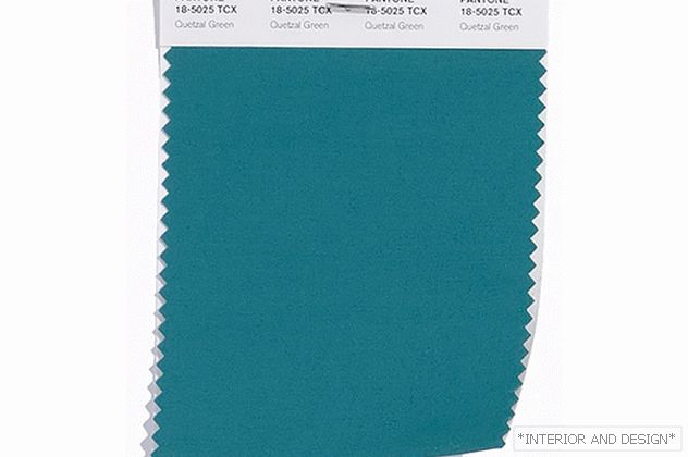
"Quezalsky Green" / PANTONE 18-5025 Quetzal Green. Soft tilov shade, named after kvezalya - a bird living in South America. "A deep and elegant blue-green color that resembles luxurious plumage."


