Loft in San Francisco - a project of architect Stephen Jones. The customer of the reconstruction was the American collector and artist Francis Mill. They met a long time ago, more than fifteen years ago, it happened almost by accident when Stefan Jones was looking for a painting canvas of the 1950s for his project.
Related: British loft by Moreno Masey
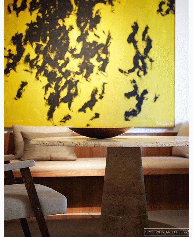
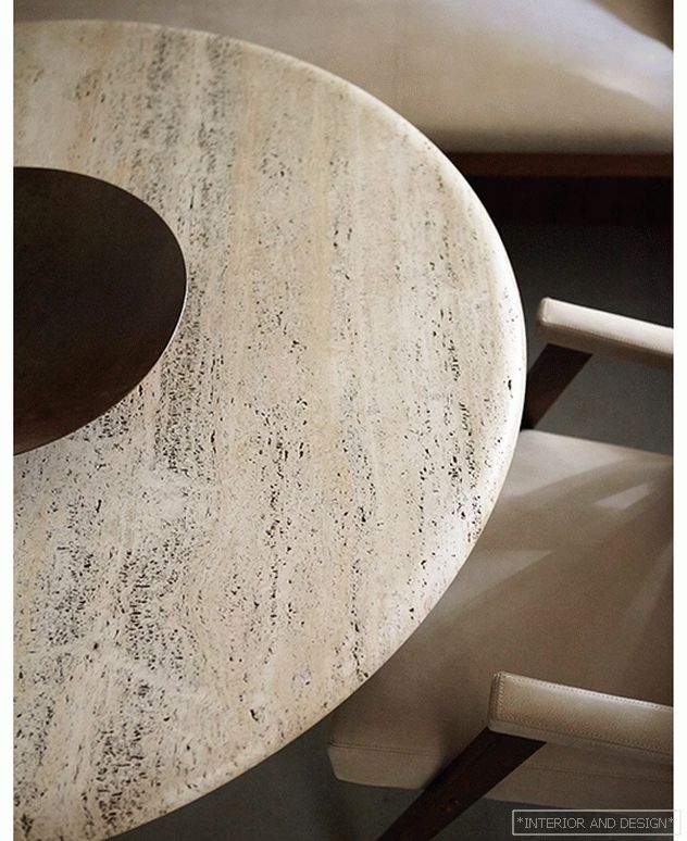
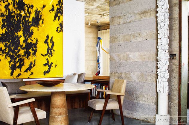 The dining room. Italian chairs upholstered in leather. Table with a leg of travertine, pillows are covered with silk Jim Thompson. On the wall is the work of J. Schuler, sculpture-column - the work of R. Farall.
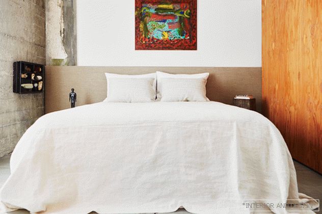
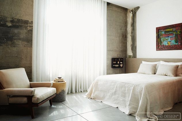
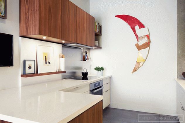
Since then, do not lose sight of each other. Having bought an interesting room of 111 square meters. meters, Mill entrusted the project to an old friend. Loft is located in a former pharmaceutical warehouse (built in 1937) in the South Market area. Today it is a fast-growing area of San Francisco with new skyscrapers, museums of modern art, as well as trendy restaurants and hotels.
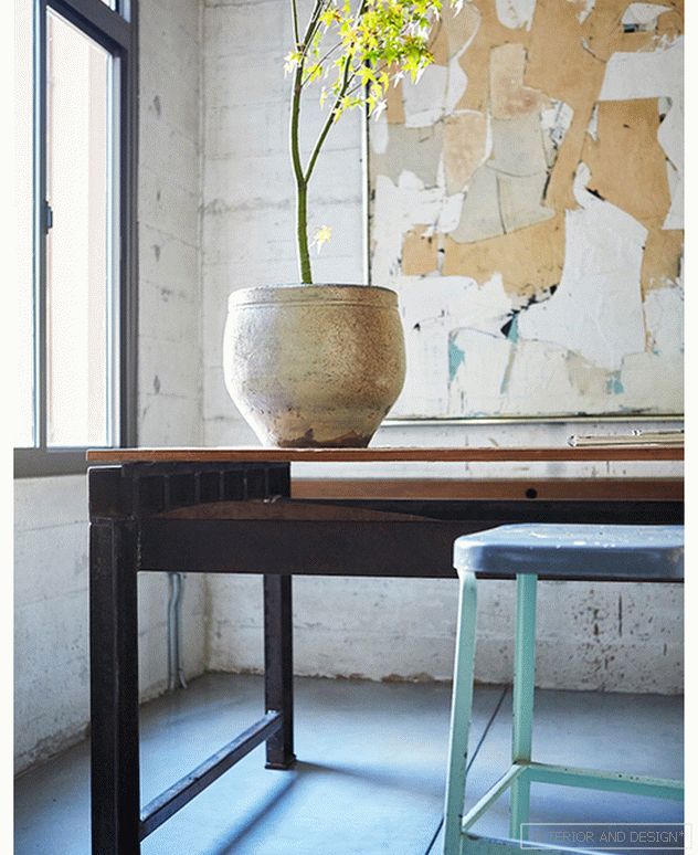
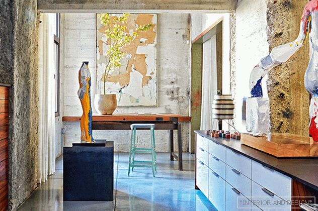 Workshop. Sculptures M. Neri. Vintage table. Curtains Soggio.
 Both the customer and the author liked the three and a half meter high ceilings, protruding concrete beams, wide doorways and an abundance of empty meters. Here it was necessary to create a flexible, functional environment, which would be both a dwelling and an artist’s workshop.
The key word for this loft is “sketch”. Here everything can change.
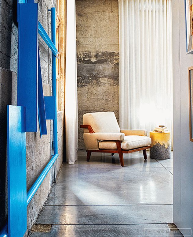 Blue metal construction - sculpture by B. Walla. T
 “Mill was always very creative,” says Stefan Jones. - He is a philosopher, doing artwork in the technique of collage. In addition, he was an architect by his first education, therefore we understood each other perfectly. ” The space is very conditionally divided into rooms: the doorways are not processed in any way, but are hung with light dense fabric curtains.
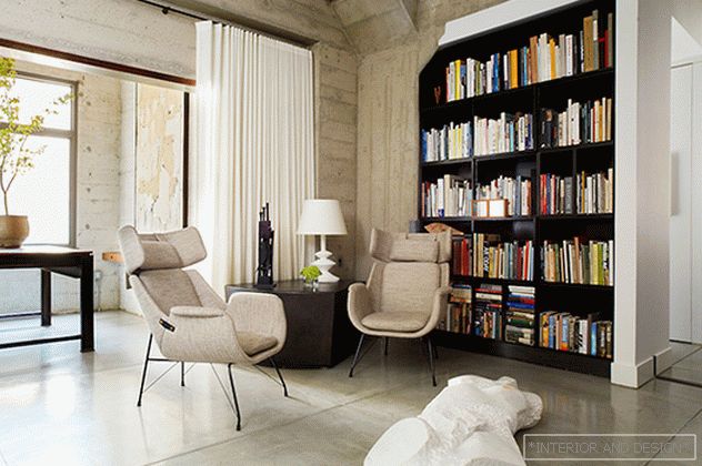
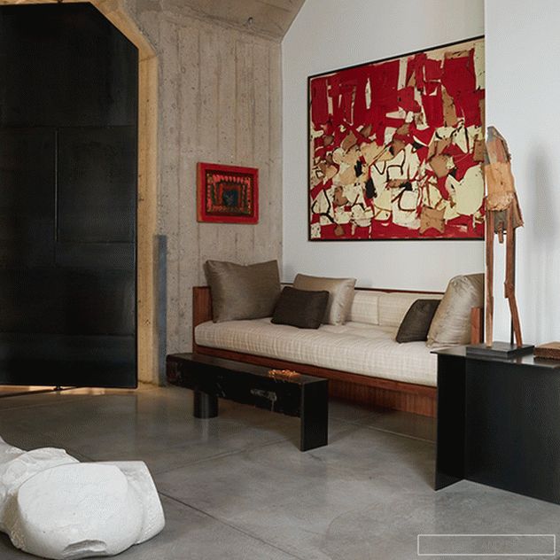 Living room. The wardrobe is made to order. Polished concrete floor. Sculpture M. Neri Odalisque I. On the wall to the right is a painting by K. Mark-Relly.
 “The interior can change a lot, partitions and furniture move easily,” says the architect. For balance, Jones created “anchor zones” - stationary furniture groups, such as a living room niche, furnished with minimalist furniture: low objects help to clear space at eye level.
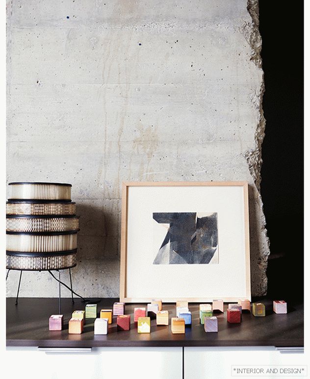
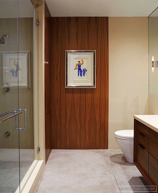
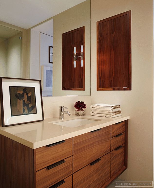
The only black metal door serves as both a space divider and a reference point. Jones and Mill unanimously agreed that coarse raw concrete should be left intact, but the floor should be polished to a shine. Moreover, together they chose such pictorial canvases so that peeled concrete looked even more brutal.
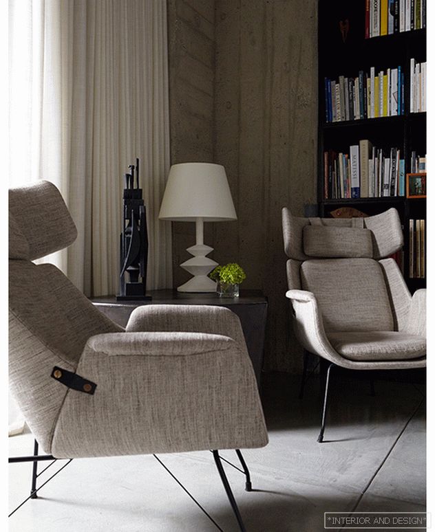 1950s Italian chairs in Gant tweed.
