Neutral design

 Passing the gallery
 A photo: Dmitry Livshits - from the archives of the press services
Leading headings: Marina Volkova
Magazine: (141)
Remember the "White Sun of the Desert". The name of the film is not an artistic metaphor. Under the rays of the scorching sun all around is white. It is no coincidence in hot countries, where + 50 ° C is the usual temperature of July-August, so much white in architecture. It reflects light, in the summer gives a feeling of coolness, freshness. In addition, do not forget about the artistic background. It seems that there is nothing more picturesque than such a contrast: snow-white buildings against the backdrop of the azure sky and sea shades of Iranian turquoise!
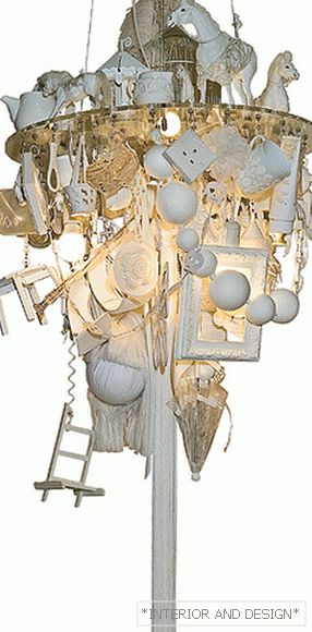
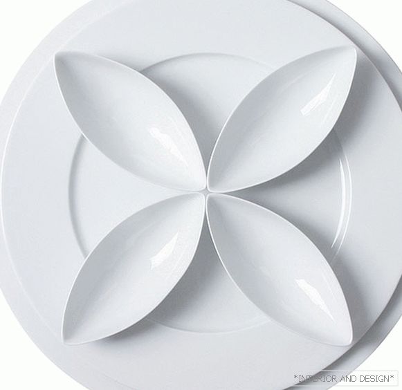
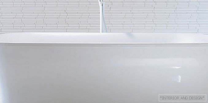
White - one of the most ceremonial flowers. It is time to think about it, selecting the design for the solemn event. This color is also considered one of the most neutral. Color therapists equate it to the concept of relaxation and are recommended to use to create an atmosphere of relaxation. But do not overdo it: overdo it - and the house will look like a clinic. You can stand in this color for some one room, such as a bedroom.
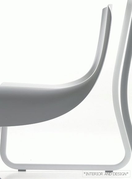
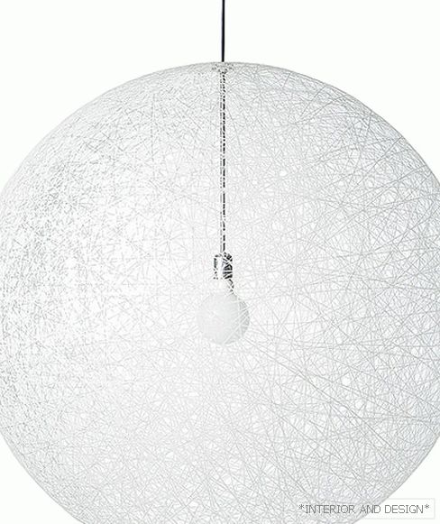
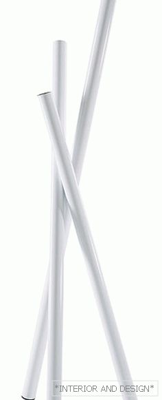
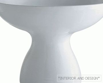
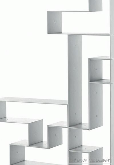
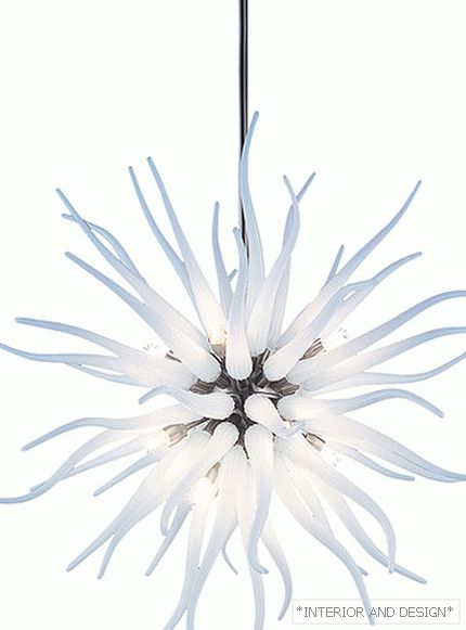
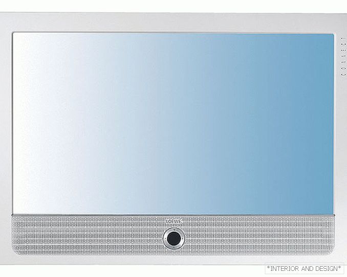
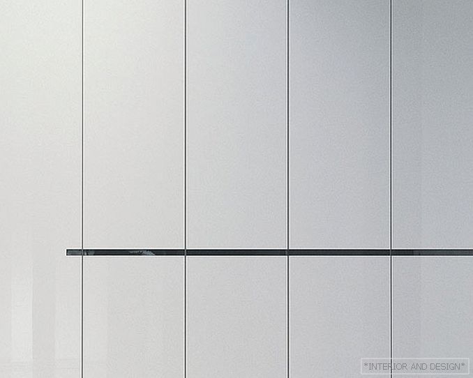
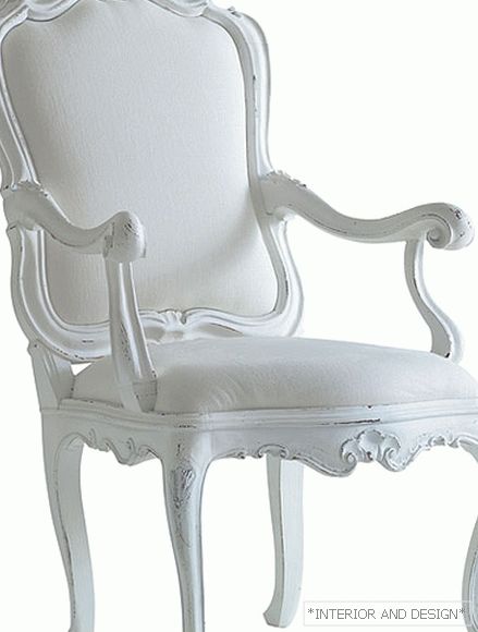
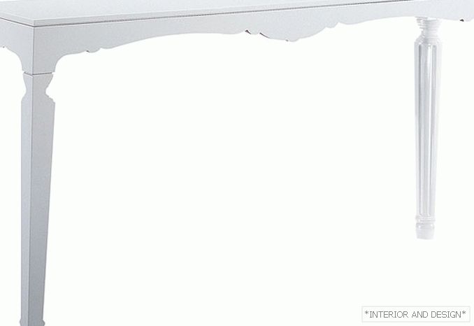
And finally, white is the most "omnivorous" color: it can be used in any interior, regardless of the overall solution - from classic to minimalism and high-tech. If in the first case the emphasis is on references to the past, to antiquity, then in the second they appeal to the severity and restraint of modern lofts. The space “in white” is a good background: any interior objects, especially of contrasting bright colors, will look advantageous in such an environment. White plus bright is the perfect design move. The apartments will immediately be called stylish!


