Exquisite interior color palette: wine with hints of raspberry and prune, ocher, beige and olive

 Passing the gallery
 Magazine: Decor N4 (115) 2007
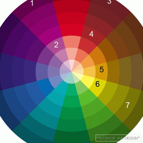
And complementary colors, as you know, are ideal companions. If you go to the periphery of the segment where this shade of beige is located, in the group of deep, “dense” colors we will find olive (7) (in the bedroom there are accessories of this color). With the run (6) side by side, the color of ocher (5) is adjacent, equal to it in density.
The author of this interior used a generally dense tone. If we look at which "orbits" of the scheme are colors, we will see that they are not chosen from the center of the circle, but from the middle and far "orbits", where saturated tones are located.
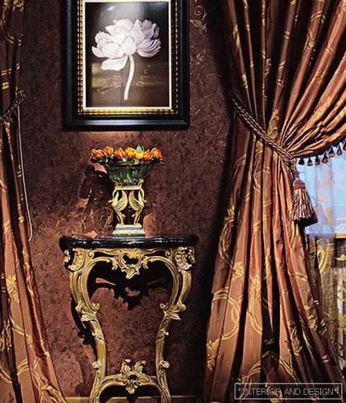
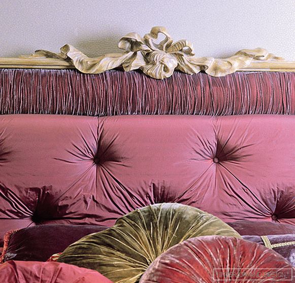
They create the mood of luxury and comfort in the interior. Note that the laws of compatibility work not only in a pair of "color - color", but also in a pair of "color - material", because different textures refract light differently. And the decorator subtly followed these laws. For example, raspberry can be polished wood, glass, velvet. But crimson is especially good if it is velvet color, the texture of which gives depth to color. Similarly, ocher (5) best manifests itself in gilded carved (wooden and metal) parts. And shades of prunes and blueberries (1, 2) - in hard silk like taffeta.
p. 3 of 3<< Previous page


