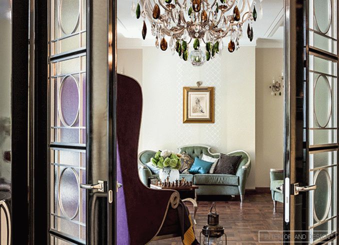
Designer Lada Podolskaya has created a modern, respectable interior in the spirit of art deco, creatively rethinking the style of the 20s of the twentieth century.
 Passing the gallery
 Magazine: Decor N1 (200) 2015
The epoch was indeed remarkable: here successes of Egyptology, and surrealist exhibitions, and new music — jazz, and the first skyscrapers, and the first rapidly acquired capitals (one of the methods shown in The Great Gatsby), and significant literary works ( By the way, was released in 1925). The interior of the time, as in the rebus, in an encrypted form contains the pathos of dizzying takeoff, faith in the power of money, love of luxury ... 90 years have passed since then. Today has its own meanings and inspirations, and the historical art deco is perceived rather as a treasure trove from which one can draw ideas for one’s own variations.
So in this case, says Lada Podolskaya, it was just that. Customers, Americans living in Moscow, wanted to see in their new apartment a modern arrangement of a historical theme. Art Deco has its own rich history in the New World, and therefore this style was especially close to the owners of the apartment: they perceived it as an image of comfort and the personification of elegance. It is difficult to disagree with them: an art deco with its contrasting palette, noble materials and expressive forms can be very comfortable and status at the same time. The author of the project tried to emphasize this component of the style in her work. “That is, in the interior of this apartment everything had to be calm, comfortable, relaxing,” explains Lada Podolskaya, “but at the same time he also had to have some kind of“ spring ”, carry hidden drama, create his own story.”
The “spring” here is the reception of color contrast. The starting point becomes the entrance hall, decided in a strict combination of black and white. Decorative accents velvet-black in almost all rooms. The front area's palette is built on a softer combination of hues — dust olive and violet. It should be noted that shades vary — from thicker and more saturated to brighter and more airy. If you look closely, then textile wallpaper, for example, a very light, barely noticeable olive tone. “The color seems to diverge,” says the author of the project. “It changes from more saturated to less saturated. For example, the shades of the armchair and sofa in the living room are thick olive and purple, and the shade of the curtains is muffled. Here, olive tulle is hung over thick purple curtains, and this gives the effect of mixing shades. ” The color palette is worked out scrupulously: the warm tone of silver on the table by design by Christopher Guy corresponds to the warm tone of the velvet upholstery of the sofa (and all the rest silver is selected in the same way).
“I have long wanted to work with the CHRISTOPHER GUY brand,” says Lada Podolskaya. “I was always attracted by how Christopher feels art deco, as he poetically interprets it. Not in any context such furniture will look organically. In this project, my dream came true unexpectedly: it was precisely these things that were needed, both fantasy and luxurious, discreet and elegant. ”
The furniture of this brand in the interior is really a soloist: the armchair and the coffee table (together with upholstered furniture) form the appearance of the living room, and in the main bedroom the bed with a hypertrophied high headboard is the central object. Artistic solutions of this interior would hardly have looked so harmonious, if not for a logical, well-thought-out layout. The division of the apartment is three-part. To the right of the entrance, through the corridor, there is a children's territory: children's bedrooms, nanny room, bathroom, dressing room. On the left — the entrance to the public area — the living room, which is combined with a wide opening with a kitchen-dining room. A door from the living room leads to the parents' private territory, which includes a bedroom, a study, a bathroom and a large dressing room. The author paid much attention to storage systems. These solutions, seemingly purely functional and “behind the scenes” of this beautiful interior story, are in fact very important: thanks to them, there is nothing accidental in the “frame”.
Read the full text in paper or


