московская квартandра (250 м2) в пентхаусе Дмandтрandй Кулandш, Anna Karpova
 Passing the gallery
 Interview prepared: Olga Korotkova
A photo: Zinur Razutdinov
Project author: Дмandтрandй Кулandш, Anna Karpova
Architect: Anton Saiko
Magazine: (103)
Architects tell about their apartment project in the penthouse
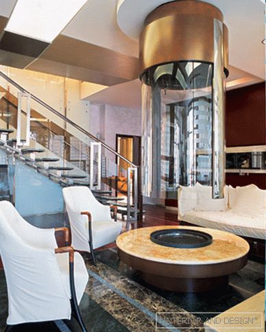
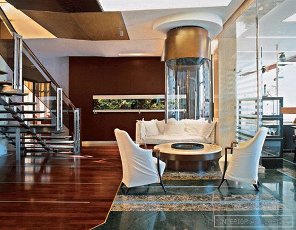
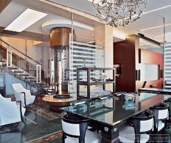
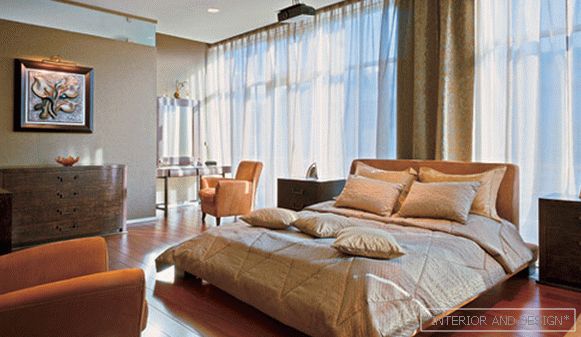
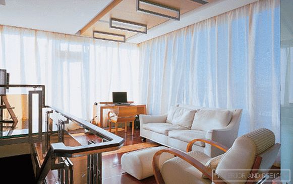
D.K .: The main thing in the interior is the combined space of the living room, fireplace, dining room and kitchen. Since the room is quite large, we symbolically divided it into functional parts with the help of glass screens - once, with the floor texture (stone, wood) - two, with a ceiling pattern - three, with color - four. Here are the basic planning techniques. On the one hand, these techniques allowed to “dismember” the space, give it multifunctionality and variety (just imagine a single-color uniform space of this size - you get something like a gym or an exhibition hangar). On the other hand, all elements of these functionally different zones are related by common themes. First of all, the connection is supported by materials and colors. It is non-standard, from the point of view that we usually use active colors. In this interior it is much warmer. All colors are muted. There is neither orange, nor red, nor burgundy. Not a single pure color. There are either maroon violet or soft shades of brown, beige ... If it is green, then it is not “hysterical”, herbal, but calm, in the autumn gamut. So if the forms are modern, dynamic, the colors, on the contrary, are as calm as possible, otherwise a sharp, radical interior would appear, striking the viewer. And the task to hit in no way was not. The number one object in this room is the fireplace. The first thing that sees a person entering the apartment is such a huge glass column. The impression is quite strong.
A.K .: Камandн - это правandльный центр. Это как у древнего человека: главное - очаг, огонь, у которого собandралась вся семья.
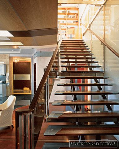
D.K .: Behind the fireplace is a dark wall of wenge, and in it a horizontally stretched glass “strip” is an aquarium. This whole undertaking is like a backdrop for the living room. If the wall had been made light, the space would have seemed endless, but we just wanted to limit its development, “put an end”. Since there are practically no walls as such - one glass, we materialized this wall.


