studio apartment of 70 m2 in Riga

 Passing the gallery
 Text: Olga Vologdina
A photo: Martin Kudryavtsev
Stylist: Arthur Mutyanko
Project author: Sergey Serpukhov, Дмитрий Юхневич
Installation: Evgeny Seredkin
Painter: Dmitry Chudinov
Magazine: (136)
Именно так рассудили латвийские дизайнеры, когда приступили к работе над этим интерьером. Хозяйка, целеустремленная девушка, ведет активную жизнь. Успевает многое: и учиться, и работать, и путешествовать. Автор проекта Sergey Serpukhov говорит, что с самого начала они подошли к дизайну с точки зрения психологии. Выбор стиля и архитектурного решения - все это было потом, а вначале они пытались изучить характер, пристрастия, образ жизни клиентки, для того чтобы создать пространство стильное, элегантное, характерное и подчеркнуто женственное.
"I wanted to make the interior light, filled with light and air, to further emphasize its feminine character," he said.
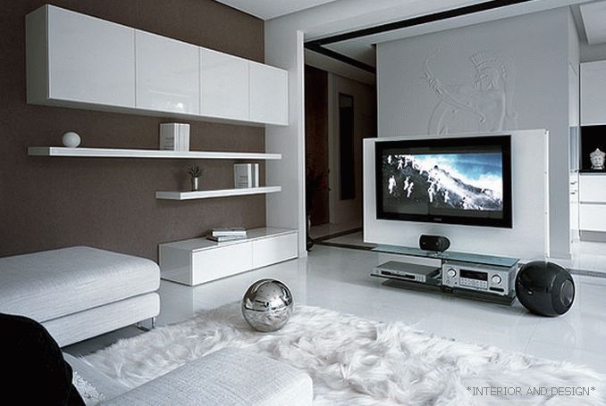
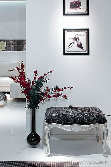
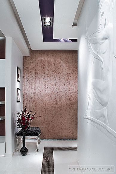
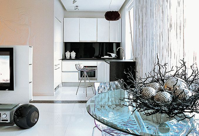
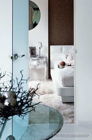
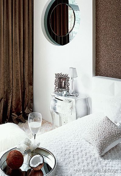
An important component of the design is a light scenario with several lighting modes. If during the day there is enough natural light from the panoramic windows, then in the evening the lights turn on, including the diode one, which completely turns the living room into a kind of club with a relaxing atmosphere. Thanks to the interesting colors and carefully selected accents, the mood of a luxurious boudoir is created. Despite the fact that the space is minimalist, it should evoke positive emotions and associations, the customer should feel comfortable. In general, the associative series plays an important role here. For example, the hallway was decorated with two sketches of fashion designers of the era of the 30s-40s, and the bedroom was designed to be warm in sensations (soft carpet, beige-golden-chocolate shades, velvet curtains). In general, I would describe the style as luxurious minimalism.
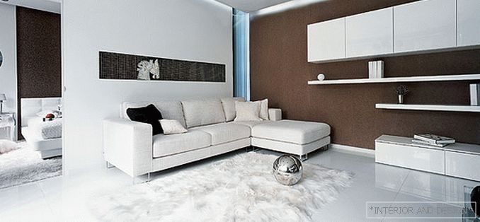
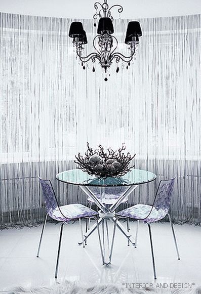
The apartment was located in the new house and had the necessary planning flexibility: no bearing walls, only communications in the corner of the room. You could do anything. We left the space as open as possible - on the principle of the studio. The customer is an energetic girl, and the apartment is small. The usual division into rooms was useless. We understood that she simply could not live in a close space. Her only wish was a sauna. To do this, we had to increase the area of the bathroom, carrying part of the wall into the living room. In the resulting niche placed kitchen appliances, while the kitchen naturally fit into the common space. The center of the apartment was the living room, which unites the living room, kitchen and dining area. Thanks to the glass doors and modules in the wall, the bedroom is organically combined with the common space. Moreover, the entire floor - with the exception of the bedroom - is lined with glossy stoneware tiles and visually unites all areas of the apartment. "
Architect
Shooting accessories provided by Spice TC, The One, Alan Deko, The Pier, Kapuce, Itehio

