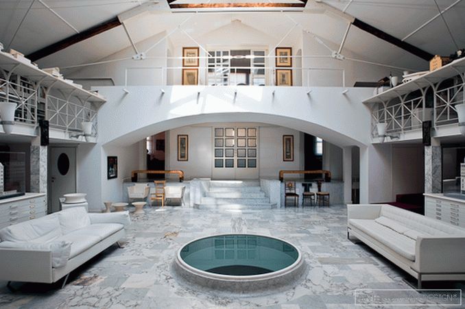
Studio of the famous Italian architect
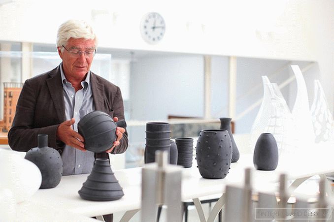
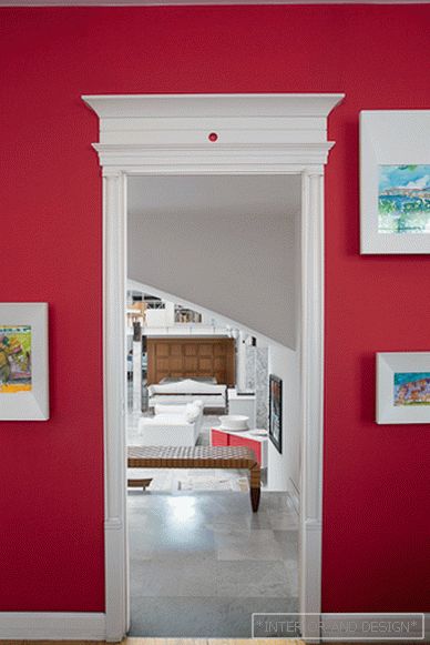
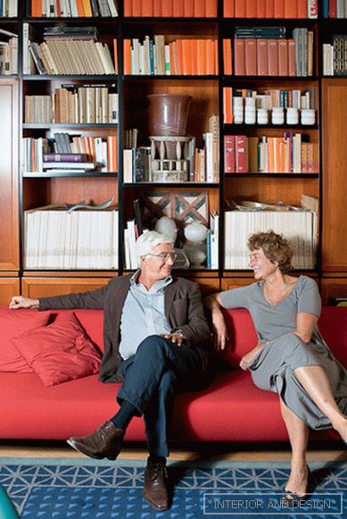
 Passing the gallery
 Interview prepared: Olga Korotkova
A photo: Ivan Sorokin
Magazine: N1 (156) 2011
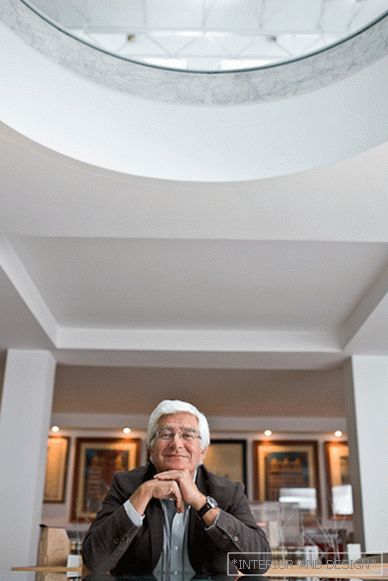
In his 59 years, he did quite a lot - he designed city blocks, apartment buildings, hotels, sofas, chairs, as well as knives and teaspoons. In Milan, there is a building that Skakketti “cut” vertically in the middle, connecting the two parts with a transparent “spine”, so that passers-by could see the oldest tree in Milan
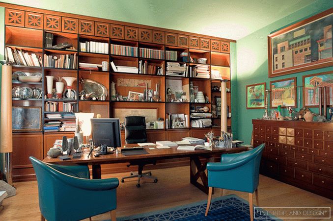
SALON: How is your day built?
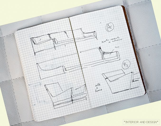
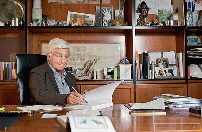
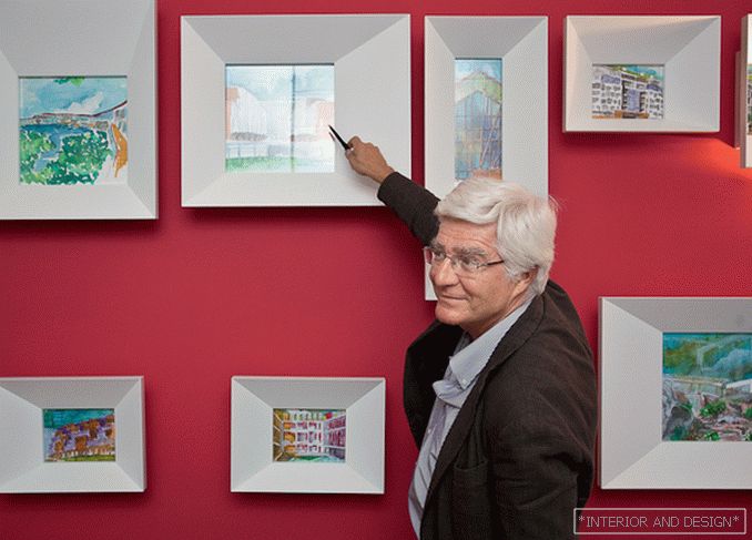
- My day starts early. At 7.30 I am already here in my office. At 9.00 in the morning my employees come, and by this time I should have a fully “project” of the day. I always draw only by hand. I don’t work on a computer at all, I only read mail. I draw in pencil and watercolor. Sometimes these drawings become the exposition of my exhibitions and ... books (today I will present these books to you).
S: How has the world changed since you were a novice architect?
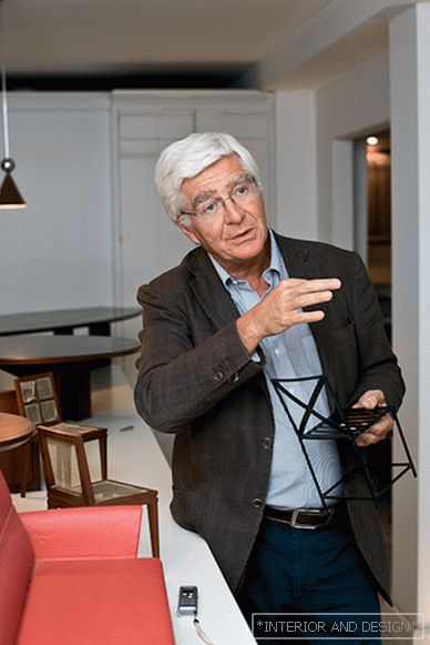
- Everything has changed, dramatically. So much change that you can’t list them, and they are obvious. Another thing is important. Quality requirements have not changed. It seems to me that these requirements have even increased - to the quality of design, to the quality of materials. By design quality, I mean not comfort, not the emotion of surprise that a person has when he sees a new thing. The matter is different: the thing, the idea, the form - all this should be really NEW. I never copied what was already. My task has always been a new solution. Look at this model of chair with a cruciform square back. Since I designed such a backrest almost 30 years ago, thousands of similar chairs have appeared. But then I first proposed this idea!
S: Has luxury become more sought after?
- I would not speak about luxury. Or rather, would speak of luxury as elegance. Now the design of furniture and interior becomes more clean - more elegant. To find the right, necessary thing, a person has to make a choice from a huge variety of subjects. It is difficult, and it obliges the designer. Yes, I believe that the world is moving from luxury to elegance.
S: Tell us about the project that you did for the Verona exhibition Abitare il Tempo 2010.
- This is an experiment. I created the interior for a rich villa. Here, pure simple forms and at the same time luxurious, expensive natural materials - wood, stone ... In my presentation this is a clean modern design. It is these projects that I offer to my clients in Sardinia - mostly they are very wealthy Italians.
S: I would define your style as neoclassical. And how do you see yourself?
- Classic - one of the most ambiguous concepts. For me, a classic is not what it was then, or what can be done now. Classic is the ratio. The ratio of proportions, colors, materials is a way to think, a way to see the world. Notice that at one time what we used to call a classic was new, even avant-garde! But there is another side to the issue - the classic form, which is visible through the modern form. This is my topic. See, this sofa is for

