квартира (126 м2) в Ростове-на-Дону Alexey Solovskiy
 Passing the gallery
 A photo: Peter Lebedev
Interview prepared: Oksana Kashenko
Project author: Alexey Solovskiy
Magazine: N4 (104) 2006
When the customer invited me to work on this object, he already knew what he would see here, ”says the architect.
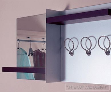
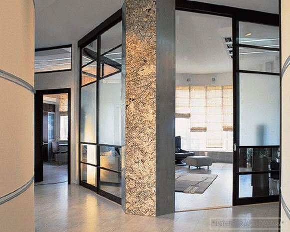
The apartment is not very big, so it was not possible to completely abandon the corridor. But it turned out beautiful, with semicircular walls. In order to revive them somewhat, I thought of making aluminum rusts throughout the corridor. It is very modern and looks expressive. There is also a share of practicality: we framed aluminum walls. In fact, in the lobby I wanted to make some beautiful corner with a painting, but the customer preferred a more restrained aesthetics. This is such a rare case in architectural practice! Usually you have to persuade the customer to abandon the excessive multicolor or from decorations. And here it was almost the opposite.
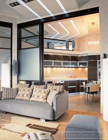
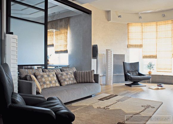
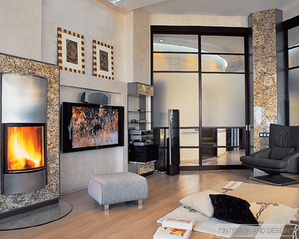
The great advantage of this apartment is the height of the ceilings. All the rooms, if measured by floor space, come out small, and if you take into account the cubic capacity - quite decent. High ceilings really make the apartment large, spacious. Although, if you look, the same kitchen is quite small, it is even more upward stretched than in width. We decided to use this dignity to the fullest, by inventing to unite several rooms with the help of the second light, and we did almost the full width of the walls in the living room, kitchen, office and children's room. That is, being in the living room, through these windows you see the walls and ceiling of the other rooms. This gives integrity to space, combines different rooms. We emphasized the line of the second light with a broken ceiling with illumination. In the evening it looks very impressive - the light is reflected in some glasses, it is refracted in others ... Especially since this broken line repeats the outline of a part of the octagon - again, a quote from the Japanese.
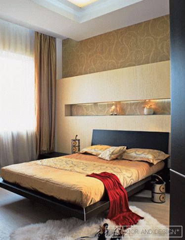
The only room that is somewhat out of this theme is the bedroom. At first she also thought ascetic, but when we began to choose wallpapers and saw these - from the Osiris collection, we had to change the concept on the fly. The customers liked the wallpapers very much and we decided that, in principle, the Japanese apartment was already without a bedroom, so you can afford to relax a little. Yes, and the bedroom - this is not a public area, here you can not adhere to the general style. Although the niches that we made in the bedroom, if not for wallpaper with monograms, it would look quite in Japanese. "

