The leading Spanish exhibitions in the interior industry — Сevisama and Habitat — were held in Valencia from February 1 to 5 in a parallel format. What do the industry leaders offer?
 Passing the gallery
 Magazine: N5 (215) 2016
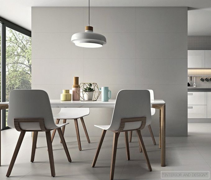
This year, the key theme of Cevisama was formulated as “Time to Feel.” It also reflects the fascination of manufacturers with a tactile effect (sometimes the relief of coatings is palpable only by touch), and changes in the color palette, which has become softer and paler. Fashionable themes of previous years — patchwork and stylization under the era of modernity and Methlakh tile — have finally moved into the mainstream category. Advanced manufacturers set new fashion, choosing ornaments in the form of elementary geometric shapes and graphic signs. They look like pencil shading, dots and pixels, and in low relief they resemble Braille. The surface of the tile is lined up like a graph paper or a notebook in mathematics, then it is lined like a school copybook. The color range is based on shades of white, smoky gray, gray, wet sand and pale green jade. Cool retrogamm is refreshed by soft pastels (pale lemon, ash pink, mint). Furniture manufacturers demonstrate the same love for smoky pastel tones. For example, CANELLA, instead of ponderous classics, presented a collection of furniture on thin supports in the finishes of the color of melted milk.
Read the full text in paper or


