Peter Law creates an interior in which everything is a bit too much.
Passing the gallery
A photo: Peter Lebedev
Materials prepared: Julia Sakharova
Stylist: Vladimir Nikiforov
Magazine: Decor N9 (98) 2005
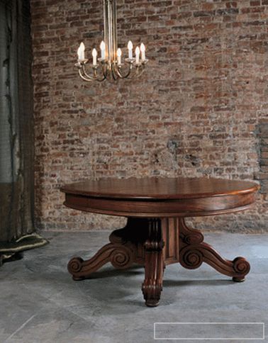
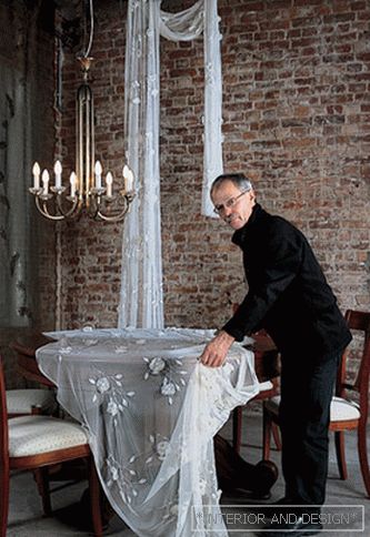
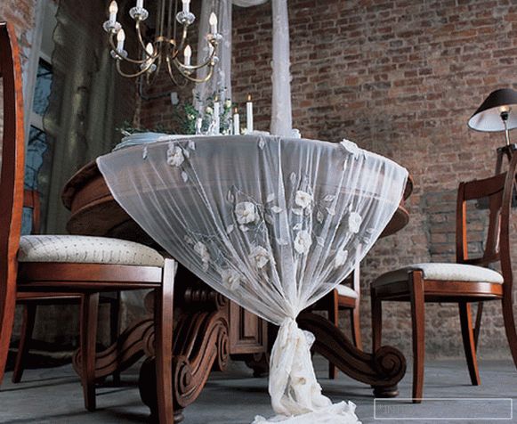
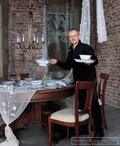
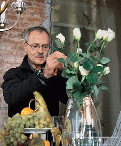
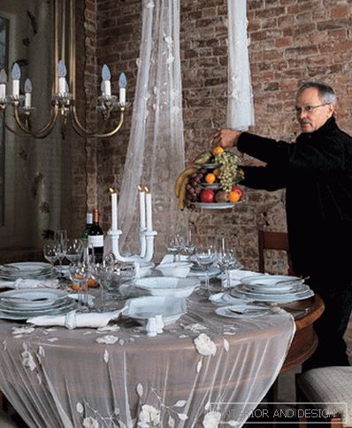
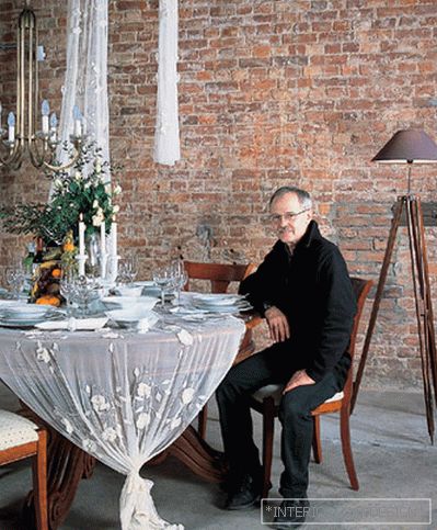
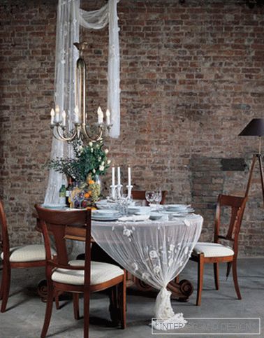
This law was brilliantly proved by Peter Law, the “architect of interior space” from Germany (this is how his position is translated from German into Russian). Peter came to St. Petersburg and held a master class specifically for the SALON-interior magazine. Created a cozy corner and served a festive table. "This lamp on three legs does not ideally correspond to the interior picture that I had in mind. He is probably too strict. But all the same - of all the floor lamps that I saw today in St. Petersburg salons, he is the best. The lamp under the lampshade gives a beautiful diffused light. It is necessary to foresee the moment that occurs during any dinner, when the chandelier is turned off and more intimate lighting is created "."Tablecloth I have, as you can see, improvised. I liked the cut of white tulle with embossed roses from fabric. On the wall below the ceiling, I found two metal brackets, and I had the idea to wrap the same fabric around one end. A rough brick wall began to look softer when I literally and figuratively connected parts of a different nature - a brick wall and elegant polished furniture. "I'm tying fabric knotted, leaving its end loose on the floor. With it, a massive antique table looks lighter and more elegant. And yet - white tulle tablecloth contrasts subtly with the dark green organza, which I curtain the window. We light candles, because my story will be about a rather romantic dinner "."Serviryu table for four persons. I chose a white service from the company ROSENTHAL, all items of which are octahedral. It seems to me that they are quite distant, but still echo in form with chairs and correspond in spirit to this antique chandelier. It is hardly possible to say that it strictly corresponds to the Art Deco style, but there is some bias in this direction. I picked up cutlery for the service, also in style resembling table silver from the 20s-40s of the 20th century. "I tried arrange everything so that the very idea of serving corresponds to the type of people who would choose such furniture, a similar service, a similar tablecloth and cutlery. They are rather conservative, generous, romance is not alien to them, their house is a full bowl. I added bottles of champagne and red wine to the fruit composition, let the table be too tightly packed! Let it all be a little bit too much. I myself will be happy to sit at this table "."Rose, Rose ... I decorate the table with a bouquet of white roses, similar to those woven on our improvised tablecloth. A bouquet should not be too ordered; it needs some carelessness. Then I will add there sprigs of small-leaved eucalyptus. I already imagine how wonderful this fluffy green cloud will revive our table. Fruits - grapes, pears, tangerines, apples - I put on a three-tier stand, giving the impression of abundance. I thought so. The fact is that this will be a Russian dinner, but here you need generosity and some redundancy in the decorative details. I am now setting the table for a family or a couple who invited close friends "."Take a lookhow everything turned out well. Against the background of ascetic brick walls, our table, decorated in white, looks very poetic. Here there is both conservatism and easy negligence - the perfect combination. And most importantly, it seems to me that something like this is easy to repeat. You can use not everything that you saw, but any individual techniques you like. "We thank "Design Gallery / Bulthaup. St. Petersburg" for assistance in shooting

 Passing the gallery

