penthouse with a total area of 800 m2 (Moscow)
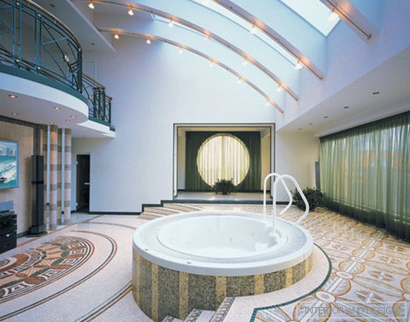 Passing the gallery
 A photo: Zinon Rasudinov
Text: Danila Gulyaev
Stylist: Yulia Klochkova
Project author: Natalya Babiyevskaya
Designer: Vladimir Chuiko
Magazine: H (109) 2006
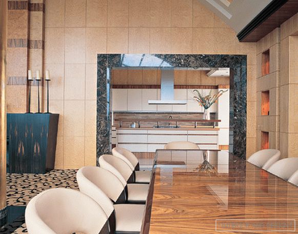
The apartment is located in the penthouse of a multi-storey building and occupies two floors. The area is impressive - about 800 square meters. meters Also impressive is the ceiling height - 6 meters - and a huge window, actually a glazed wall. It can be said that this is an apartment with a palace scale, but intended for a modern urban lifestyle, requiring comfort and functionality from the interior. In principle, in this case there was too much space, it was empty and cold. Architect
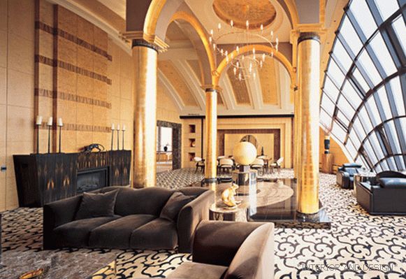
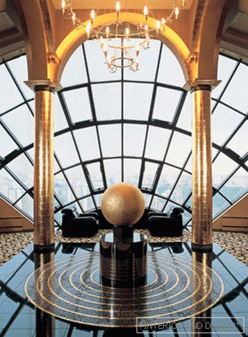
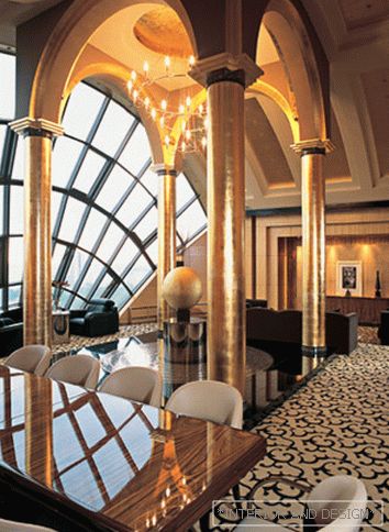
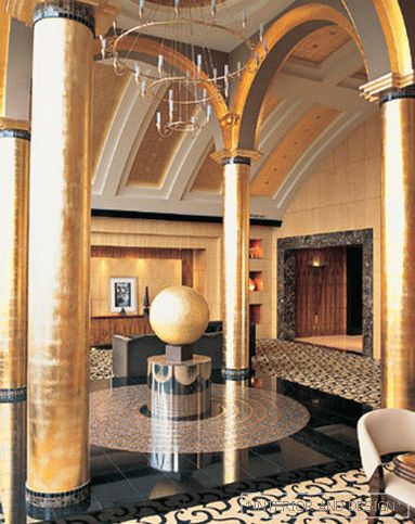
Each room, although the word "hall" is more appropriate here, is built on the classical principle: there is a clearly defined center in which the axes of space intersect. In the living room, this center is marked symbolically - a large golden ball on a pedestal. It stands on a granite podium decorated with marble mosaic with golden circles. In fact, this is omphalus - a stone that was the center of the world in ancient mythology. If we consider what panorama opens from a giant window in the living room, then such symbolism, in general, is not accidental - here you really feel like in the center of the world. But on the other hand, the story of the appearance of this building was almost like that of Akhmatova: "if you knew from what rubbish ..." somewhat unfortunate architect built. The dome with pillars was originally in the room, the pillars were carrying, but a little out of place. It was impossible to remove all this for technical reasons. It is impossible to remove, but you can turn the flaws into an artistic device, as the author did, by thickening the paint and turning the builders fad into a miracle of decoration.
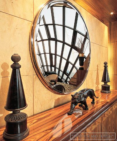
Natalya used the most luxurious colors and textures - gold, gloss black, and it turned out to be a glamorous installation in the center of a huge living room, almost the main hall. Often, the halls of hotels, and, indeed, many palaces, are similarly decorated. Functional zones are logically located around this installation - a sofa, a dining room, a fireplace. And the walls are lined so as to make the space as saturated as possible, to create a feeling of completeness. For this, four types of veneer were used: rosewood, ebony, ash root, maple root. Such a variety was needed so that the huge walls were not monotonous and overwhelming, so that the decoration would have contrasts that enliven the interior. And in general, the style of the living room resembles the samples of American Art Deco, impressive and expensively decorated.
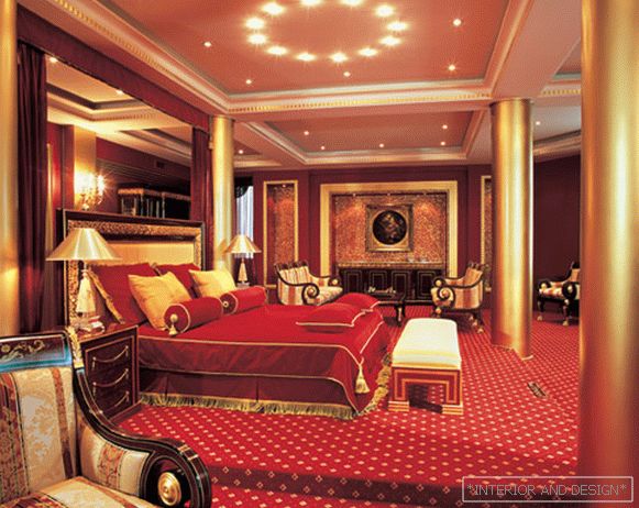
An association with American art deco interiors also occurs in the bedroom. "I was told that the bedroom looked like presidential suites in some New York hotel," says
Project author

