Interior palette designed by Elena Dobrovolskaya

 Passing the gallery
 Text: Julia Sakharova
Magazine: Decor N1 (123) 2008
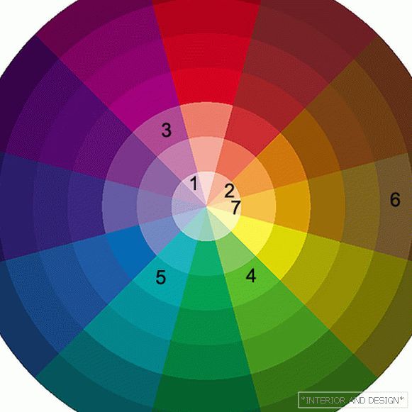
For the walls, for example, they selected complex dark shades of warm gray (1). Depending on the lighting - natural sunlight, warm yellow light from incandescent bulbs, halogen lighting - this shade of gray gleams mauve, purple, and brown. Against this background, shades of pink look advantageous, such as salmon (2) and fuchsia (3), which the architect chose as bright accents for the living-dining room space. In the pink tones as an integral part there is red, and in the color of fuchsia - also blue. Red and blue are in complex shades of warm gray. Therefore, they are well combined with each other.
But the feeling of harmony develops not only due to the presence in one space of colors that are in the same segment of the color wheel (like red and pink), but also due to the so-called additional colors (they are opposite each other on the color wheel). For red (and pink) these are different shades of green. Pale-pistachio (4) variant of green color is used in the living-dining room.
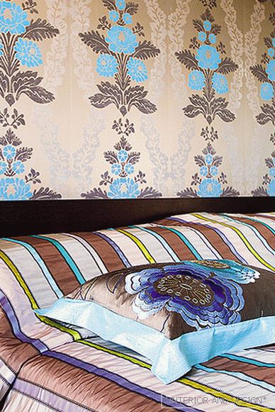
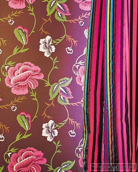
For the private zone, cool turquoise was chosen as a bright accent (5). If it were combined with its traditional companions - magenta (cold, bright pink and crimson) and pistachio, it would feel like very cold. However, paired with chocolate color (6), turquoise looks soft, calm. Over the past two years, this combination of colors has managed to become a classic. In principle, this color combination is quite strict, but the nature of the graphics on the wallpaper and on textiles - stripes and stylized leaves - adds liveliness to the decor.
And one more important color in this interior, a universal color, with the help of which it is easy to “dilute” the interior that is too dense in color, is beige (7).
Page 3 of 3<< Предыдущая страница


